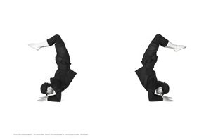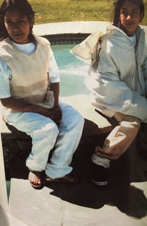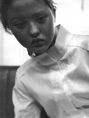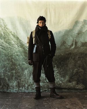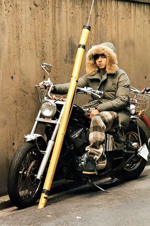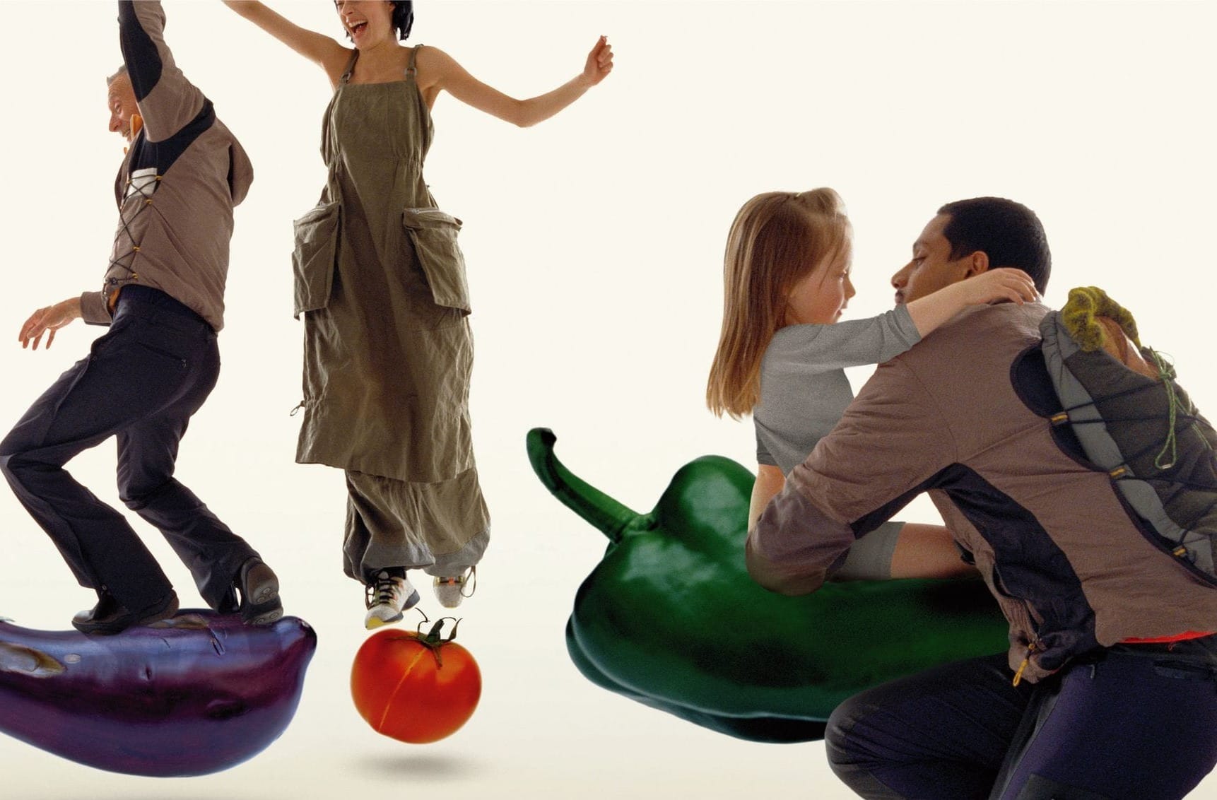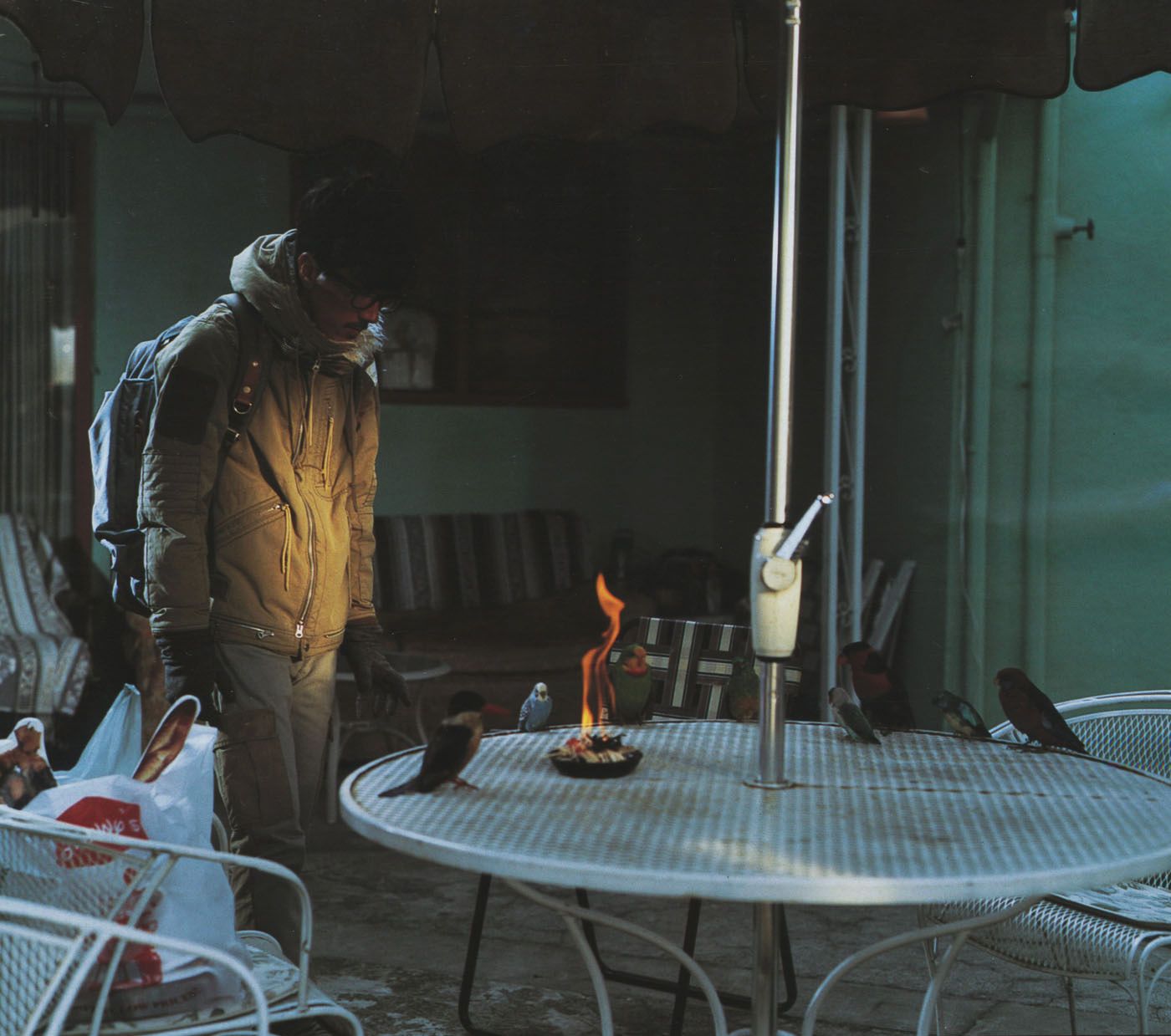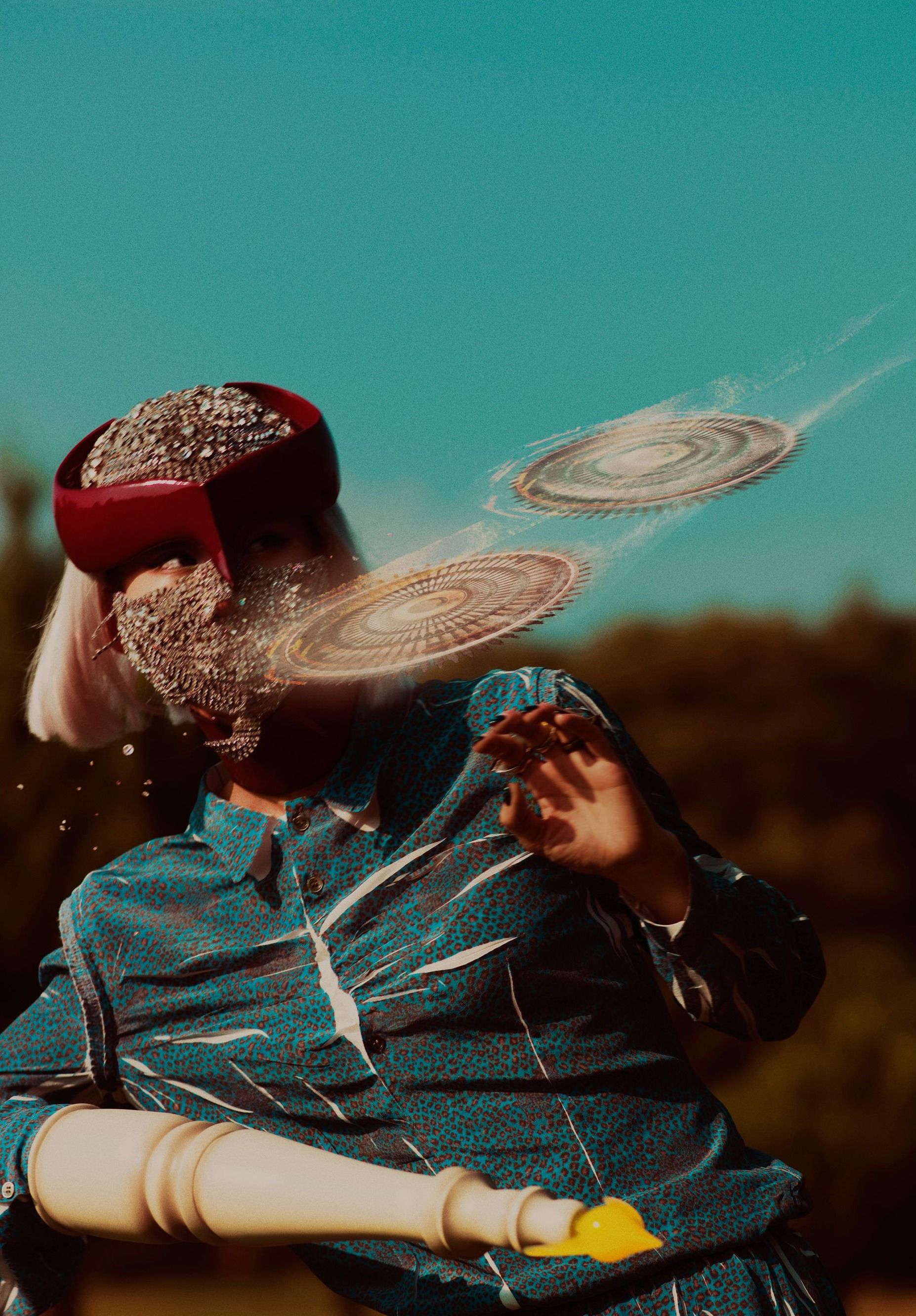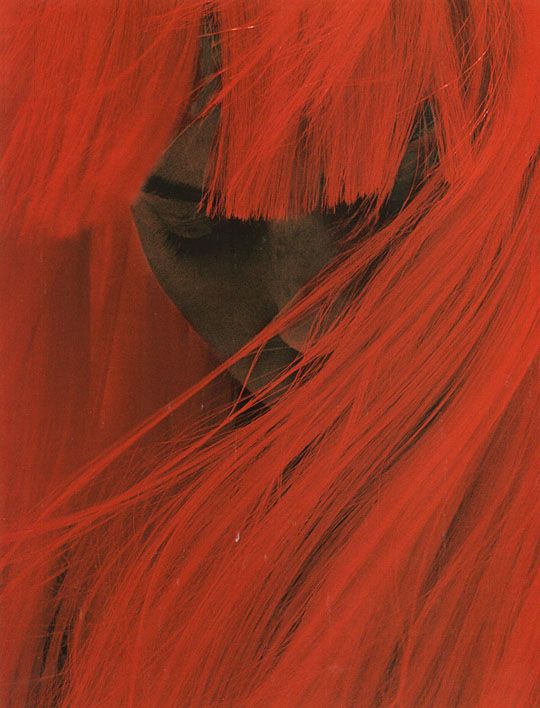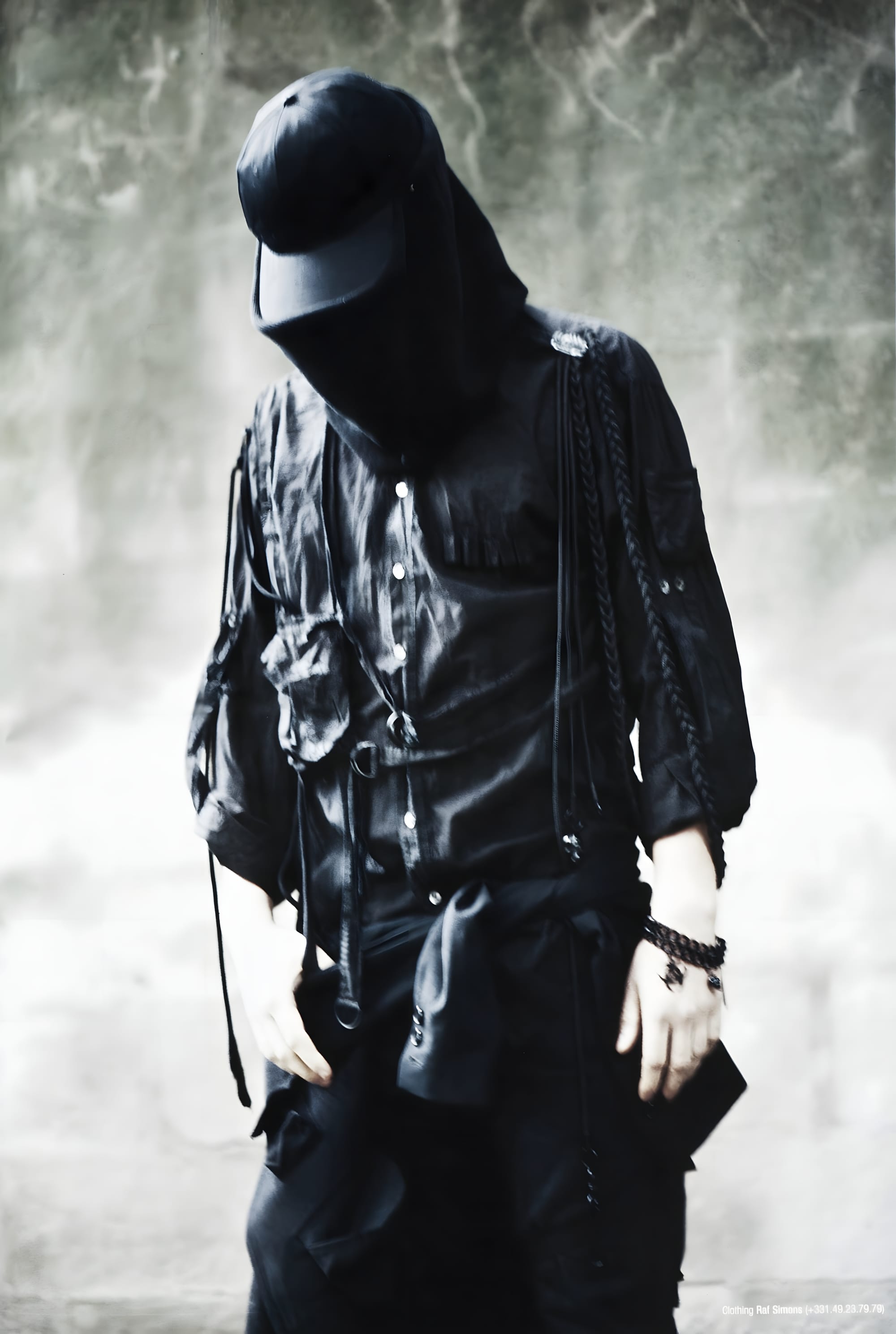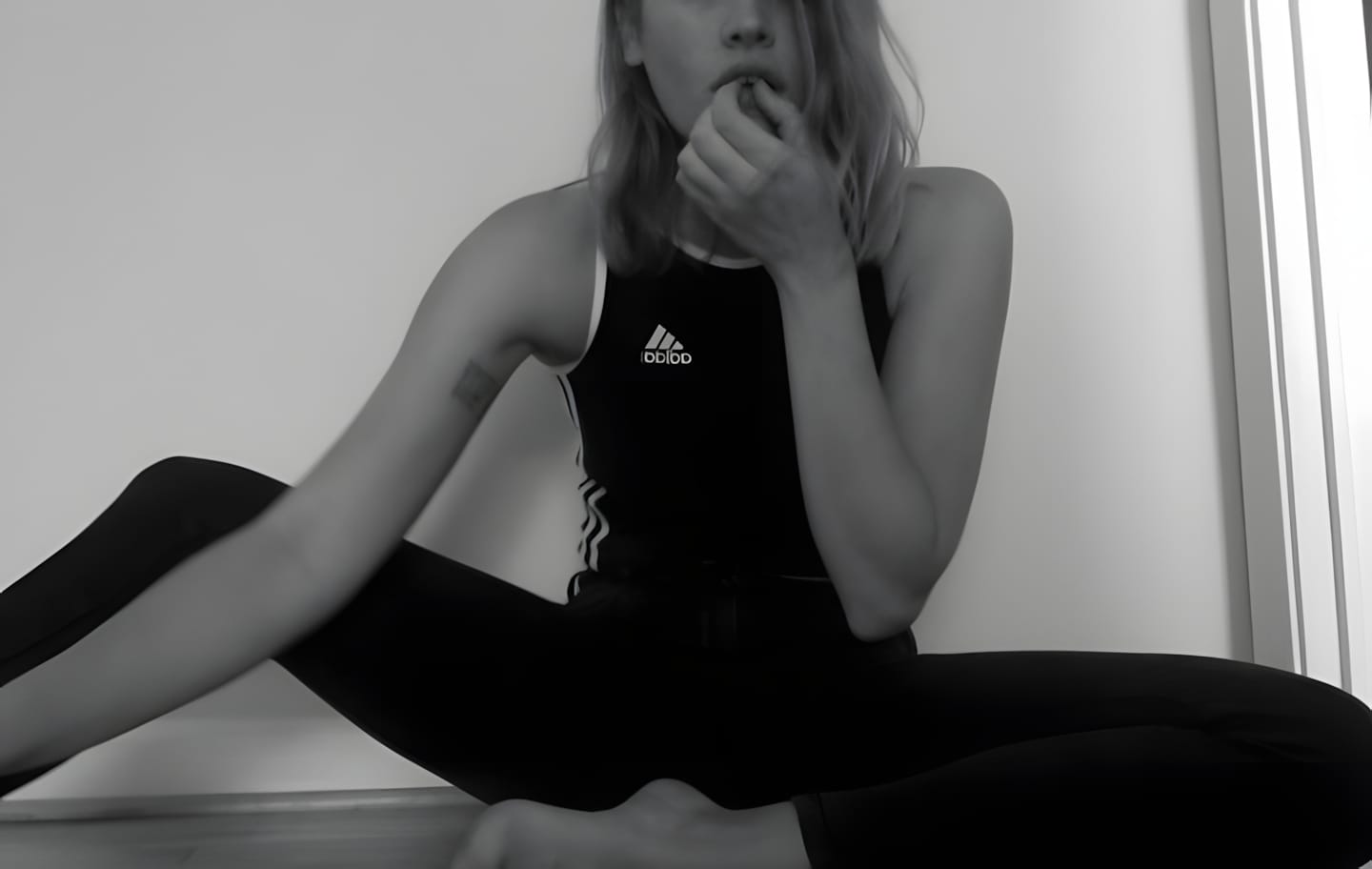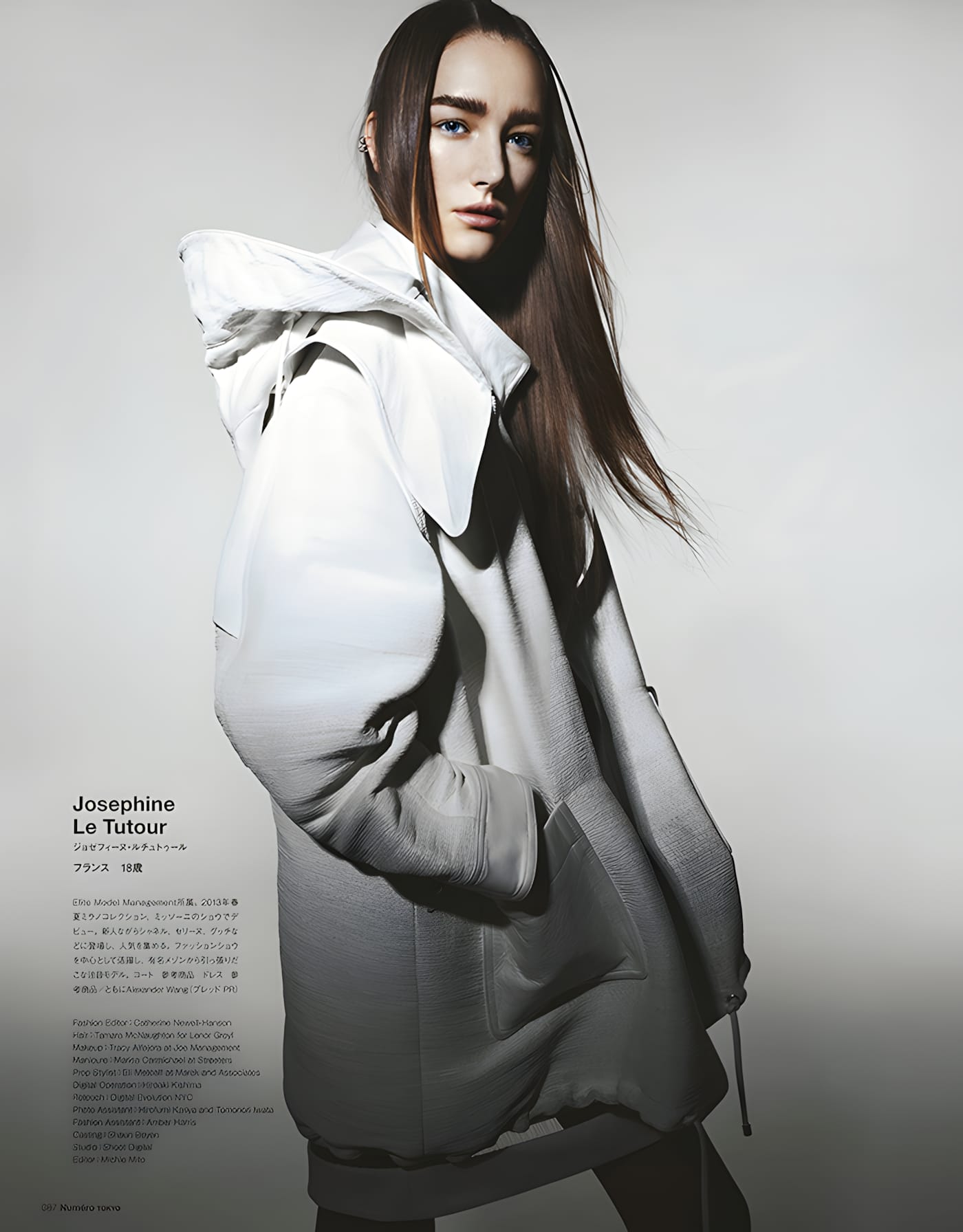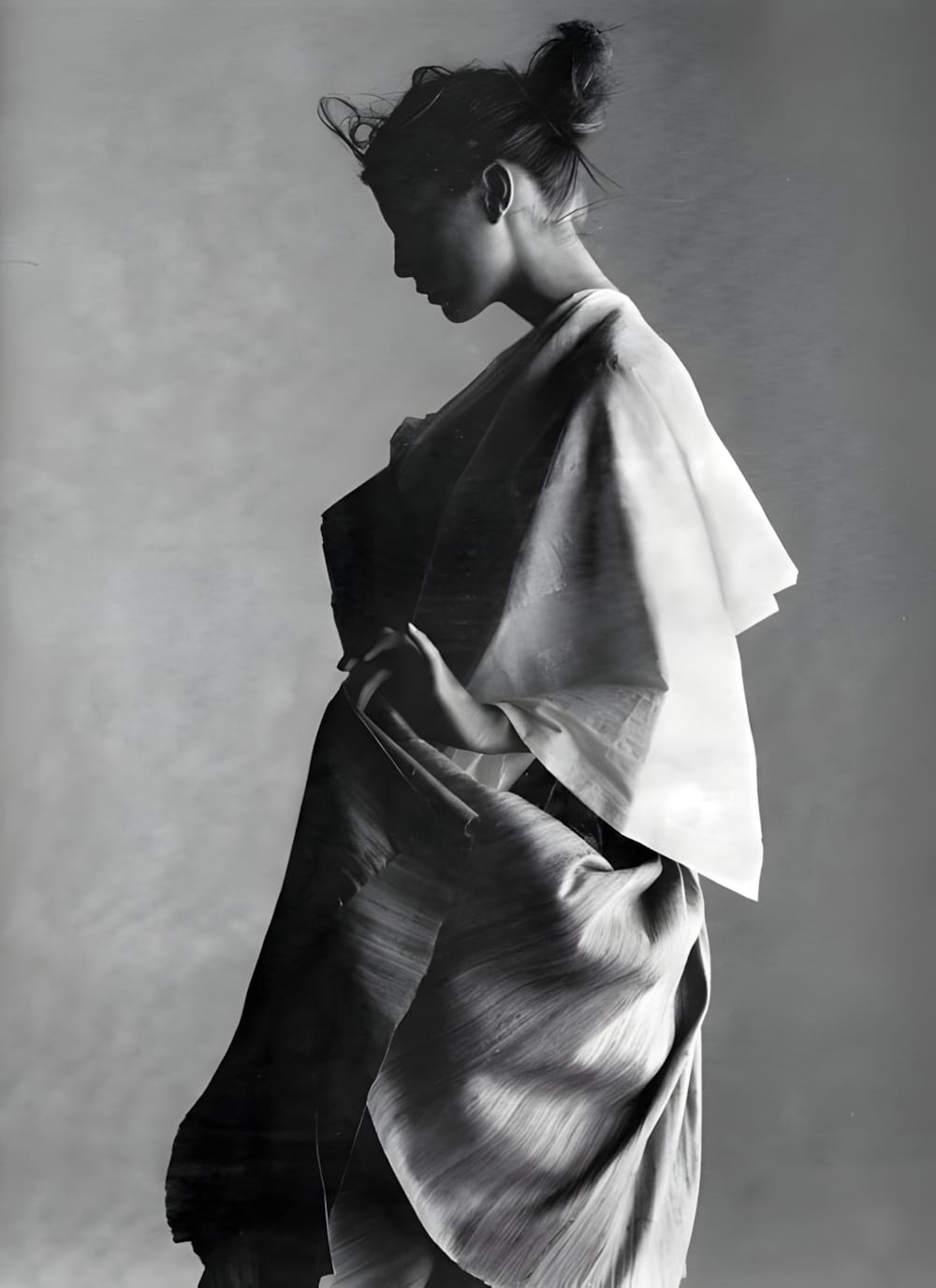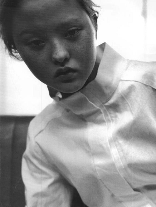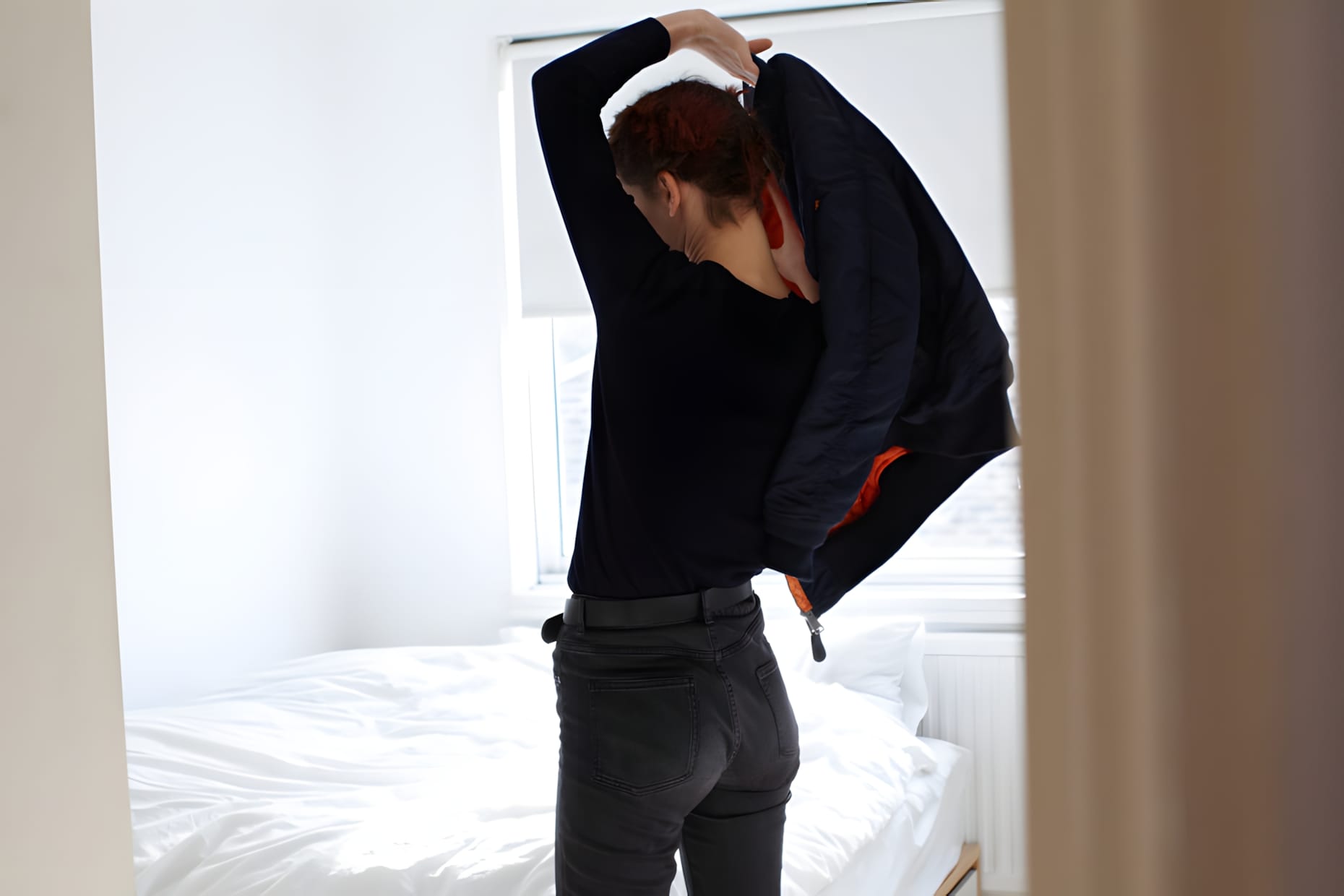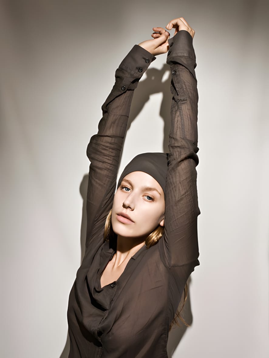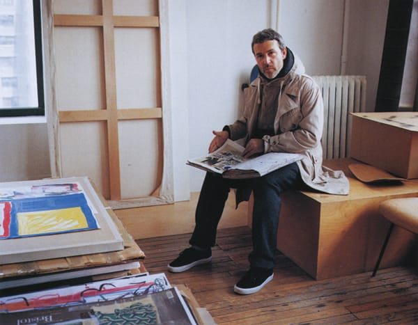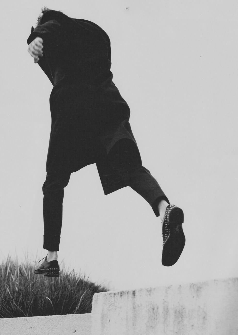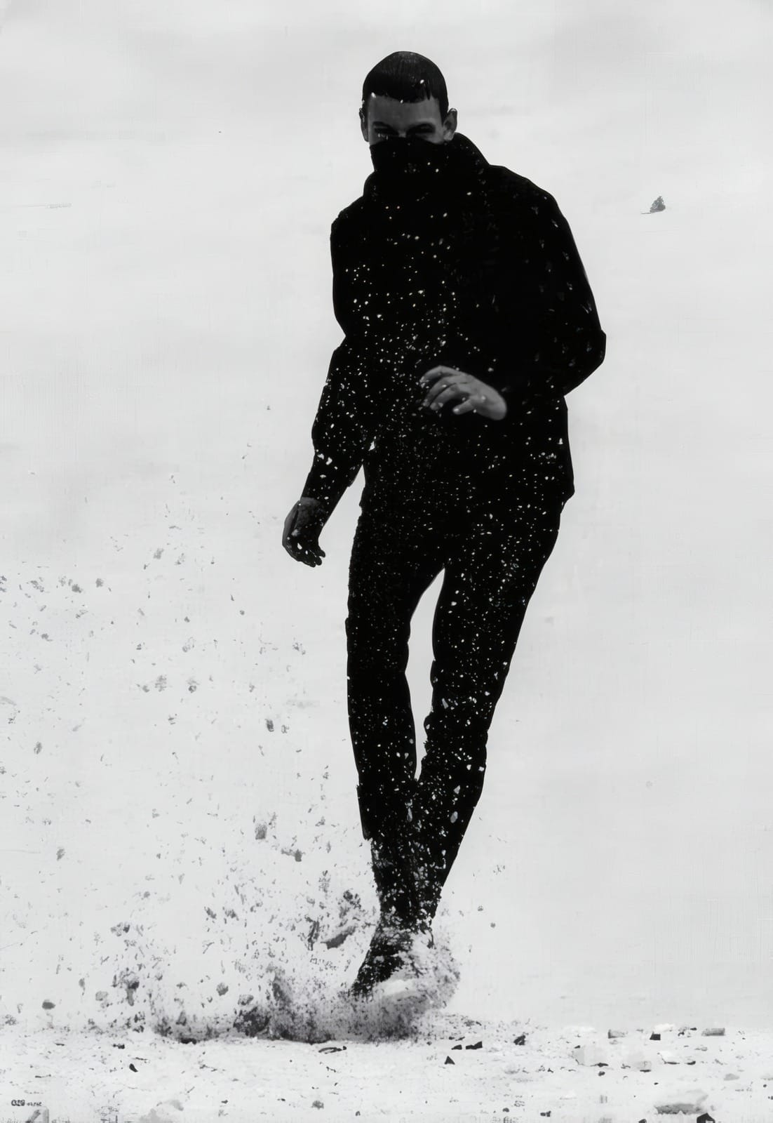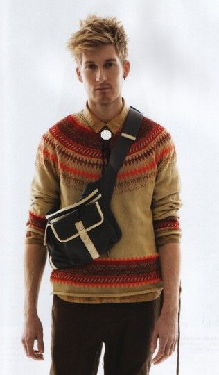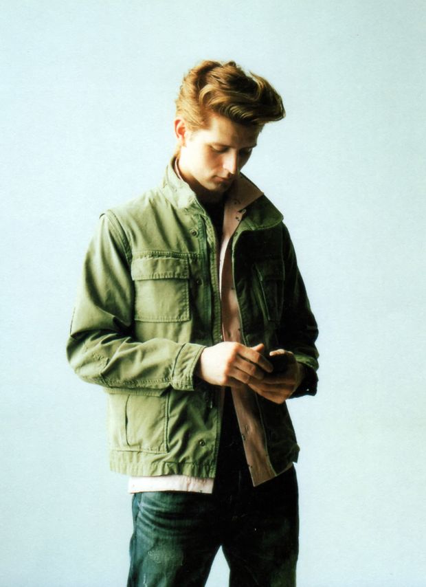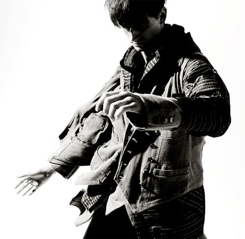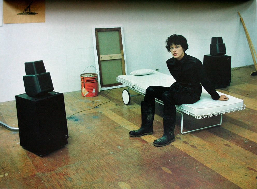
MIlla Jovovich by Juergen Teller
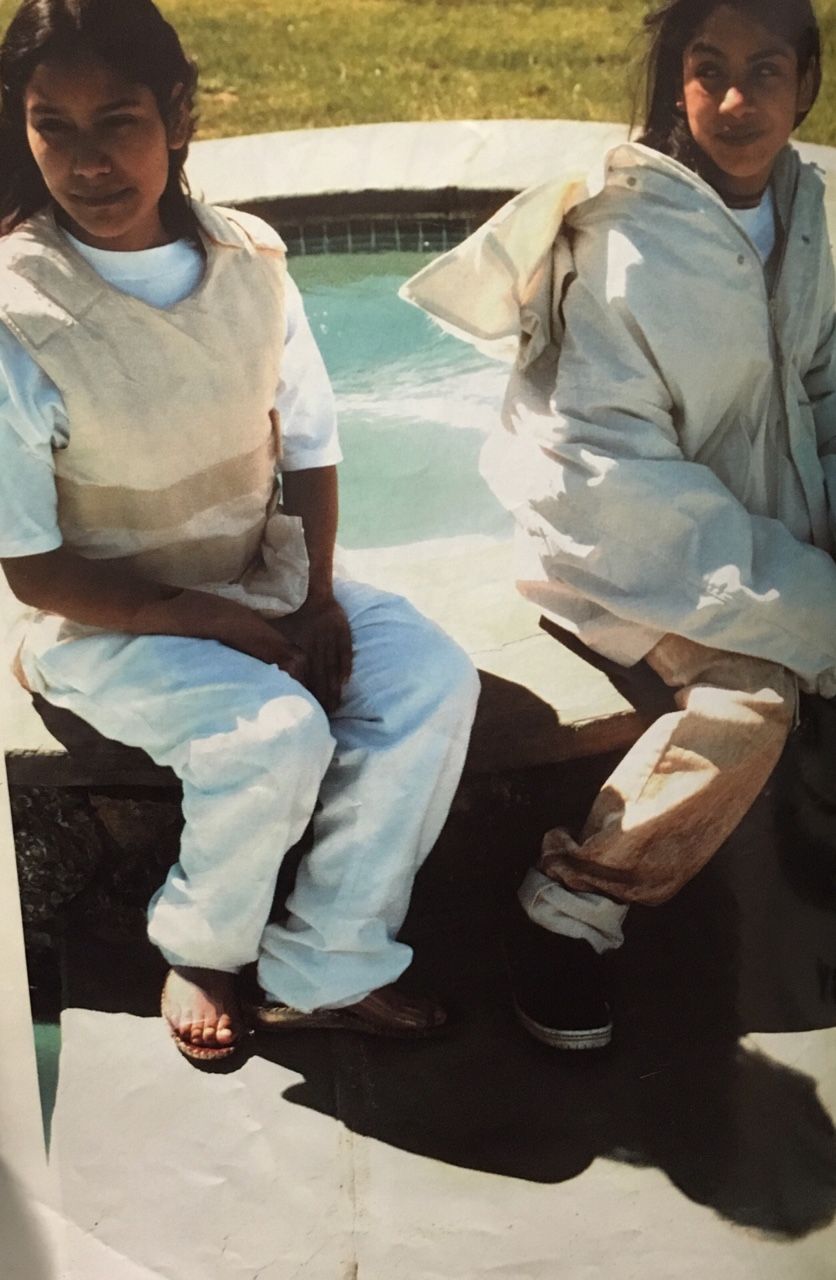
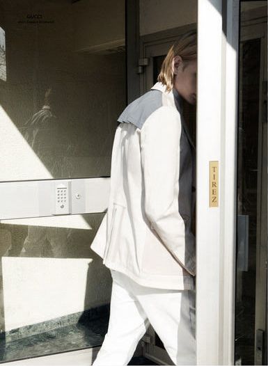
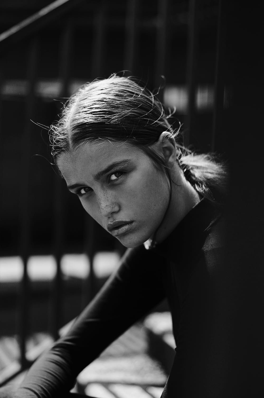
MIlla Jovovich by Juergen Teller for Strenesse fw97
MIlla Jovovich by Juergen Teller for Strenesse fw97


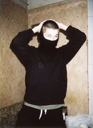
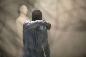
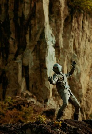
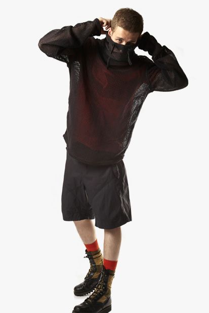
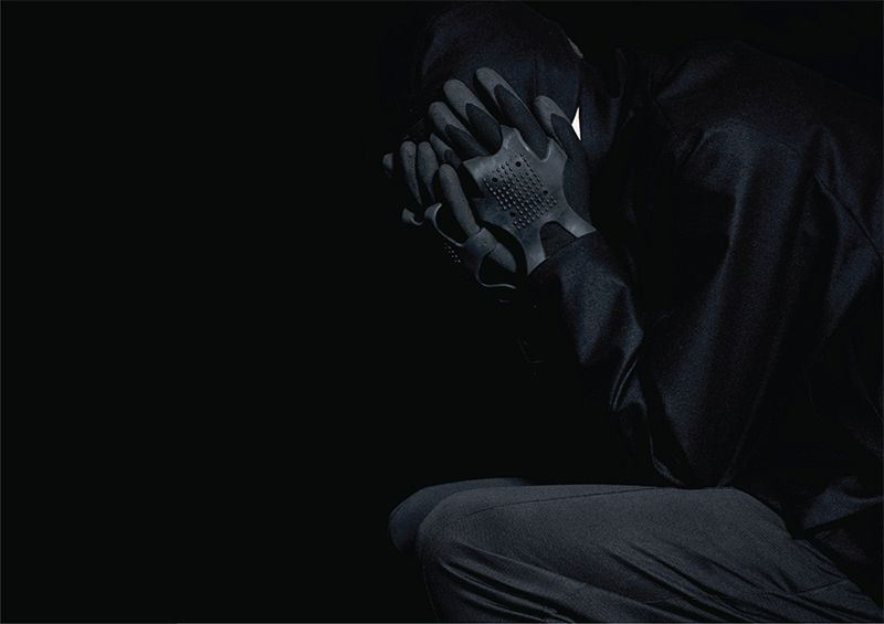
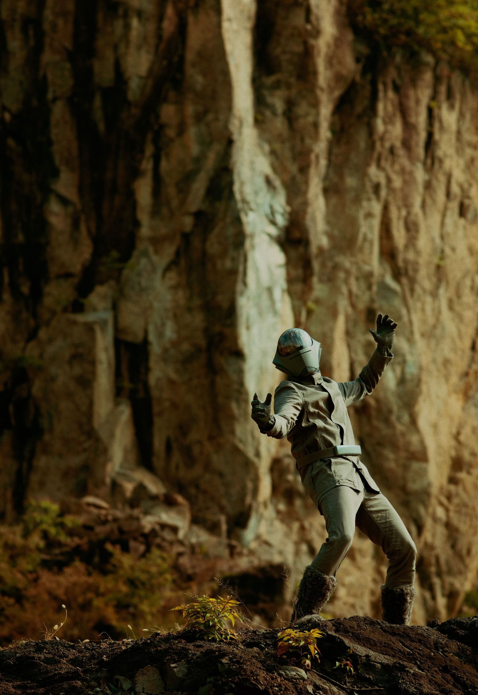
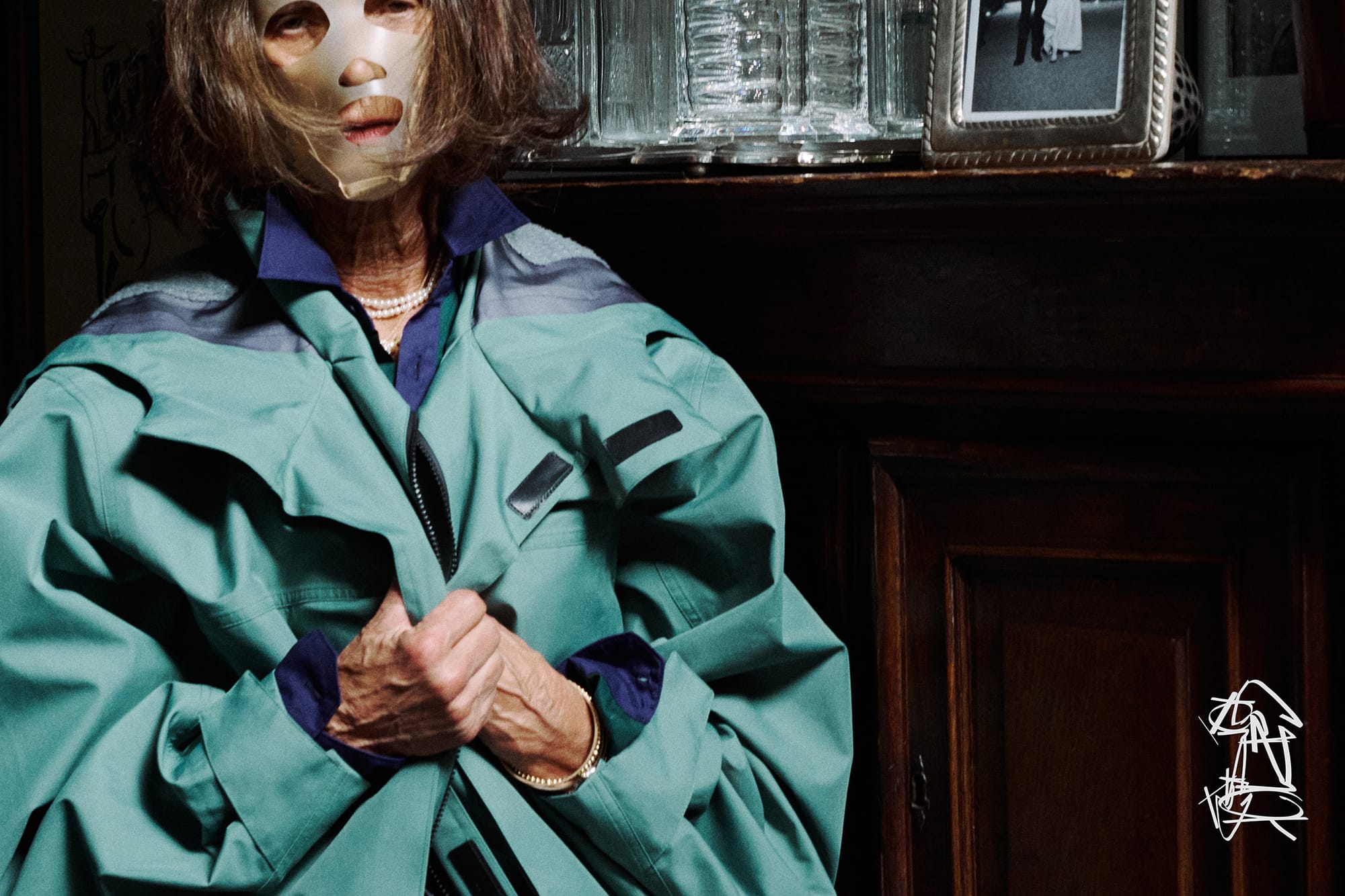
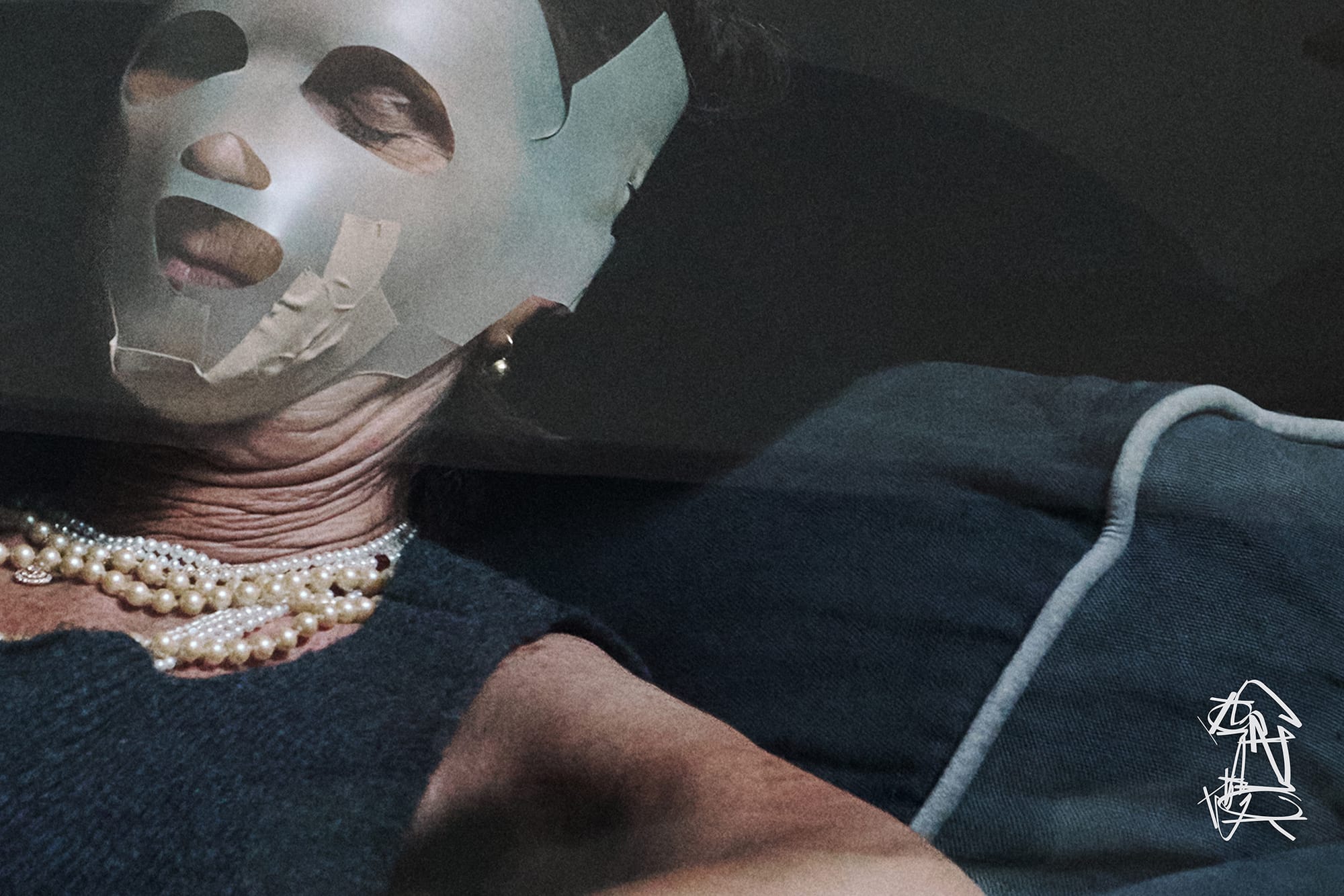
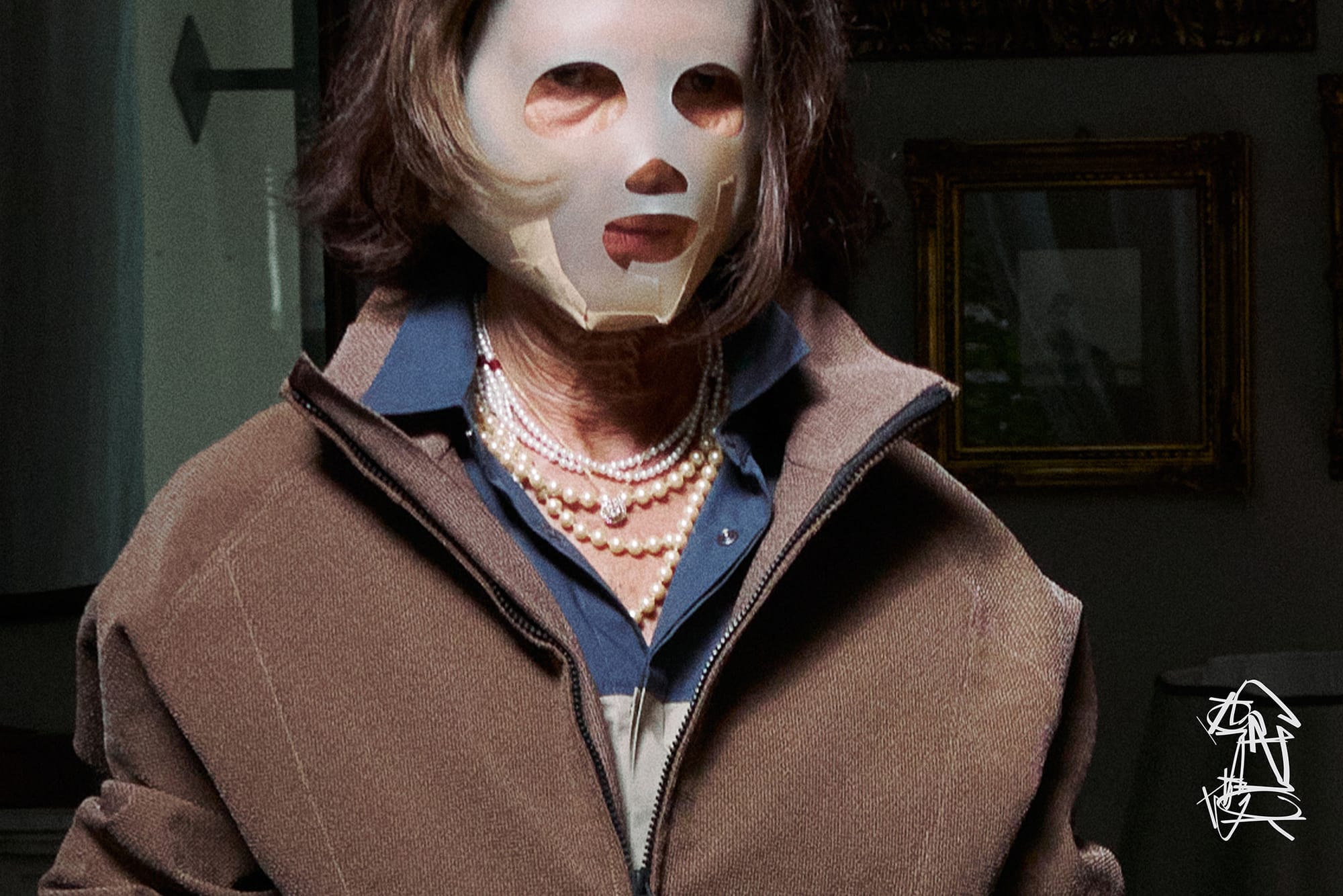
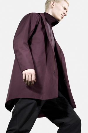
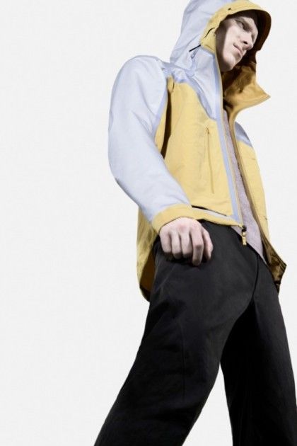
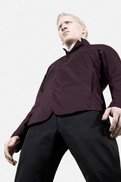
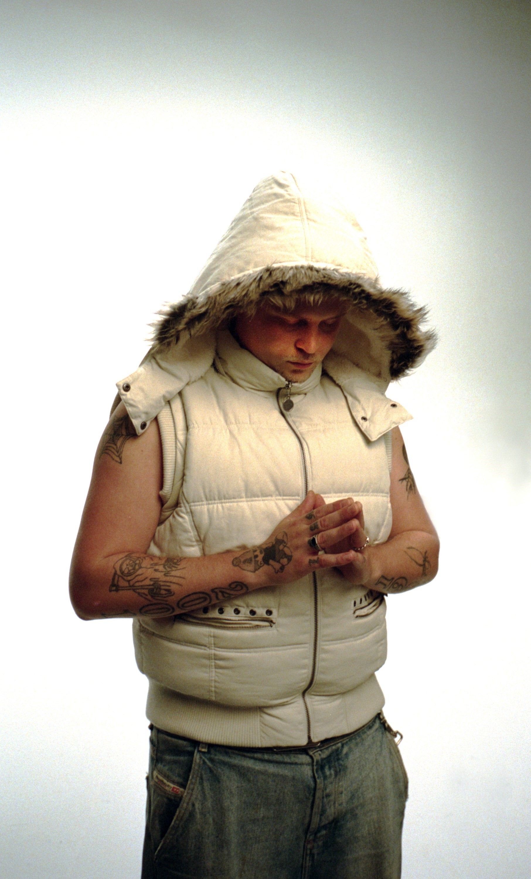
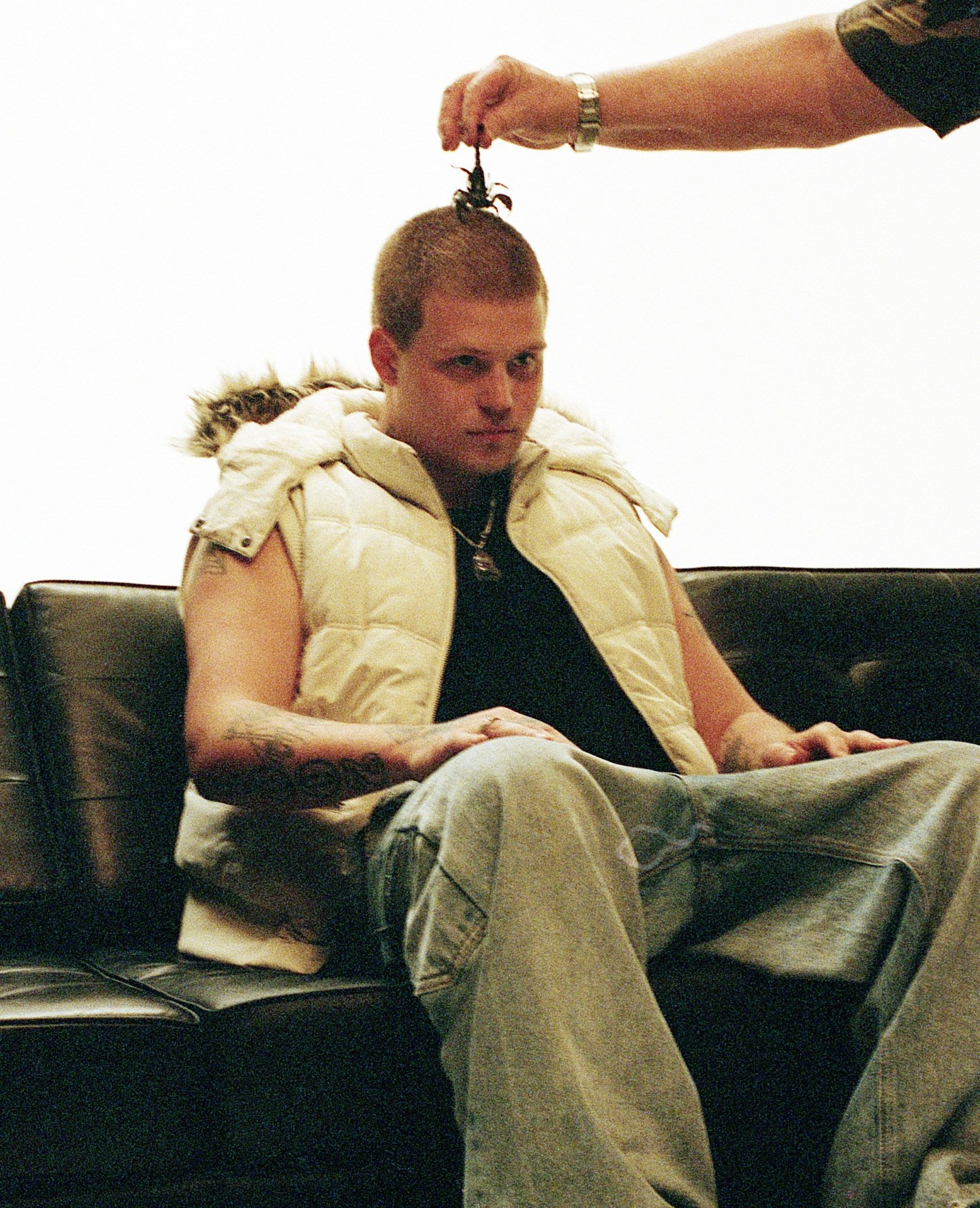
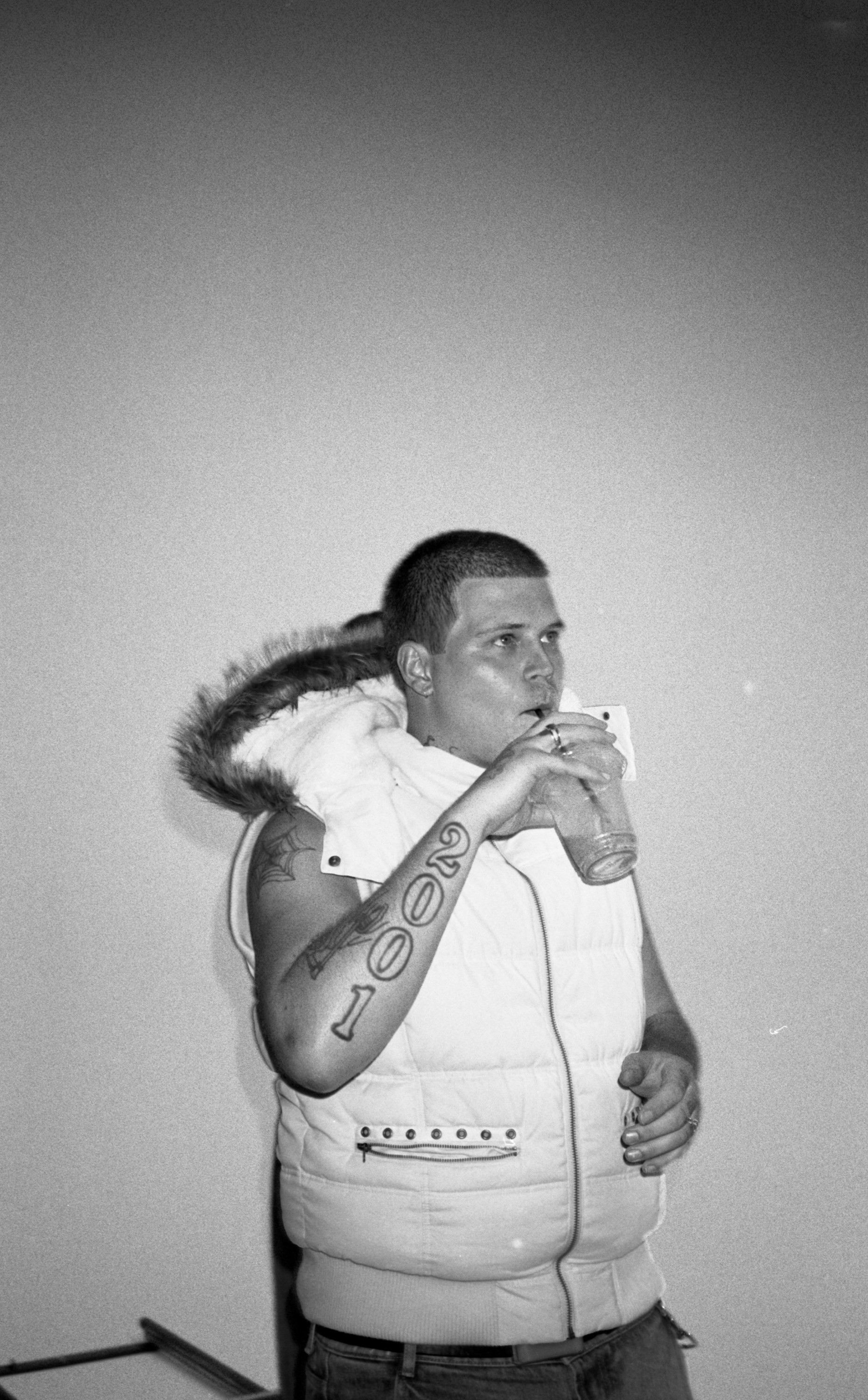
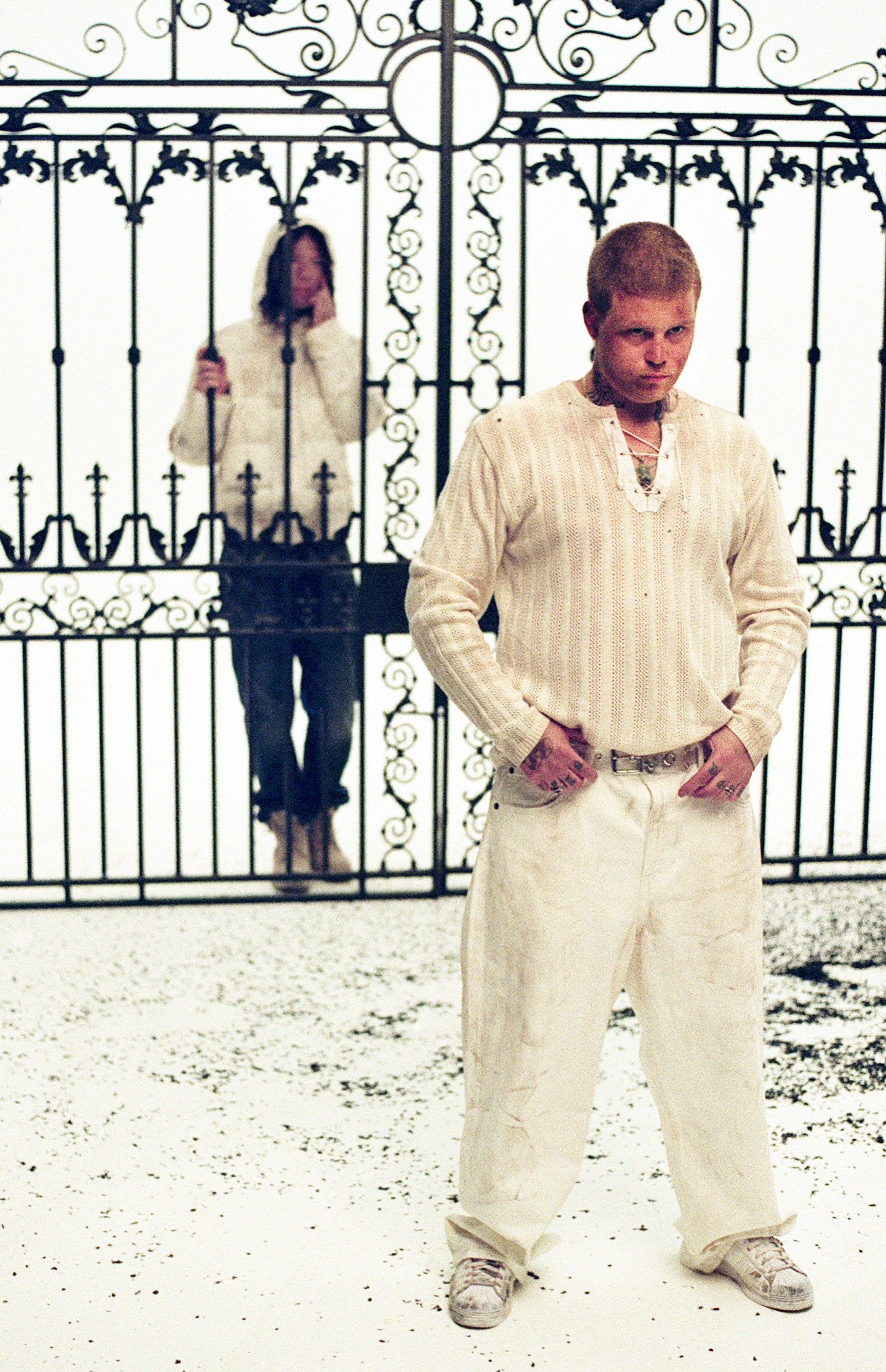
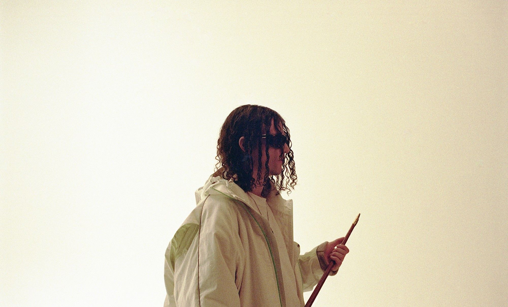
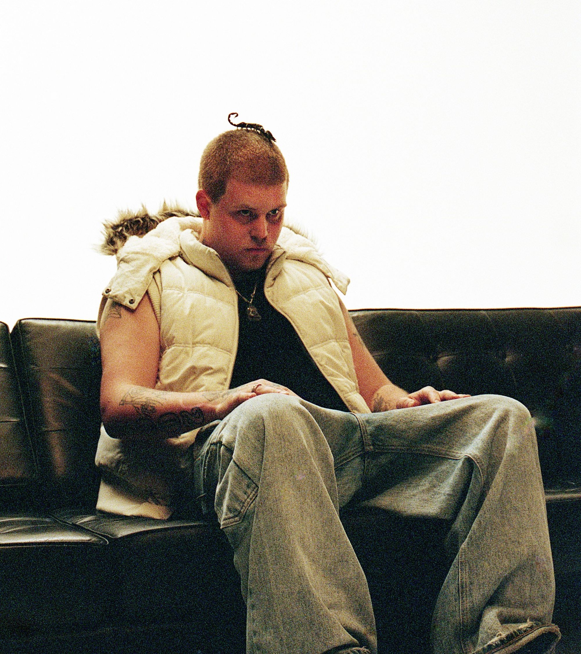
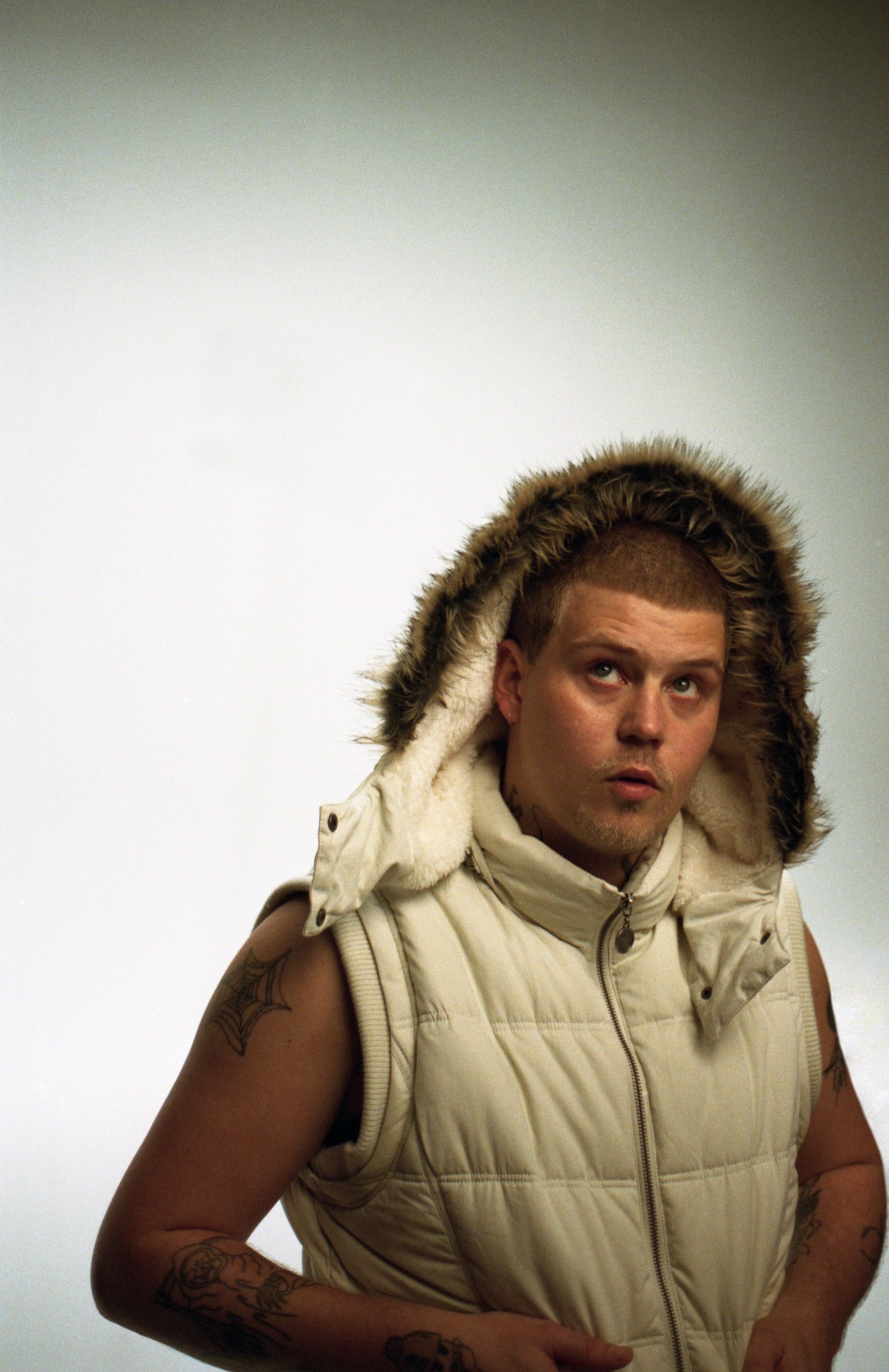
GR10K "Incognito" Fall 2024 Ad Campaign

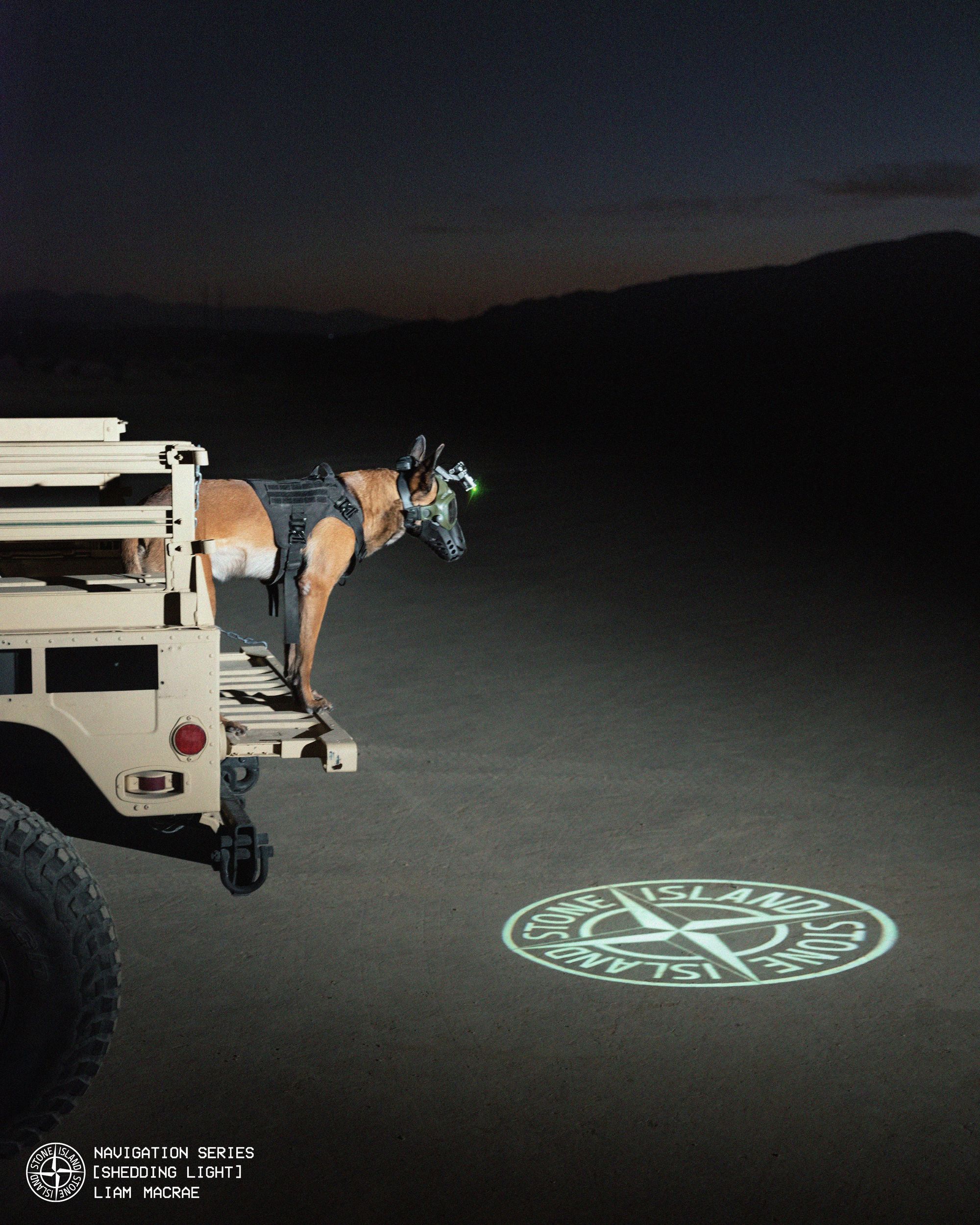
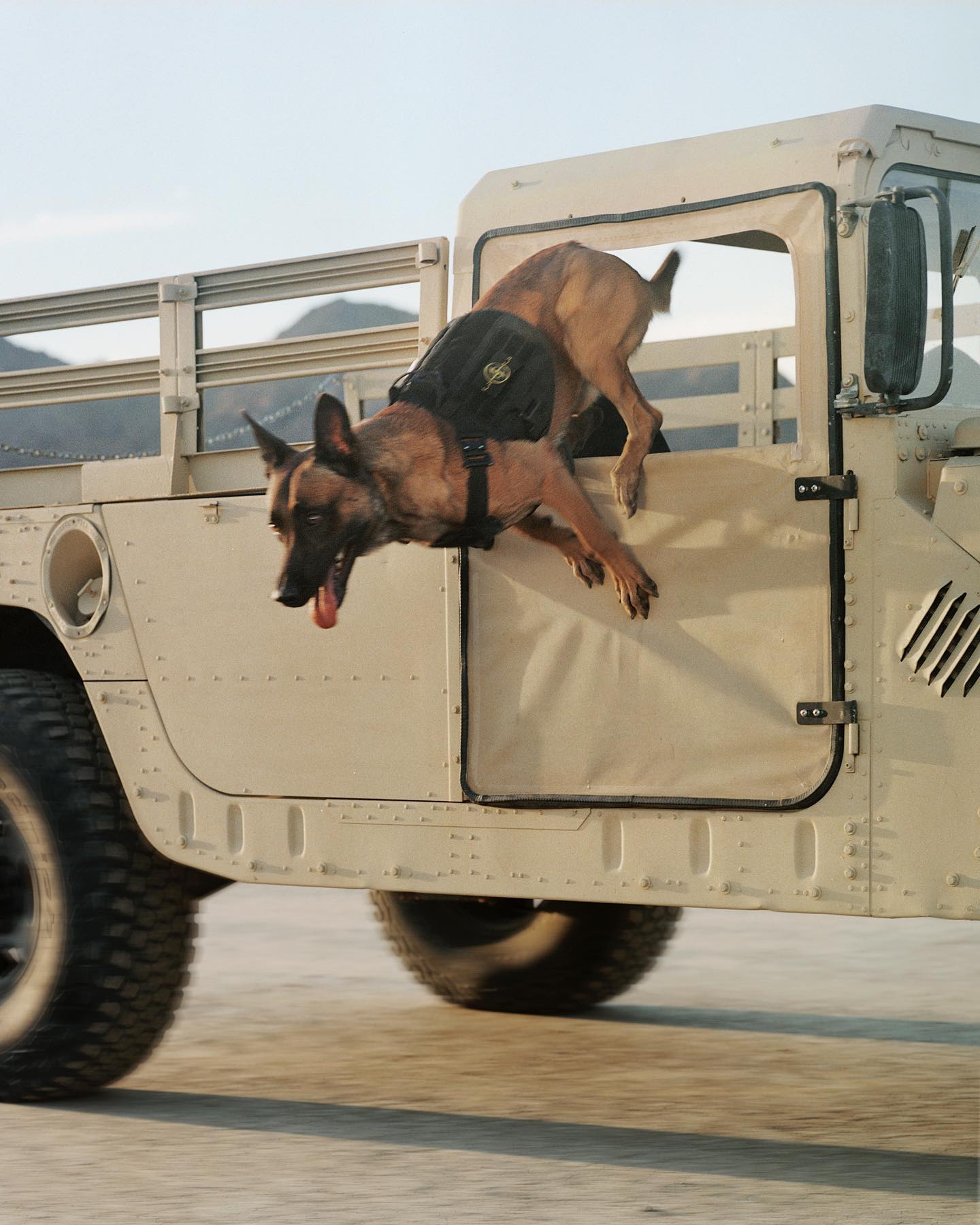
![Stone Island Navigation Series [shedding light] by Liam Macrae](https://storage.ghost.io/c/14/ee/14eef3be-ca5a-434b-8324-fa1f874026f1/content/images/size/w300/2023/09/F5WkecNXQAA78GB.jpeg)
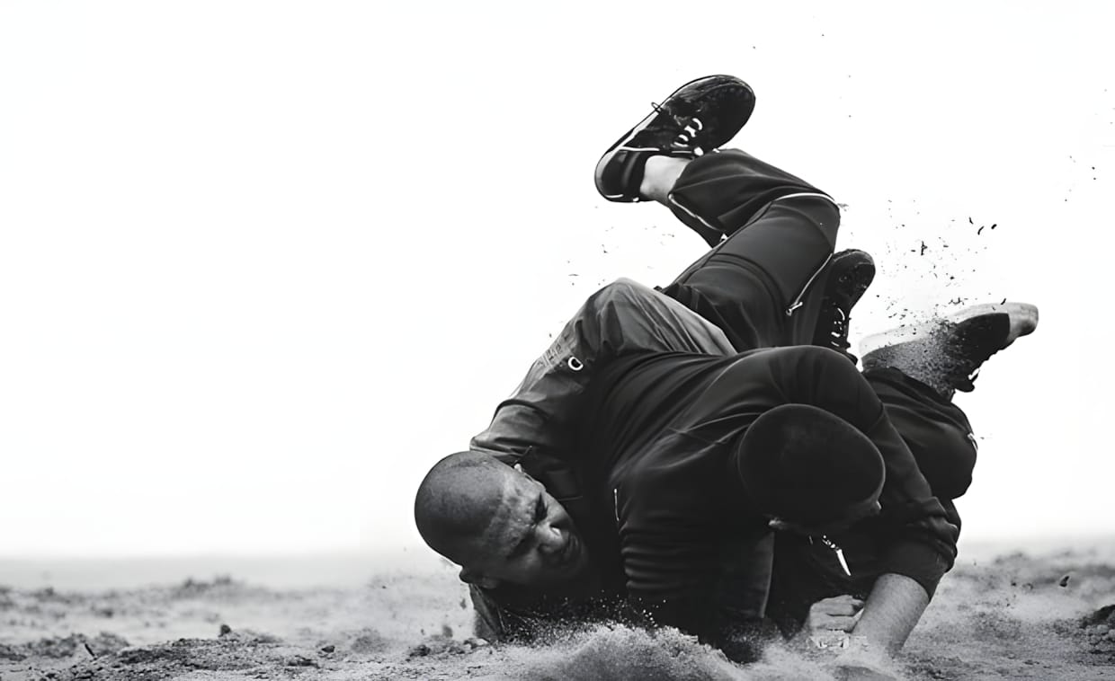
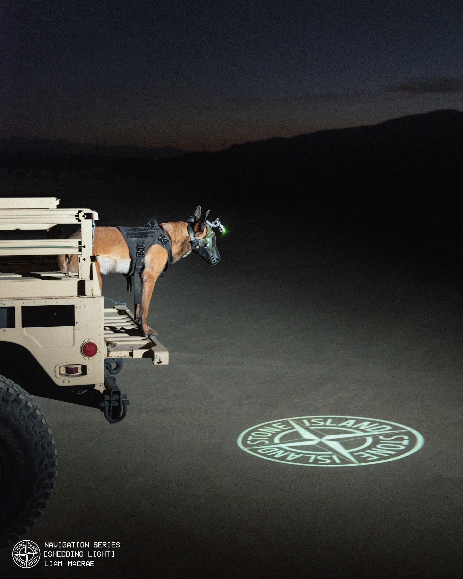
Stone Island Navigation Series: Shedding Light by Liam MacRae deploys a canine unit as both subject and sensor. The sequence examines tracking protocols, movement signatures, and light scatter in terrain navigation. Objective: assess animal-assisted pursuit as a guidance vector. Visual narrative captures the moment of release—unleashing the chase to test instinctive tracking against controlled illumination parameters.
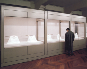
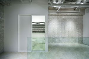
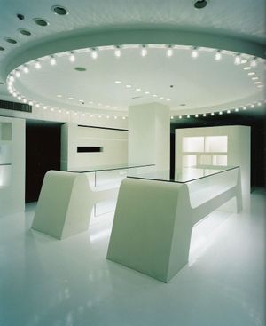

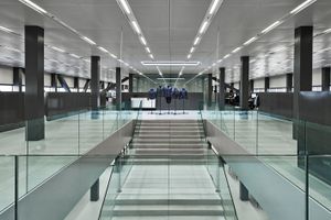
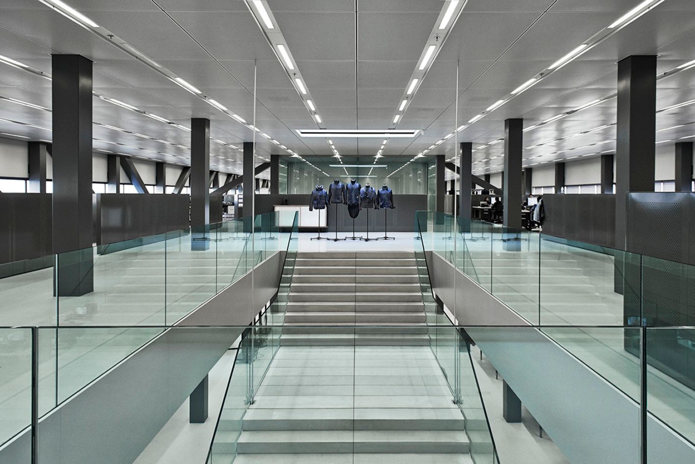
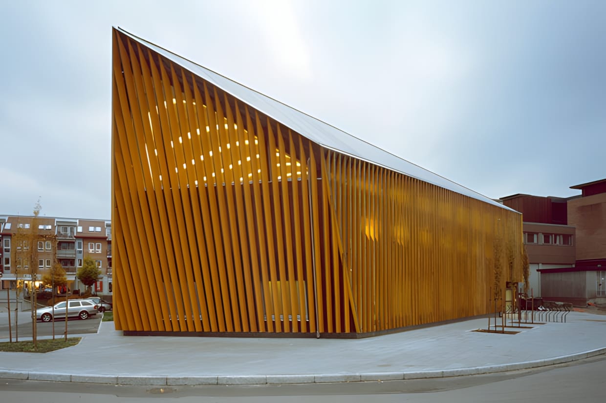
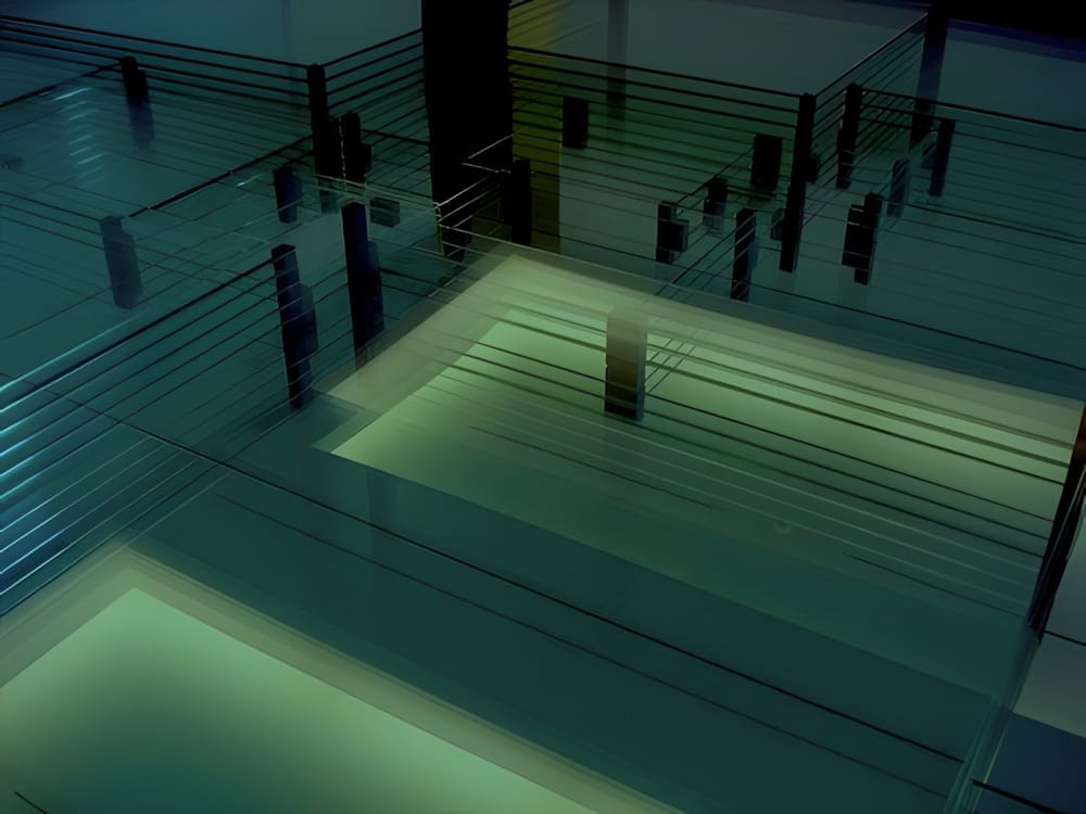
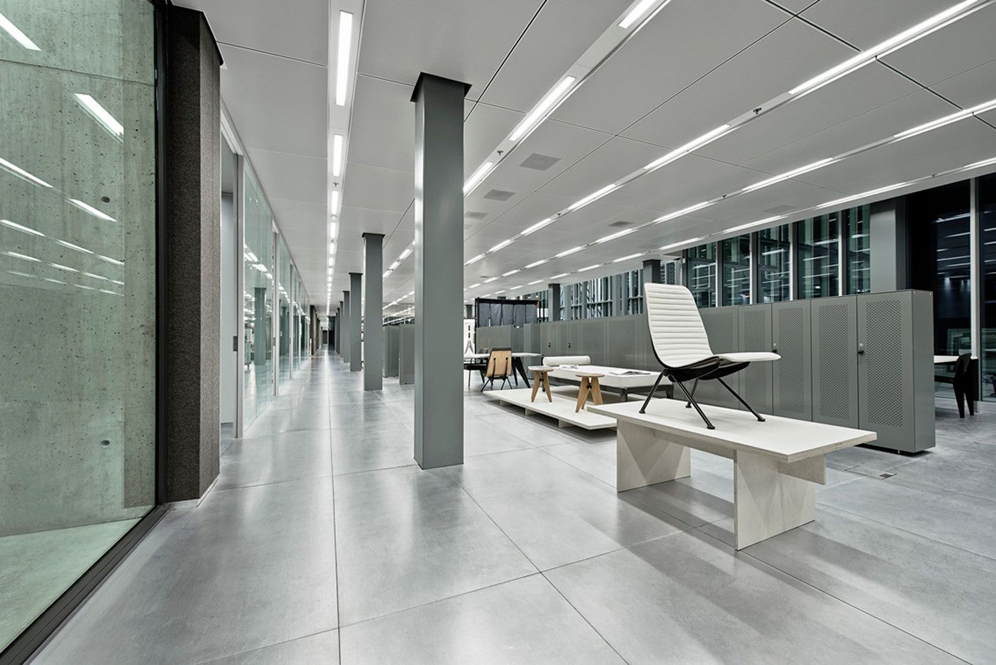
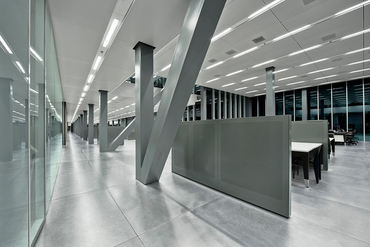
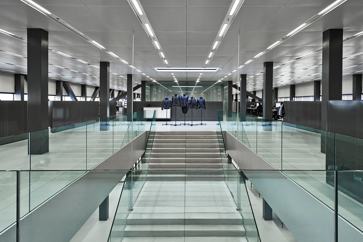
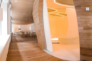
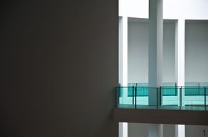
The horizontal building spans 27,500 square meters and stretches 140 meters in length. It comprises a central creative hub that houses G-Star RAW's essential departments. This creative center is encircled by offices, parking spaces, and supporting amenities. The differentiation between the functional support areas and the dynamic creative core is emphasized by the use of distinct materials. The outer ring is constructed from black concrete, giving it a solid and unified appearance, while the transparent glass facade reveals the vibrant creative core within. The lower section of the ring serves as a base for parking and drop-off purposes, as well as a platform for installations and events.

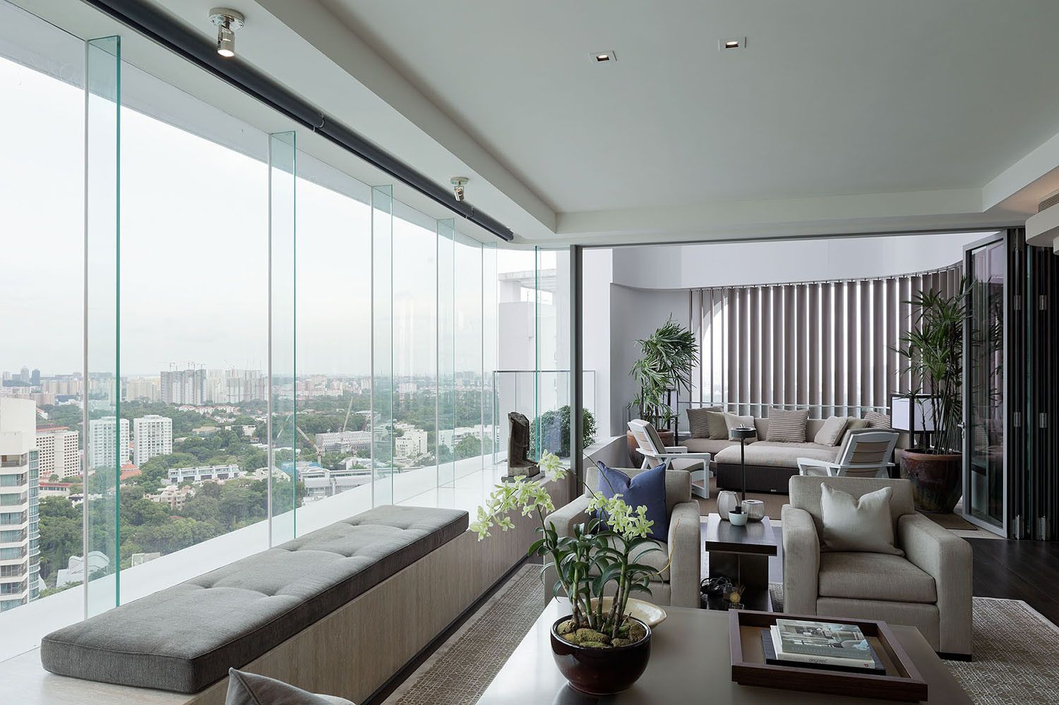
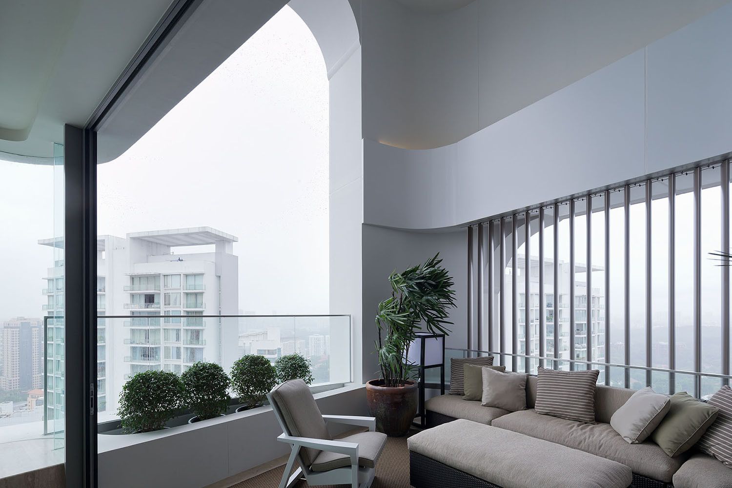
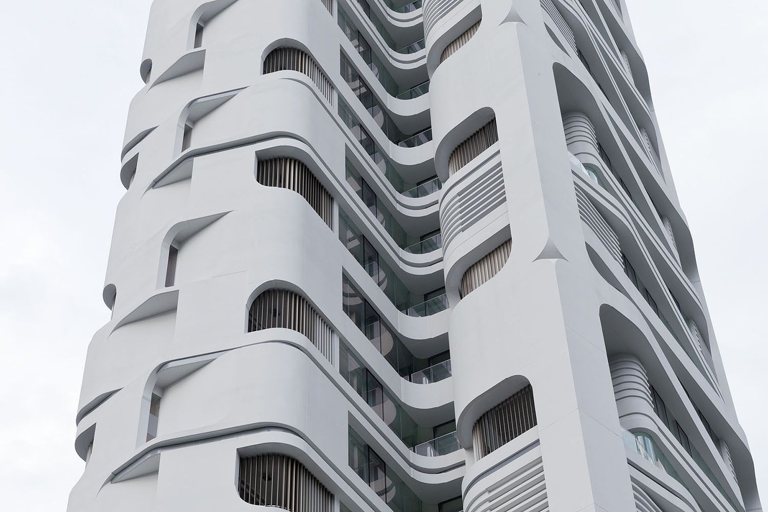
The primary concept for the design of the 36 storey, 17.178 m² residential tower is a multi-layered architectural response to the natural landscape inherent to the ‘Garden City’ of Singapore. This landscape concept is integrated into the design by means of four large details: the articulation of the facade, which through its detailing creates various organic textures and patterns; expansive views across the city made possible by large glazed areas, bay windows and double-height balconies; the interior ‘living landscape’ concept adopted for the design of the two apartment types and the introduction of transparency and connectivity to the ground level gardens by means of a raised structure supported by an open framework.
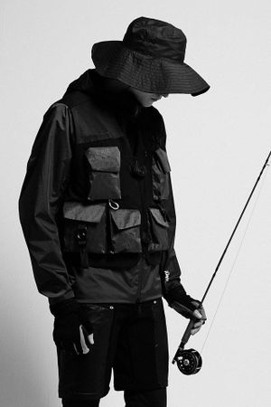
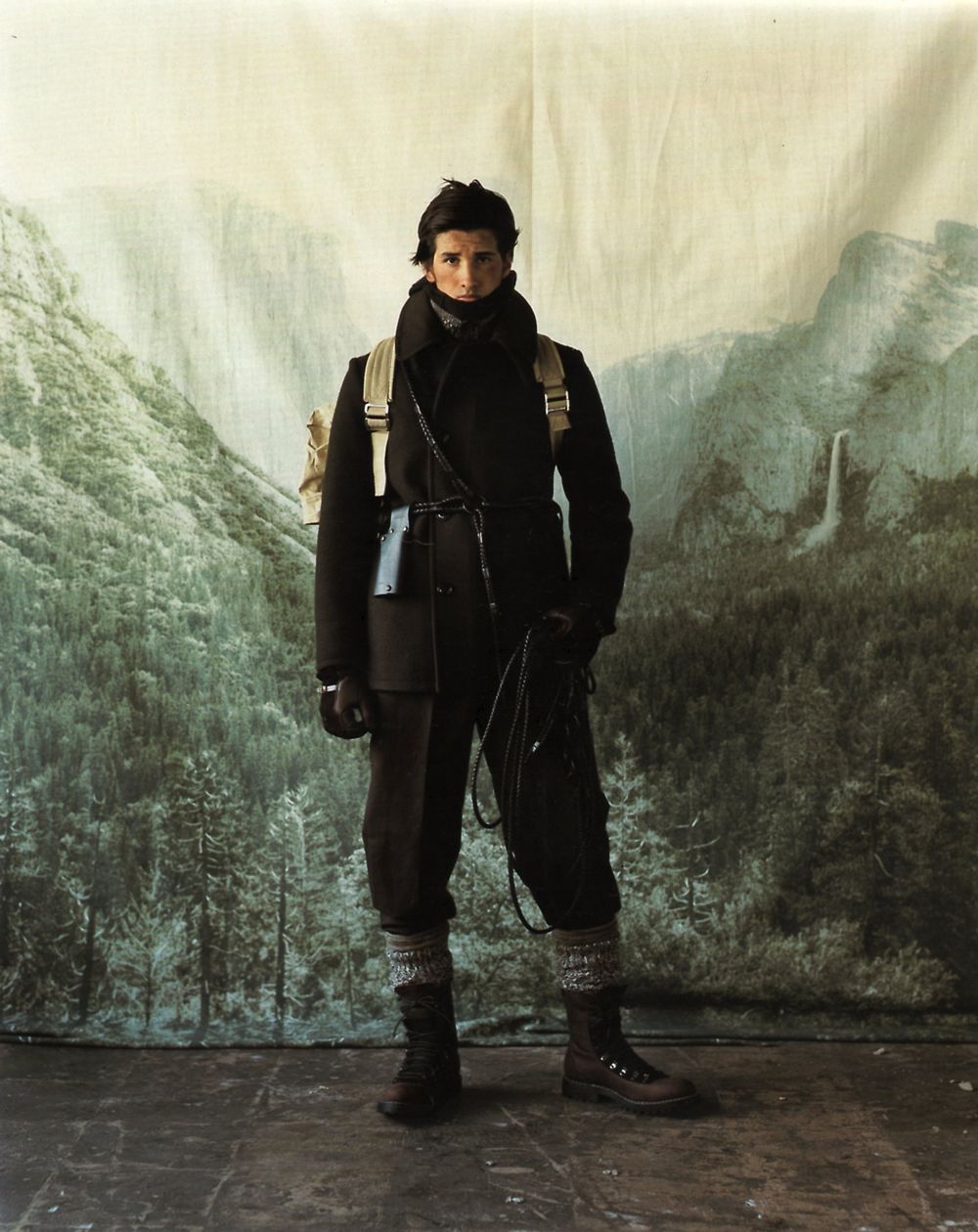
Utilitarian-inspired Japanese fashion brand Man of Moods presents a selection of shots exhibiting a 2016 spring/summer collection titled “Mountain of Moods.” Featuring the brand’s usual blend of sleek lines and practical engineering, “Mountain of Moods” will be unveiled at House Gallery Space in Tokyo on September 15. With photography from Teppei Hoshida and styling by Tomoyuki Sasaki.
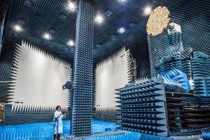
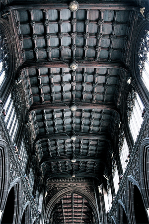
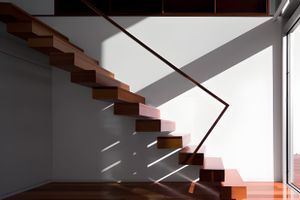
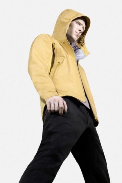
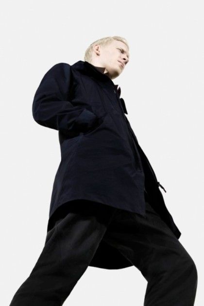
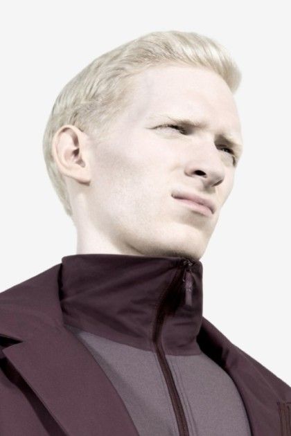
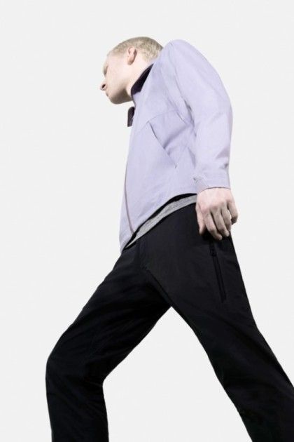
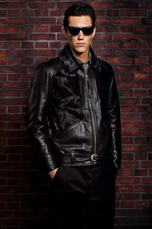
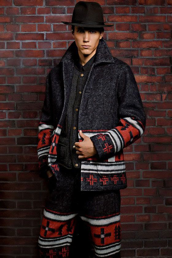
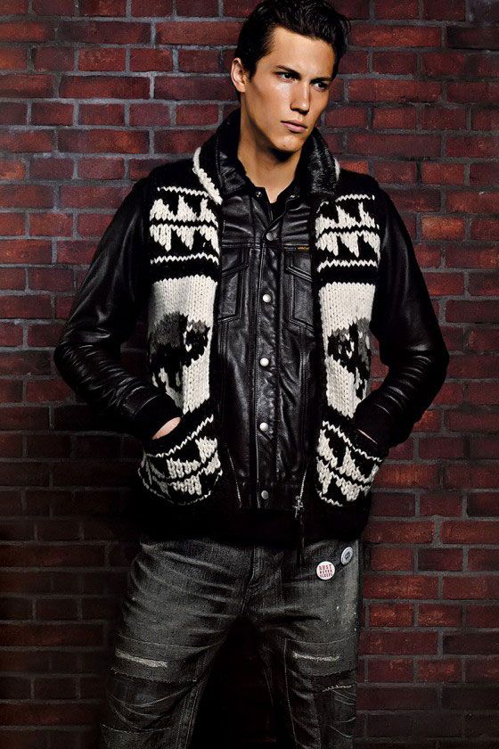
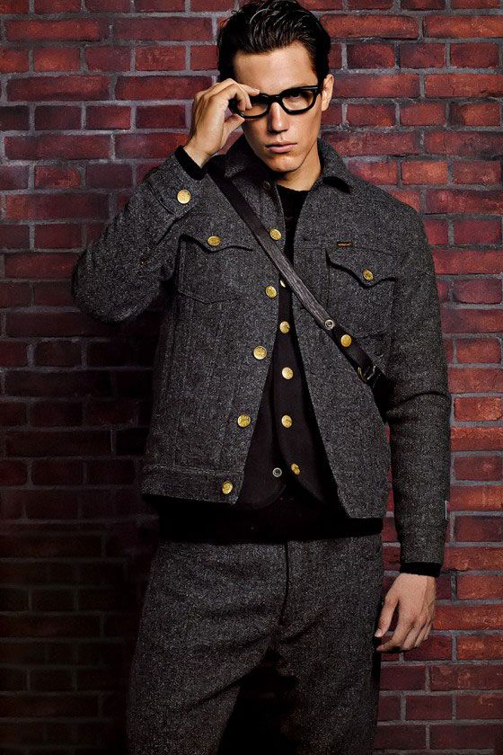
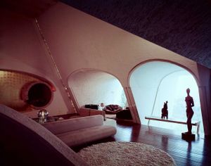
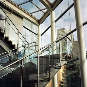
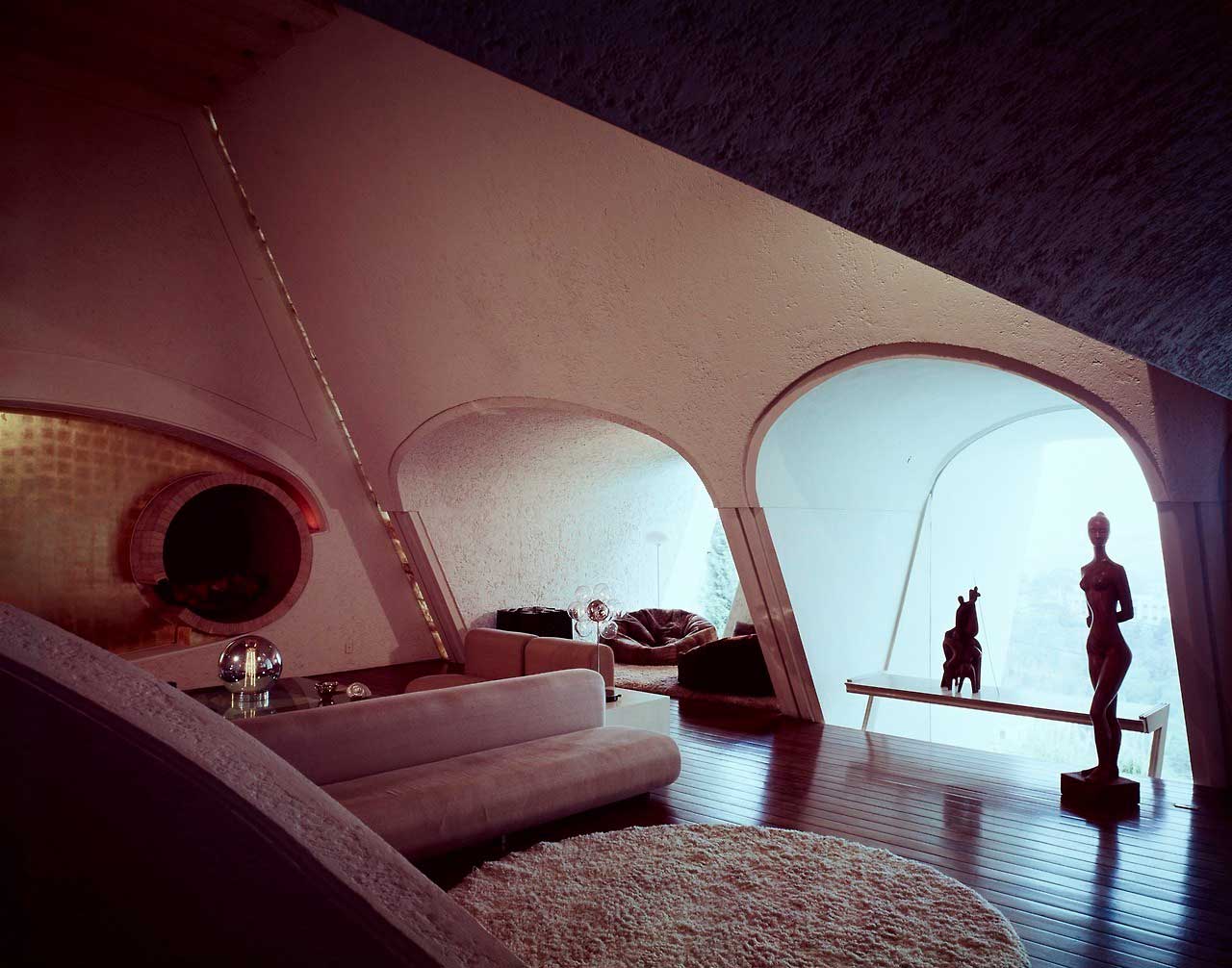
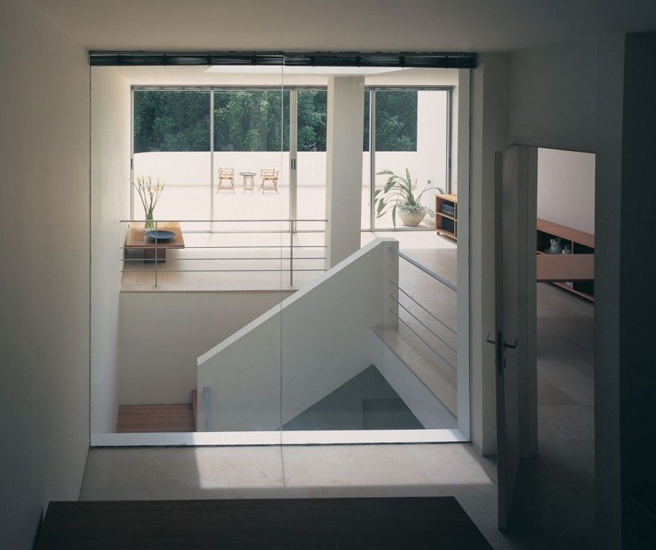
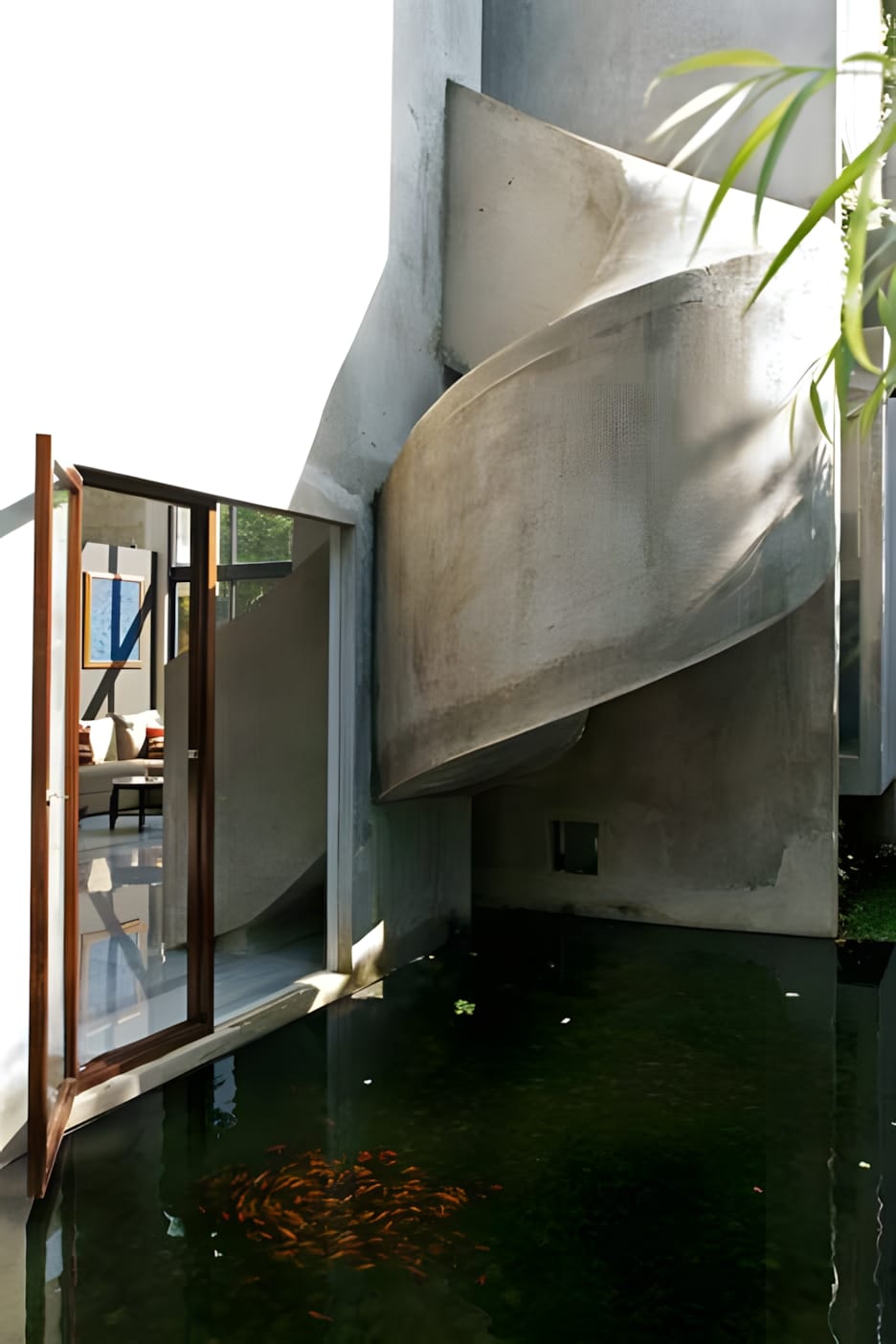
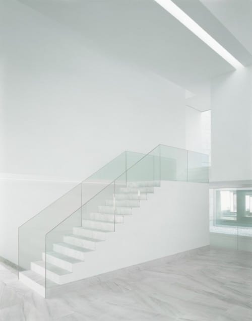
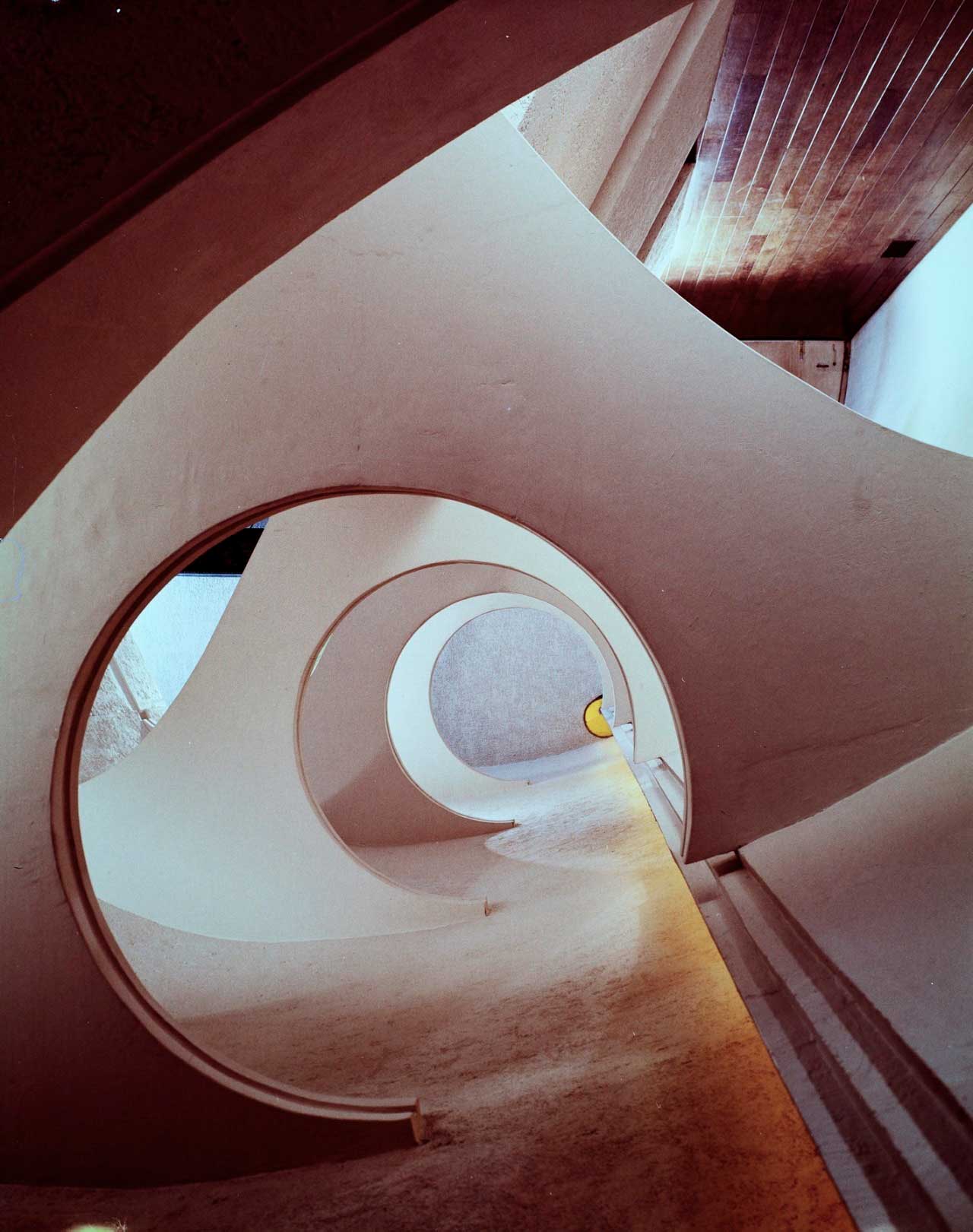
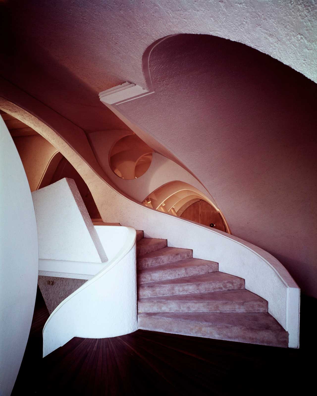
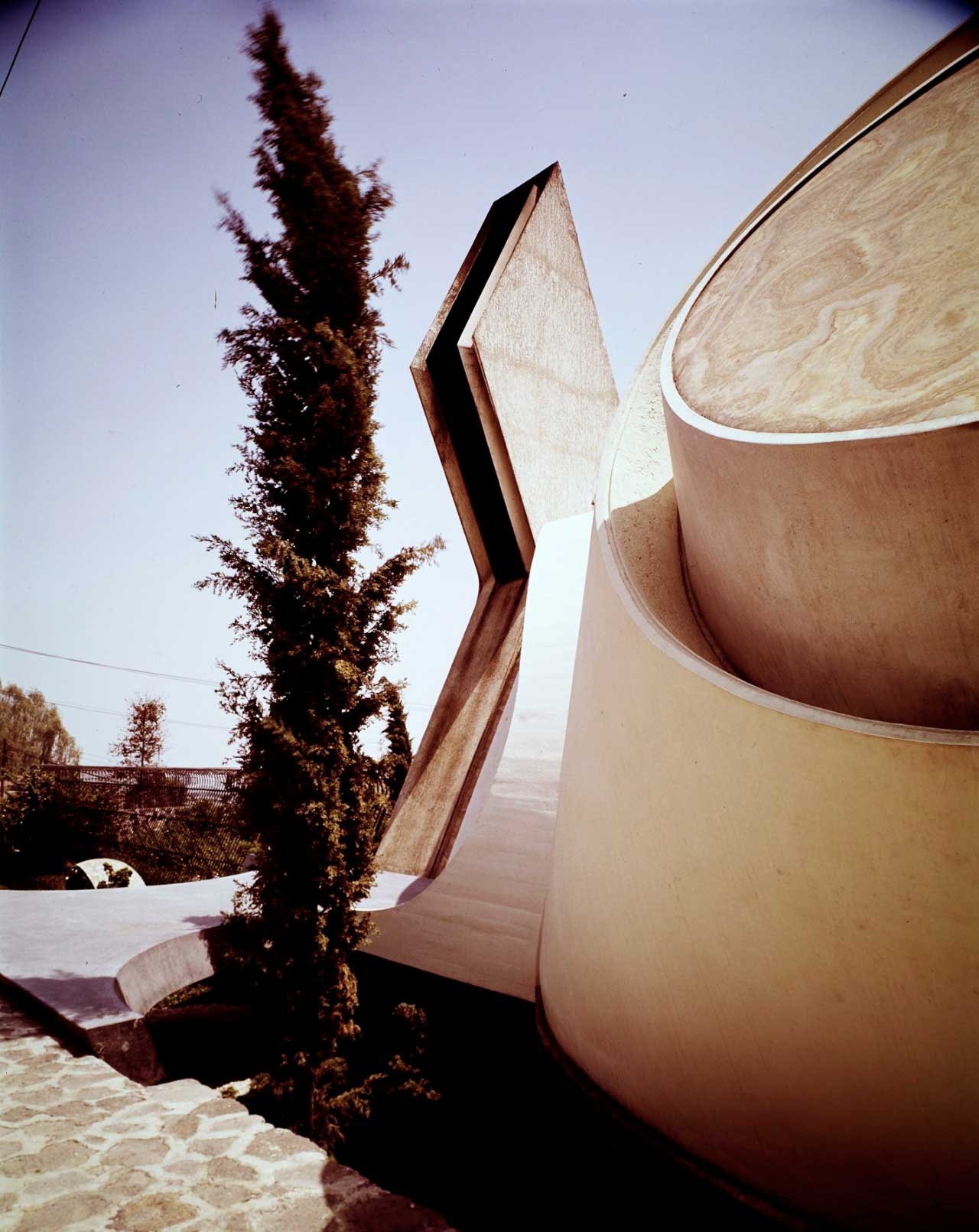
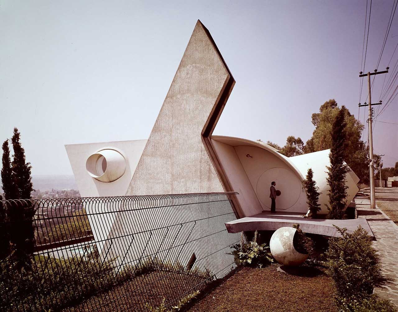
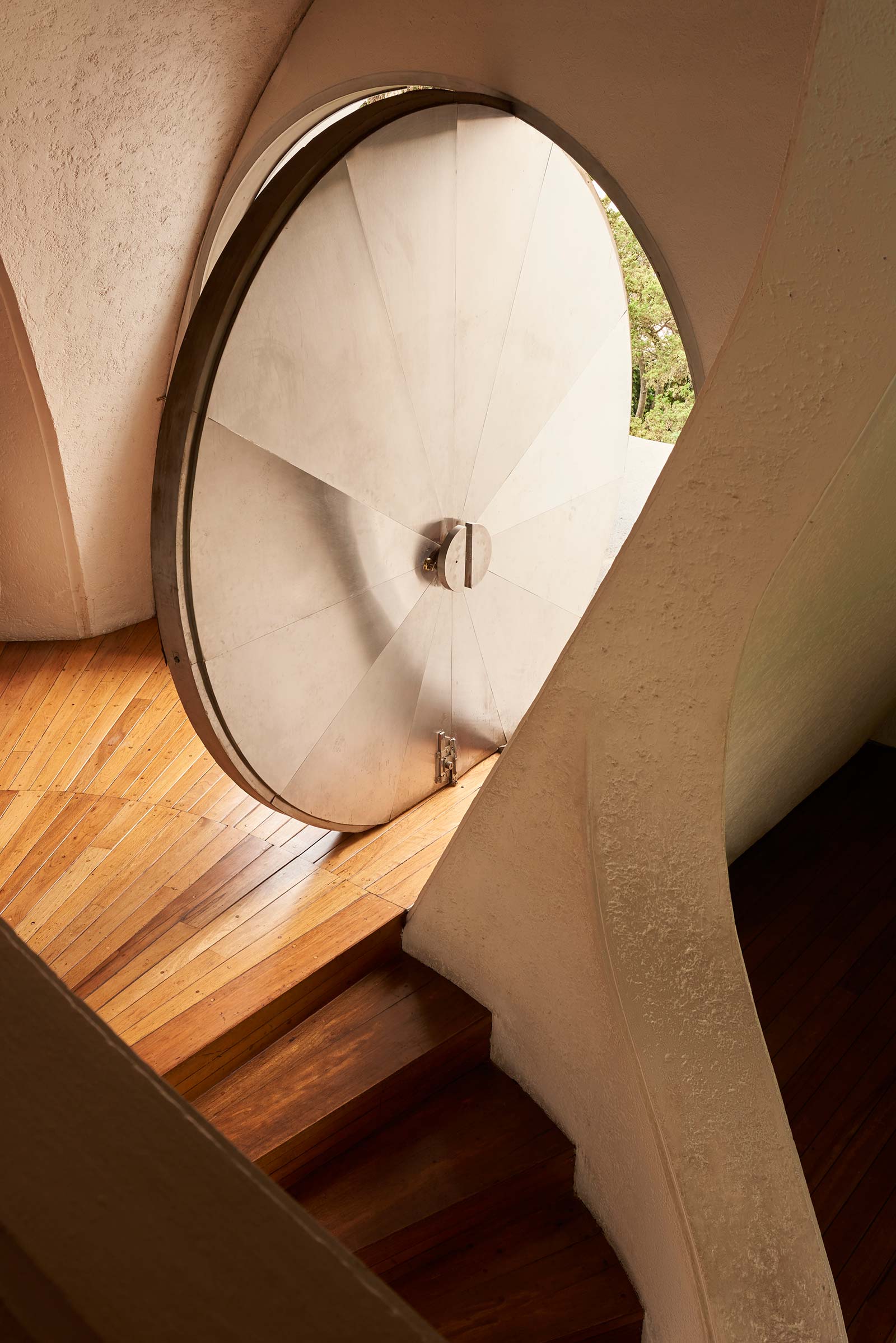
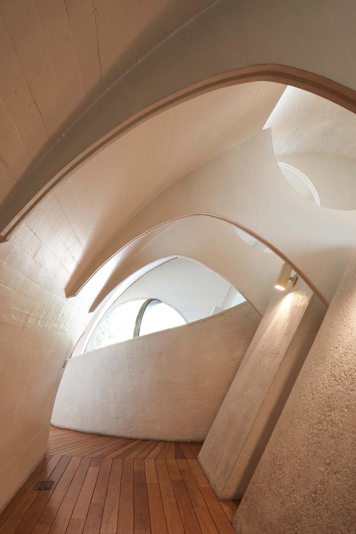
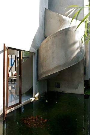
Agustín Hernández Navarro is a Mexican sculptor and architect born in Mexico City. He is the son of politician Lamberto Hernández and Amalia Navarro and studied at the National Autonomous University of Mexico. Leading exponent of “emotional” architecture in his country, Hernandez has fused elements from Mexico’s Pre-columbian past in his contemporary architecture. He usually starts by designing the vertical elements of a building, such as the stairs, as he feels these are of much importance. As organic nature, his architecture unites structure, form, and function.
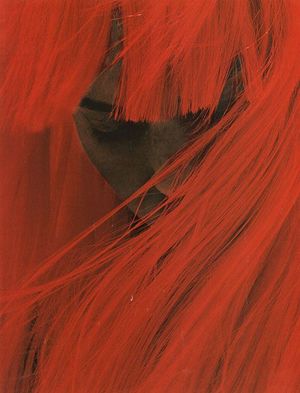
Angela Lindvall POP (F/W 2002) ph. Mert & Marcus
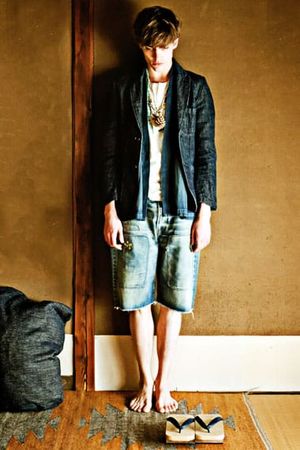
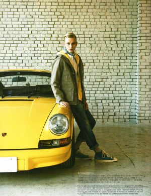
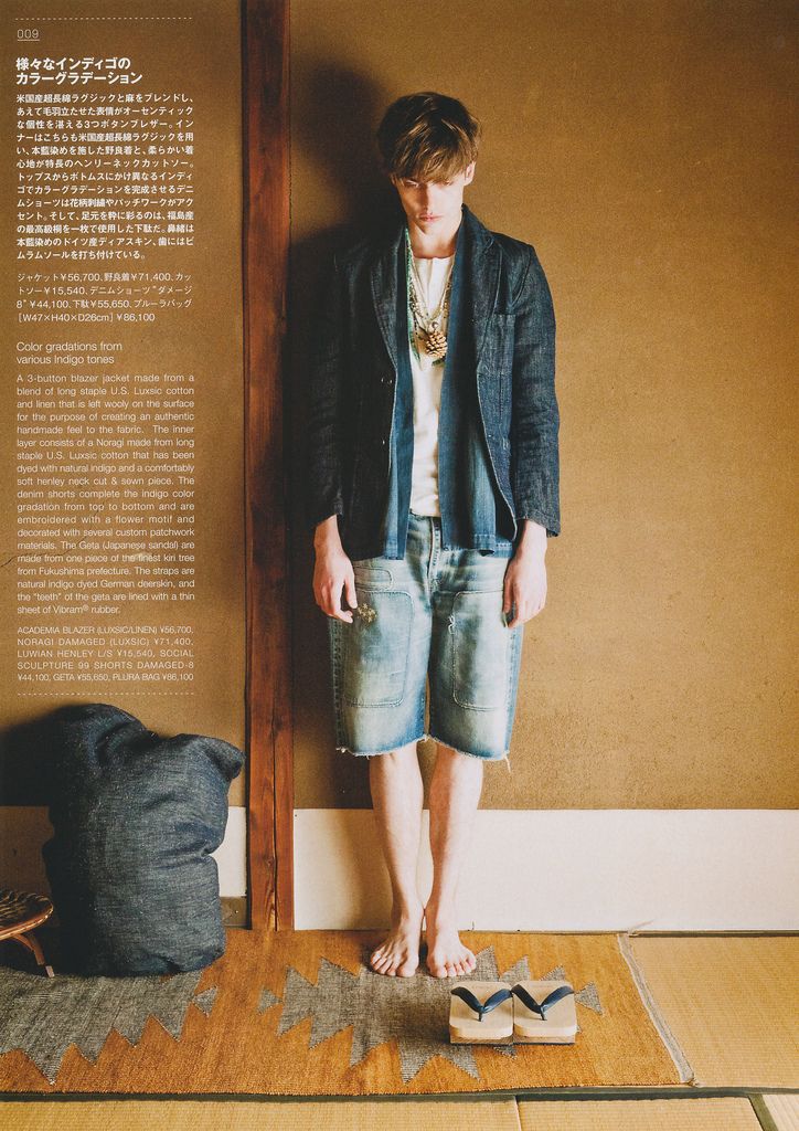
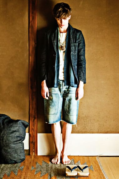
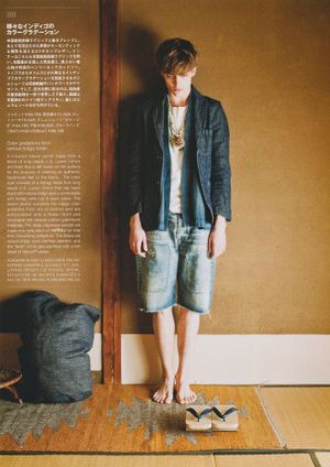
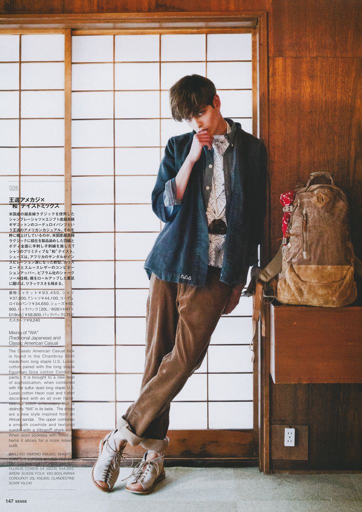
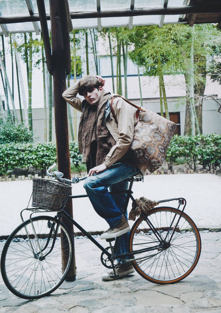
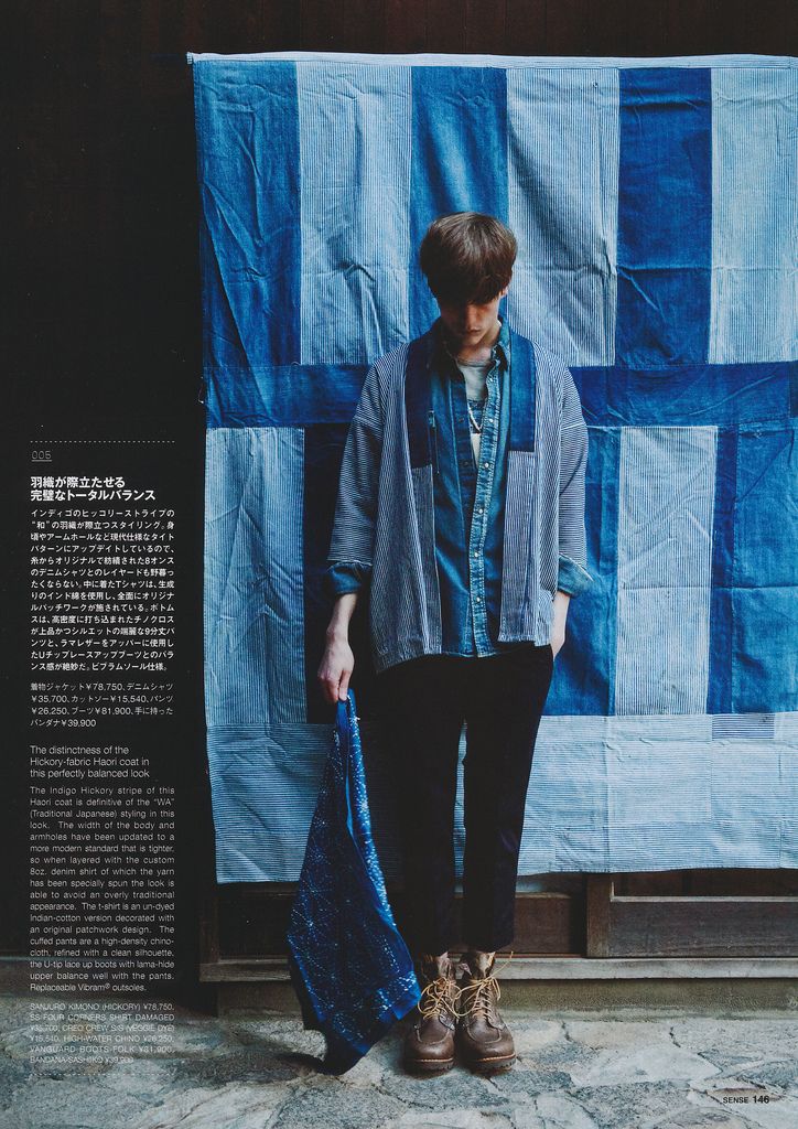
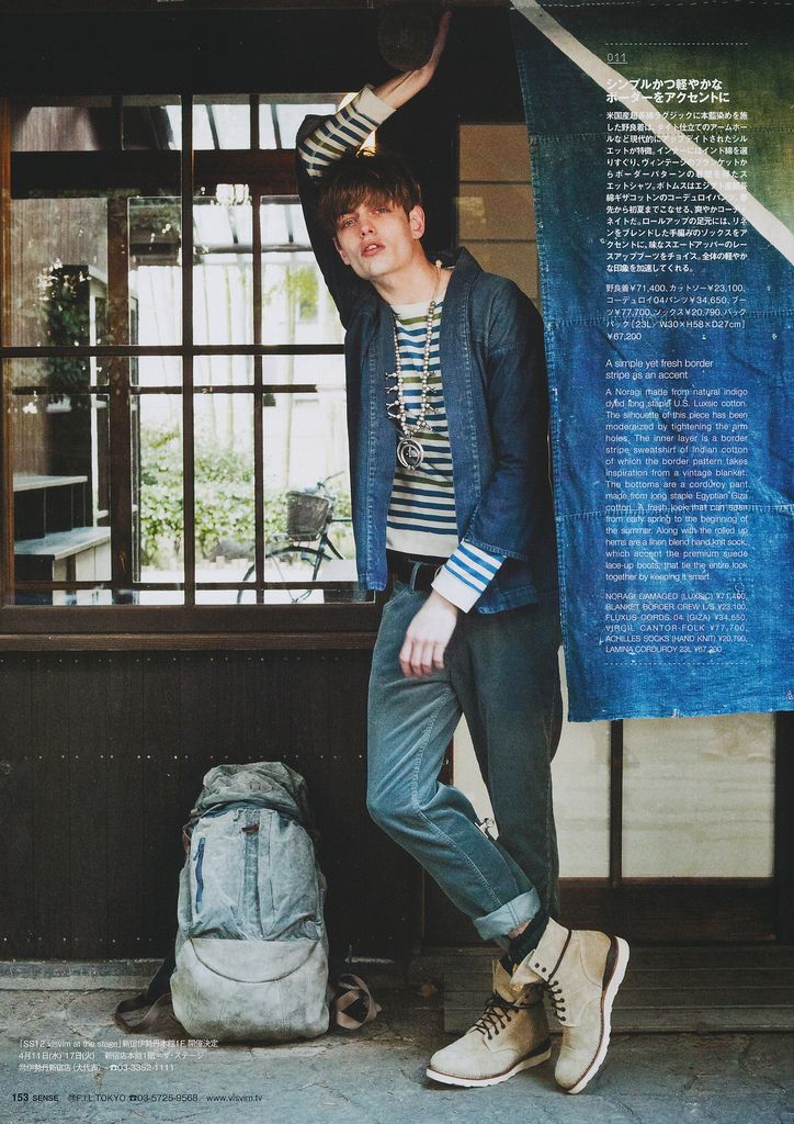
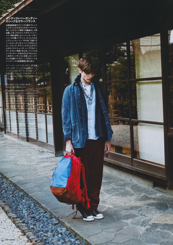
A page from 'TEXT in visvim', the visvim Spring/Summer 2012 feature in Japan's SENSE Magazine (March 2012). Naturally dyed, hand-constructed pieces from Hiroki Nakamura.
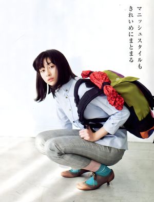
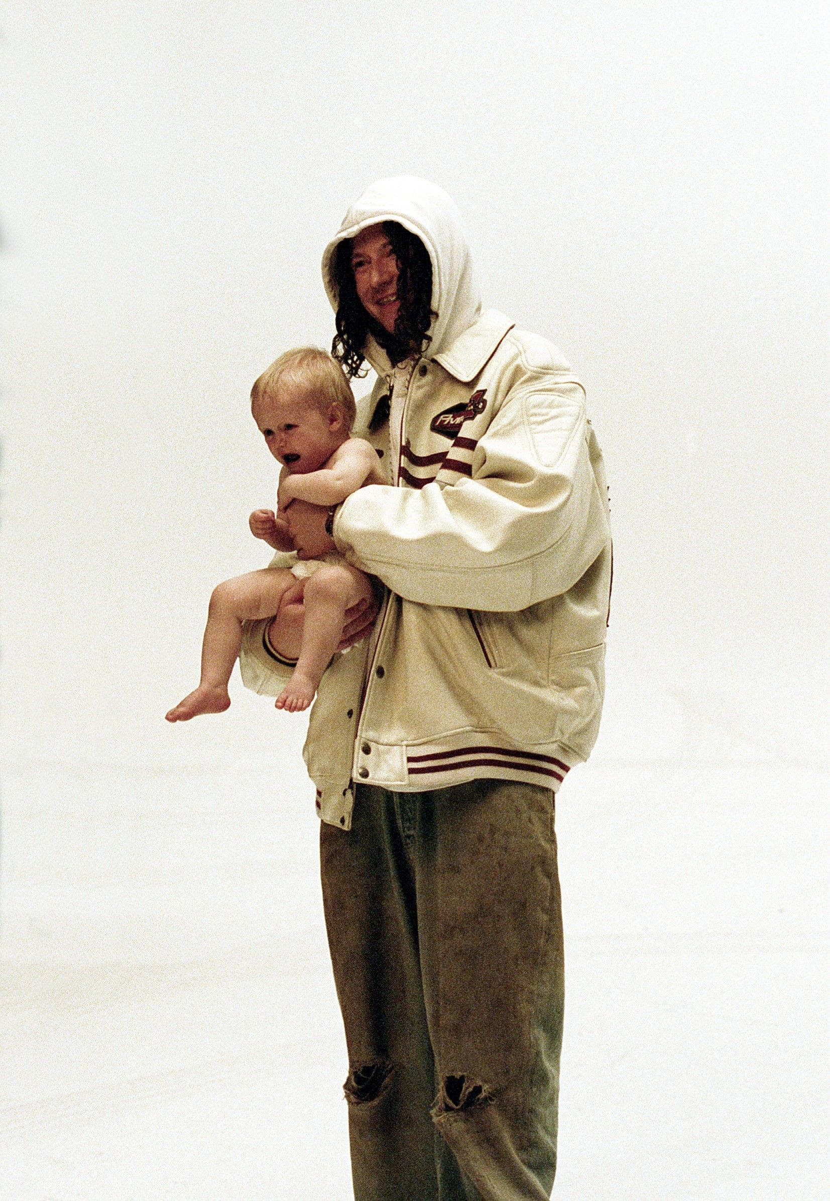
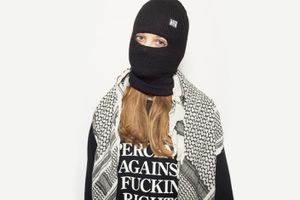
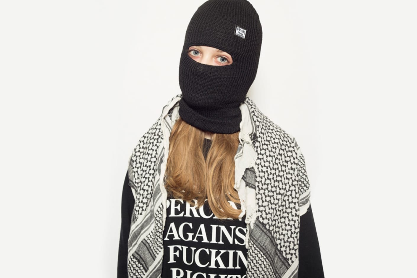
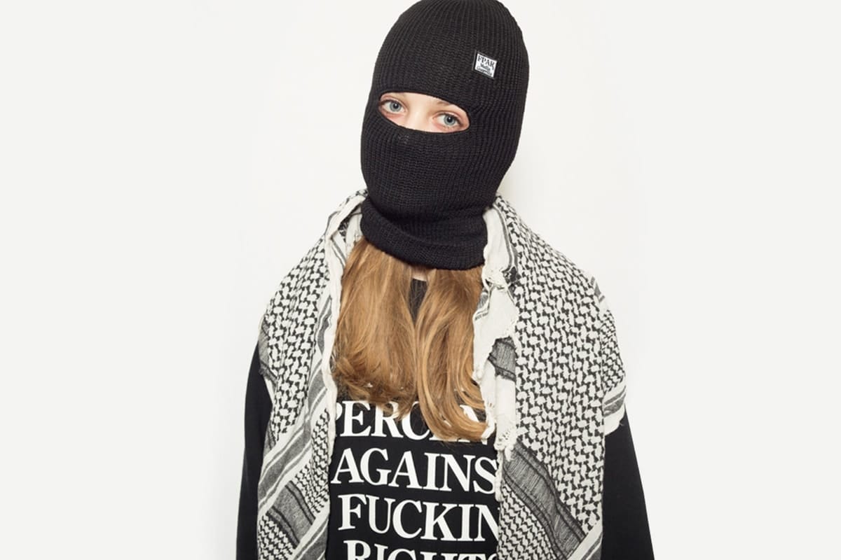
FORTY PERCENTS AGAINST RIGHTS (FPAR), a Japanese label by Tetsu Nishiyama, who also runs WTAPS and ran the 1990s FPAR. Message-based graphics with military- and workwear-derived cuts; it opened its own online store in 2013.
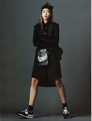
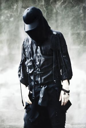
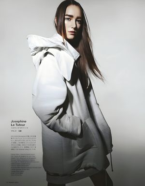
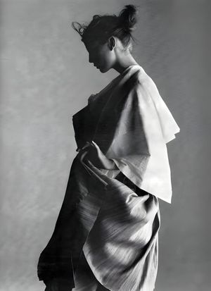
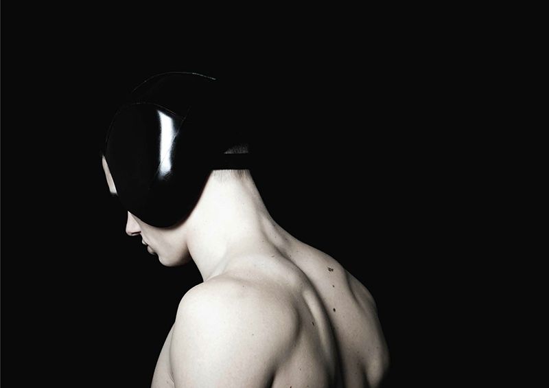
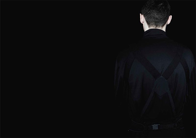
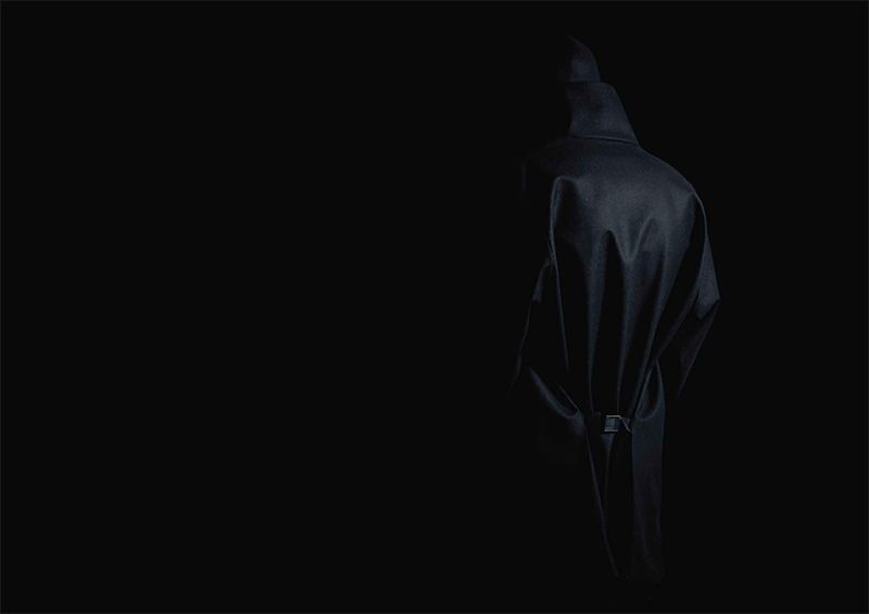
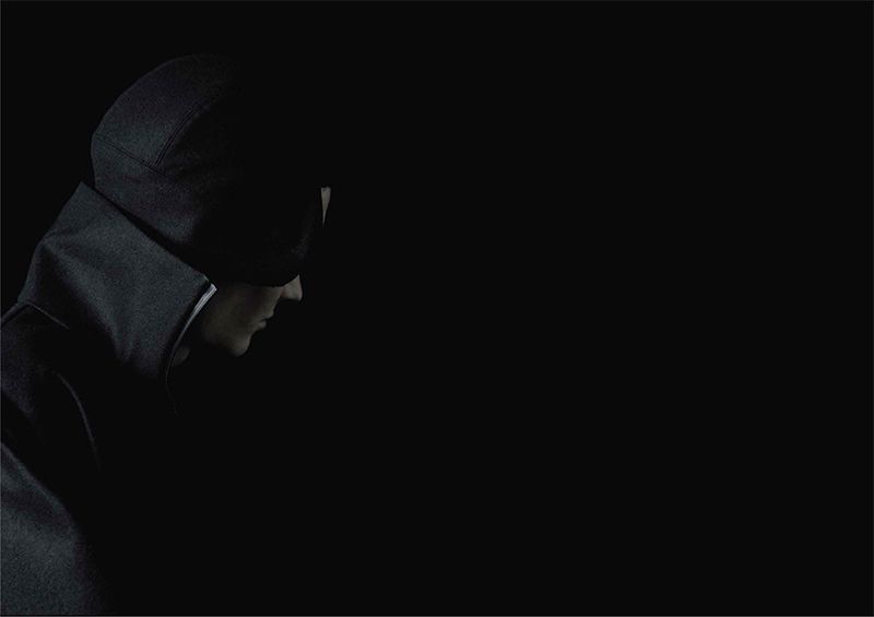
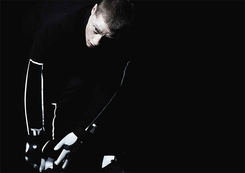
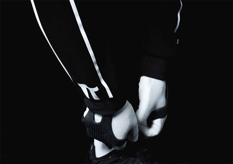
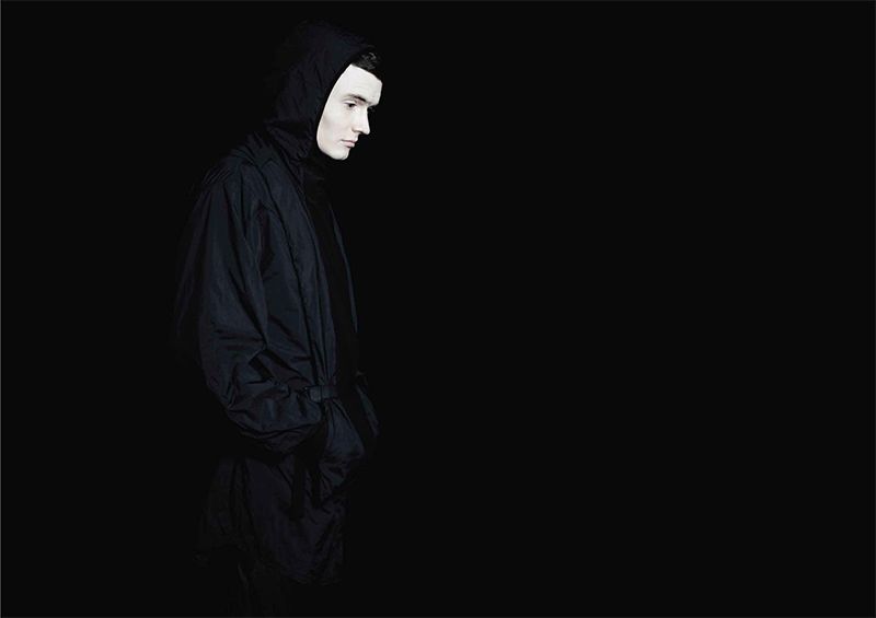
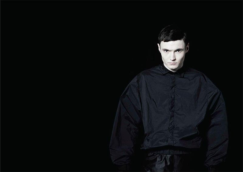
Credits:
Photography: Aline &Jacqueline Tappia Reynaud
Stylist: Lorenzo Posocco
Models: Charlie & Robin
Hair: Sophie Harris
Make-up: Jasmin Laura Rosso
Assistant: James Rg Neville
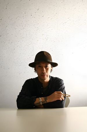
Interview with Jun Takahashi on Undercover AW13
Q: After two years away from the Paris catwalks, why was now the right time to show a runway collection?
A: After the earthquake disaster, we Japanese were spiritually in the worst state. It’s been two years since then and everyone is hoping to improve the present situation. I am one of them. I chose to have a runway show in Paris in order to restore myself. I thought it would work because going back to the runway was one of the things I had been hoping to do.
Q: Talking of the scar that Japan’s earthquake left on you, did it creatively affect your AW13 collection?
A: I was craving for creation, and that resulted in those one-off dresses. Two years ago, mentally and financially I wasn’t able to create such things. Those one-off pieces are my original works and made intuitively by myself. I am the only one who could make them. They are sacred works to me. I guess I like things where you can feel human warmth.
Q: Why did you call the show ‘Anatomicouture’? Was your intention to expose the inner bones of the garments?
A: It is a mentality of exposing the inner self, corresponding to my desire to reveal my creation and what’s going on in my head.
Q: Despite the skeleton and organ motifs, the collection is beautiful and seductive – does this come back to your interest in the contrast between ugly and beautiful?
A: Ugliness and beauty co-exist in human mentality. I always want to express those emotions.
Q: The AW13 show had the feel of punk performance art – why did you stage it like theatre?
A: Because the theme of this collection is related to human emotions, I thought my theme could be conveyed much better with such staging effects that would move people’s hearts. That’s why I used songs by Cat Power and James Blake. All the songs are great and meaningful and helped me convey what I wanted to express through the lyrics of songs too.
Q: When did your love of fashion start, and how did that lead to Undercover?
A: When I was little I loved drawing and had a twisted personality. I was so into punk during my high school years. My interest in fashion arose when I was around 15 years old and I was hoping to become a designer. At 18, I entered Bunka Fashion College. I was questioning about learning ‘design’ from teachers who were much older than me. So I told myself that I would learn only techniques in the school, nothing else.
Q: Undercover was considered part of a new wave of Japanese designers. How did your approach differ from the likes of Rei Kawakubo and Yohji Yamamoto?
A: I am not sure if Undercover is part of a new wave and I don’t really care. But Rei influenced me a lot on things like breaking stereotypes.
Q: You and your friend Hiroshi Fujiwara collected vintage Seditionaries pieces and published a book about them, and you even appeared in a show of Vivienne Westwood’s designs in Tokyo in 1990. Can you describe the impact punk made on you and explain why it still resonates today?
A: To me, punk means a spirit that questions and abolishes conventional ideas. That is my fundamental principle. You can apply the principle to fashion design. It depends on each season, but I instil punk interpretation into my designs in many ways – for example, by fusing two contradicting elements or applying techniques that are generally considered taboo.
Q: You recently designed lines for Uniqlo and Nike – how did you enjoy those two experiences? Did they feed back into your work with Undercover?
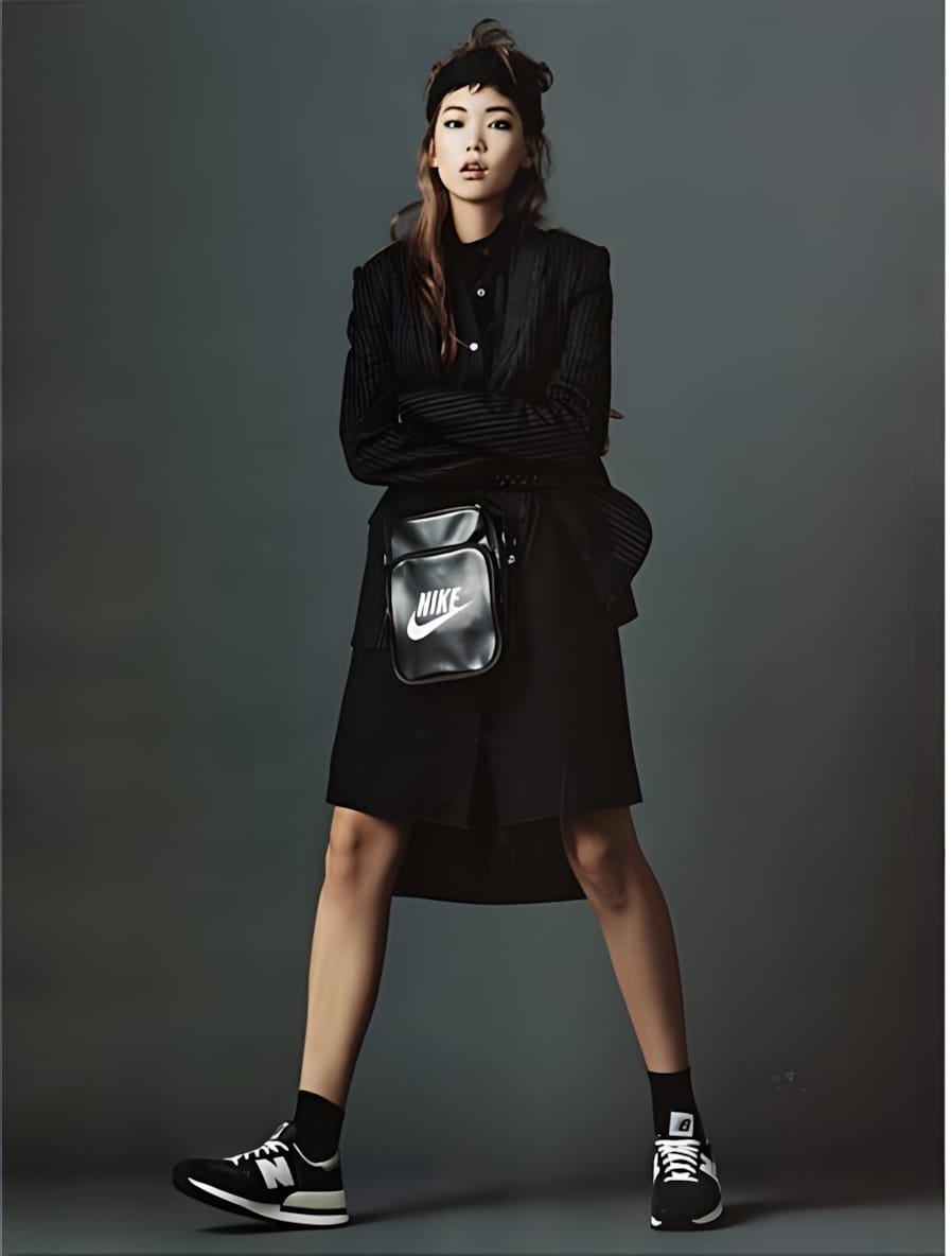
A: The Uniqlo and Nike collaborations are totally different types of designs from that of Undercover. Therefore the collaborations didn’t really affect my work with Undercover. But for my career as a designer, both collaborations became good experiences. Working with Uniqlo gave me the opportunity to learn about the creation of mass products and newly standard items that are totally different from designing avant-garde pieces. As for the collaboration with Nike, I am very satisfied both as a designer and as a runner with the fact that I have been able to create products which integrate necessary functions for running with fashion-design aesthetics, which had often perhaps been missing in the existing sportswear.
Q: You’ve talked in the past of the difficulties with keeping up with the six-month cycle of fashion shows, and skipped showing in Paris for a couple of seasons – how are you currently finding working within the fashion calendar?
A: Right now, I’ve come to the conclusion that the six-month cycle is appropriate. Themes of each Undercover collection vary by season. If we could spend more than six months on a collection, and if we continue to work with the same theme for a year, it would be difficult to keep up the tension towards the theme and I am afraid that the freshness would be lost.
Q: AW13 got a great response. Will we be seeing you back on the runway next season?
A: I could strongly feel that a lot of people were waiting for Undercover and I was very thankful about it. I will be back on the runway next season.
Q: Next year will mark the 20th since you began showing as Undercover. How do you feel you’ve evolved in that time?
A: I went through many phases and experienced many things. There was a time we faced various troubles, or we jumped into things just by force of circumstances. But nothing was wasted. I am responsible for all success and failure of Undercover. I will go forward without being ashamed of the paths I’ve chosen.
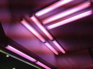
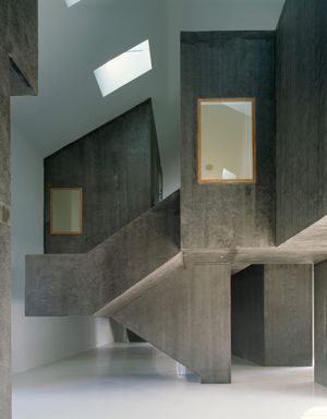
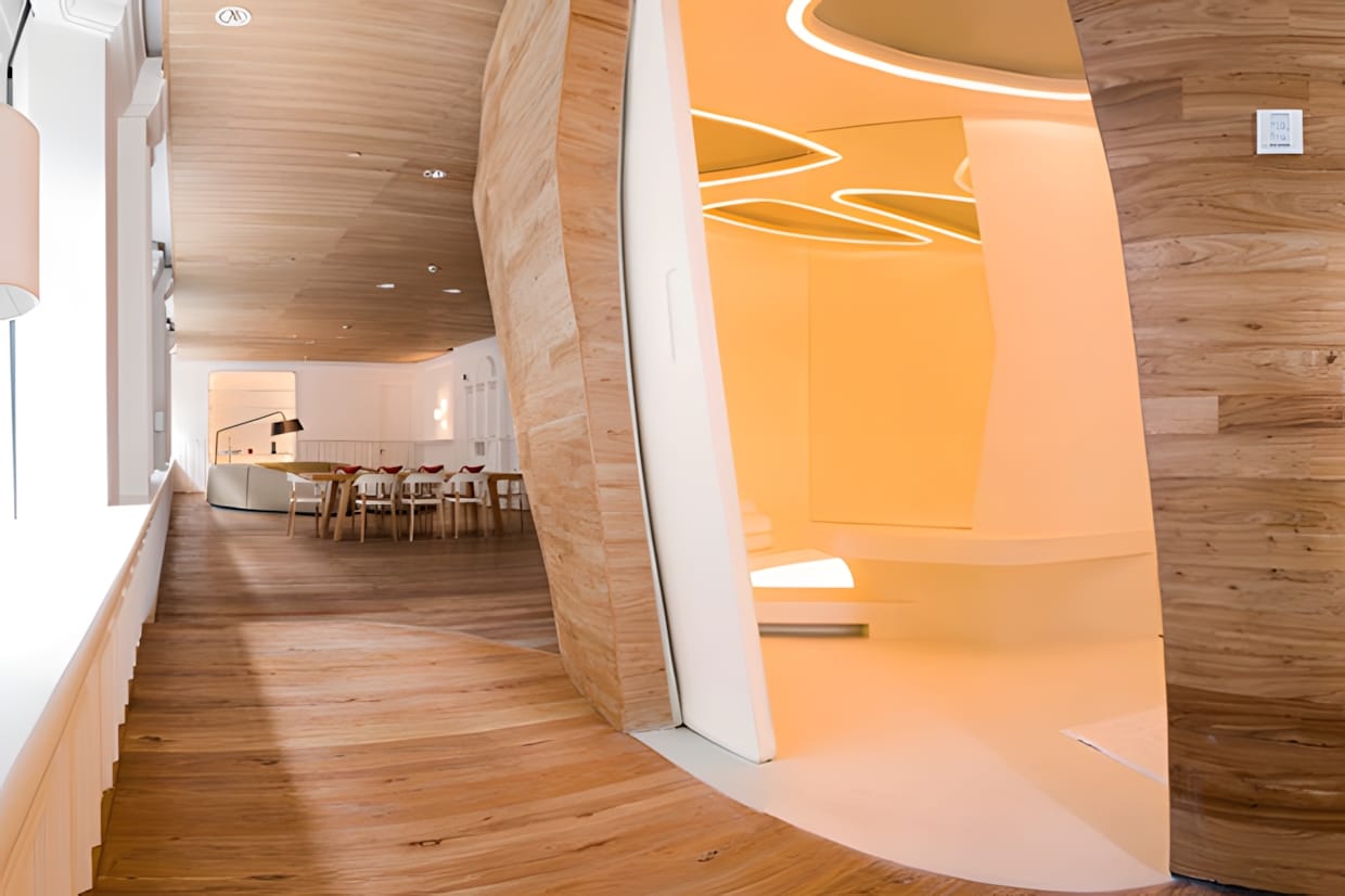
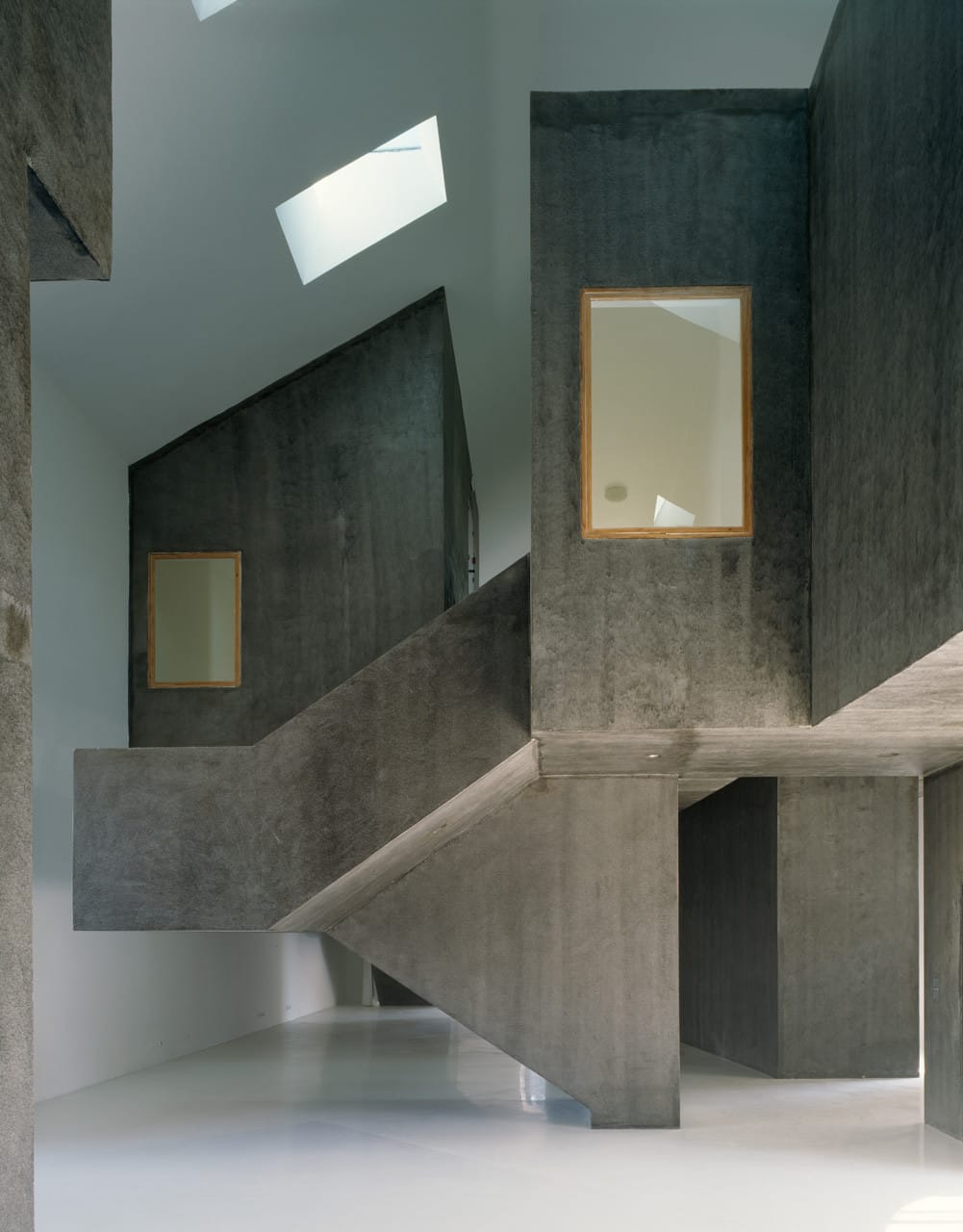
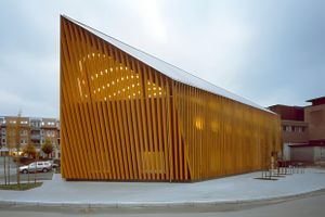
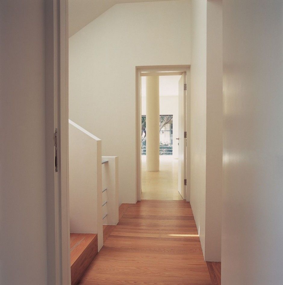
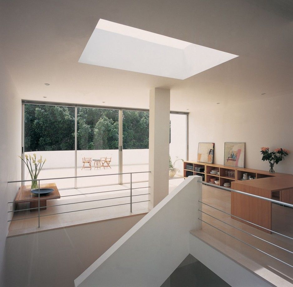
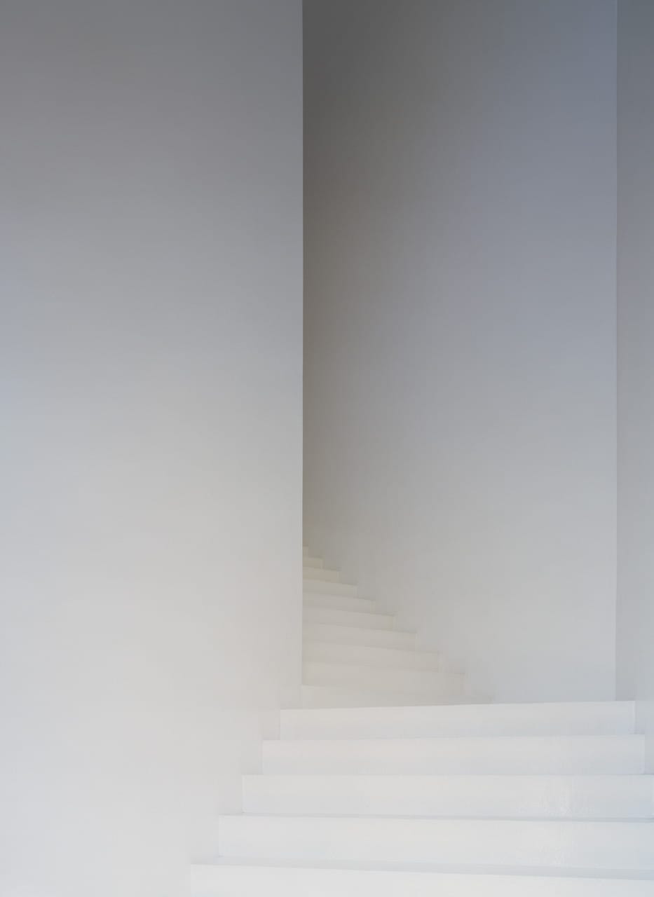
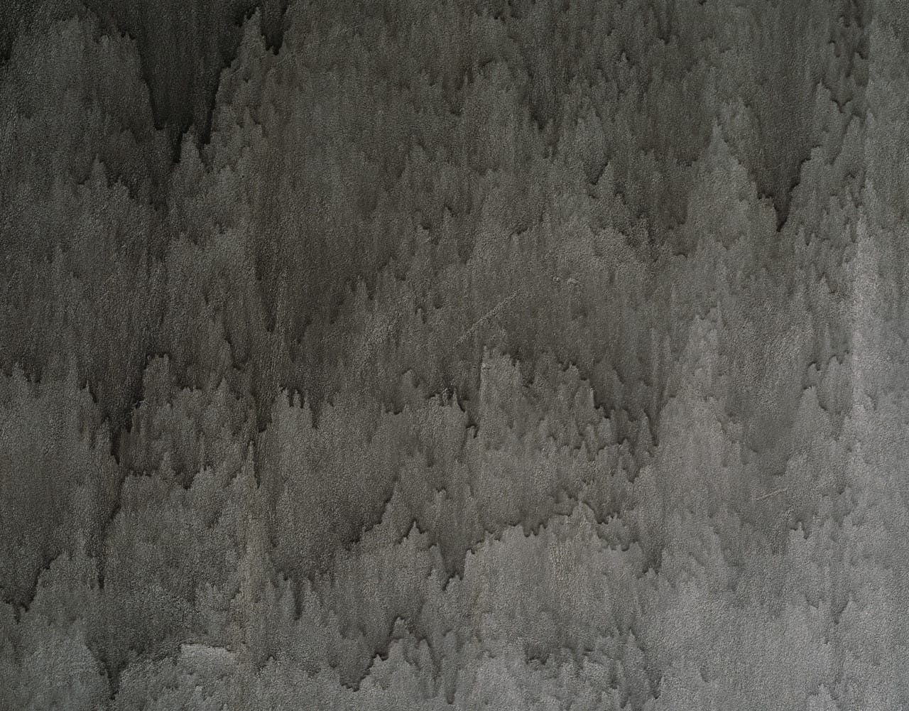
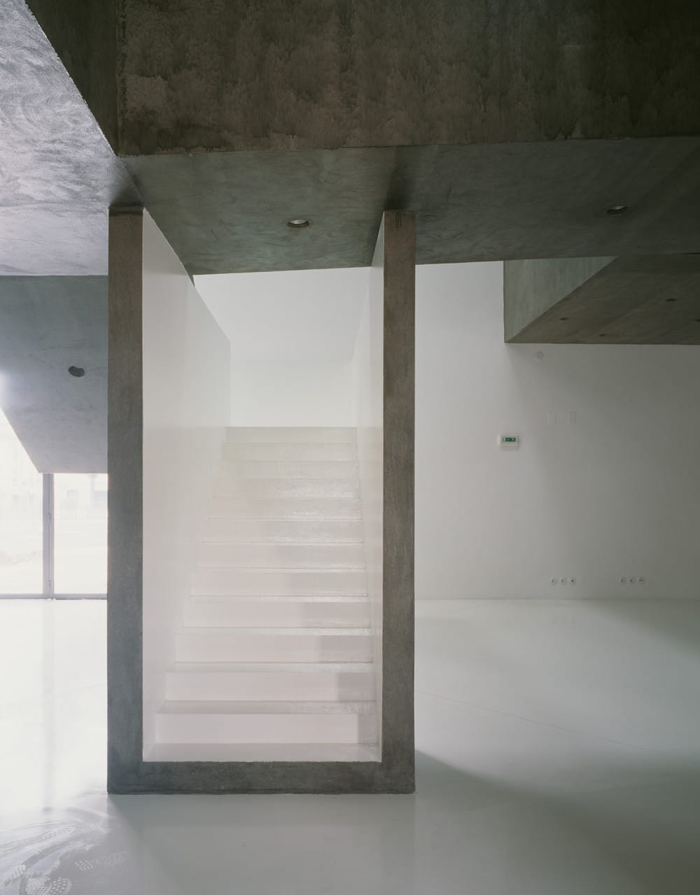
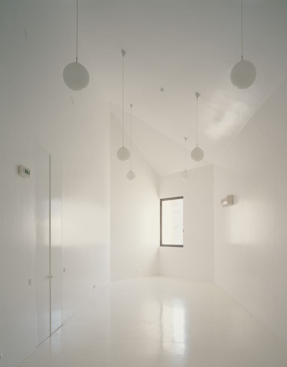
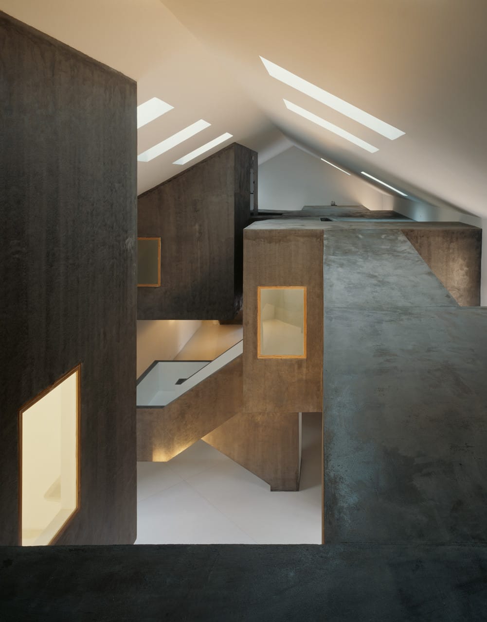
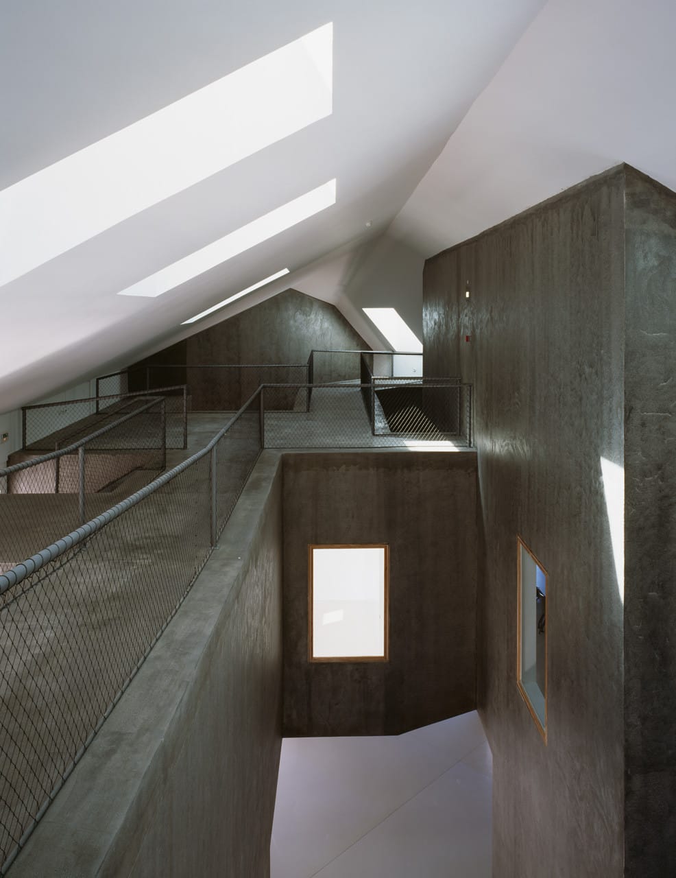
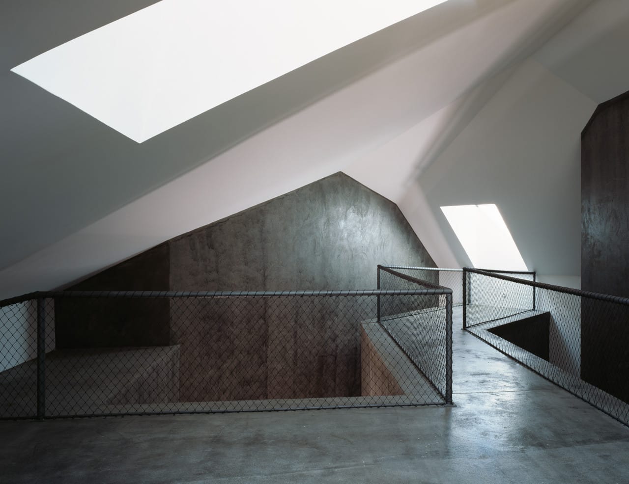
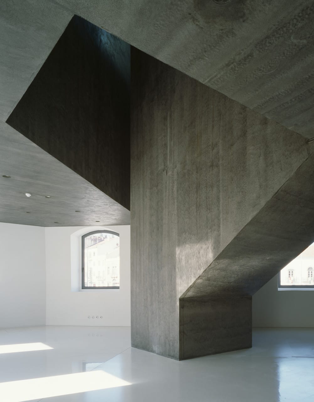
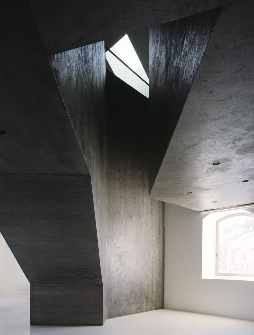
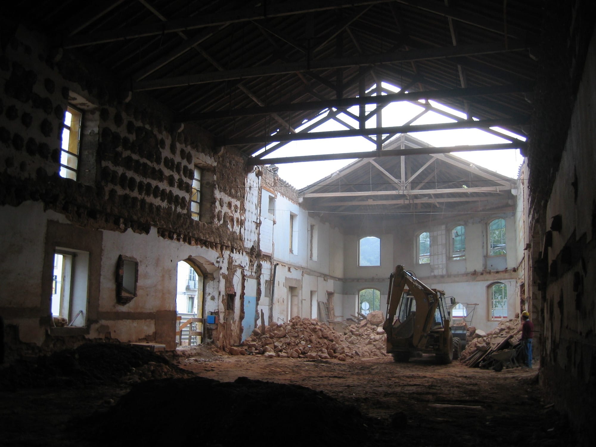
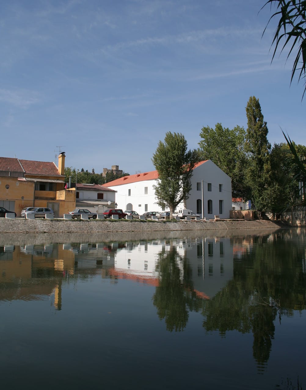
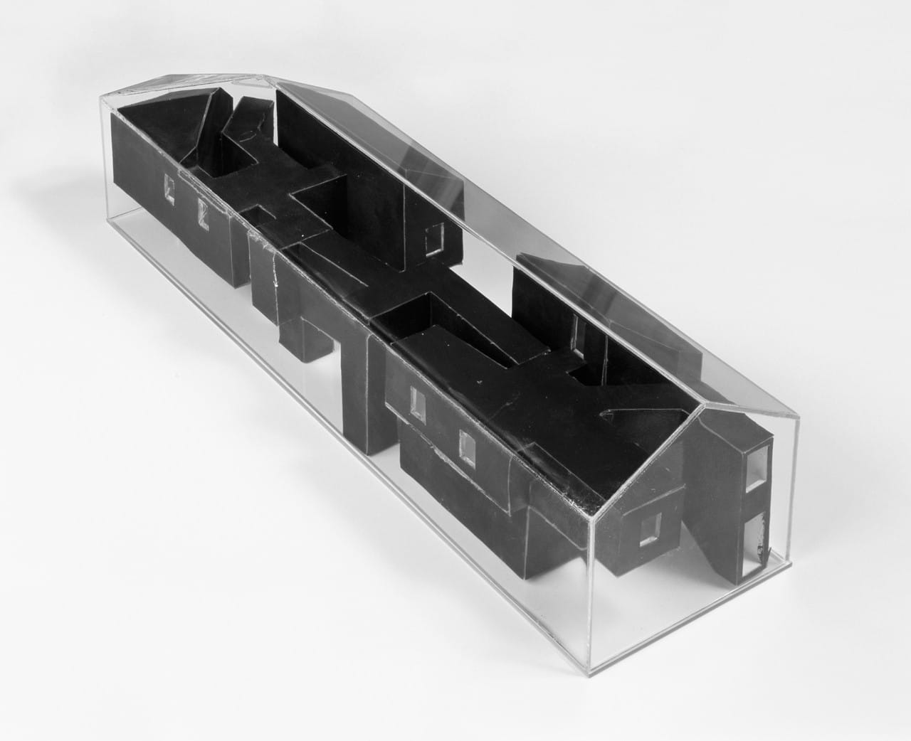
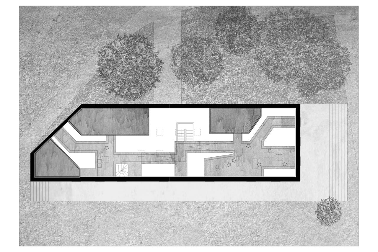
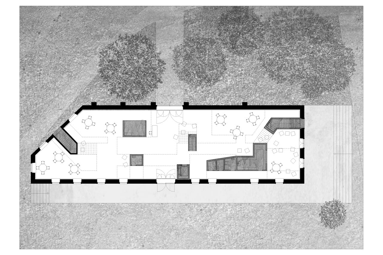
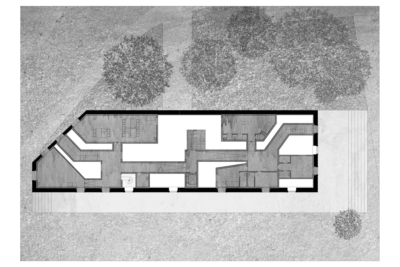
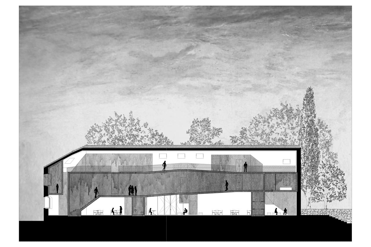
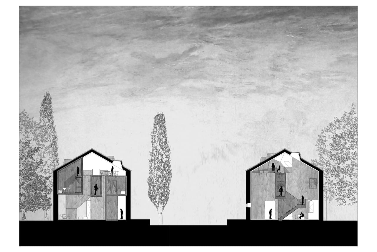
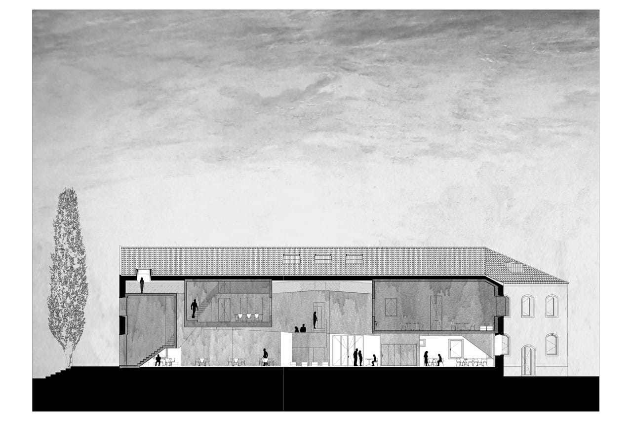
Casa dos Cubos is EMBAIXADA arquitectura’s 2007 conversion of a former industrial building in Tomar, Portugal. Angular dark volumes organize exhibition, meeting and residential spaces inside the preserved shell.
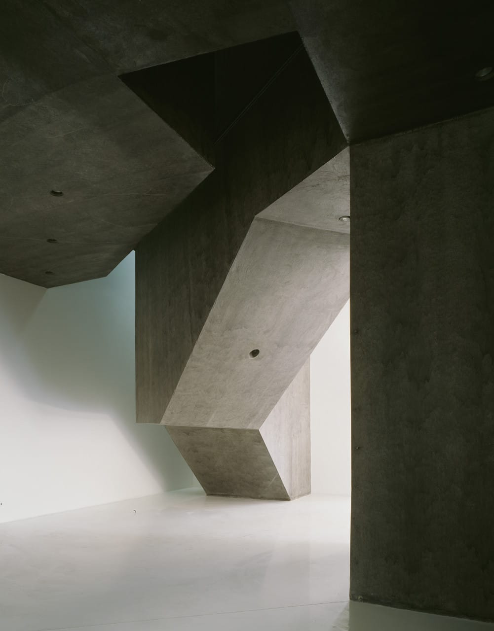
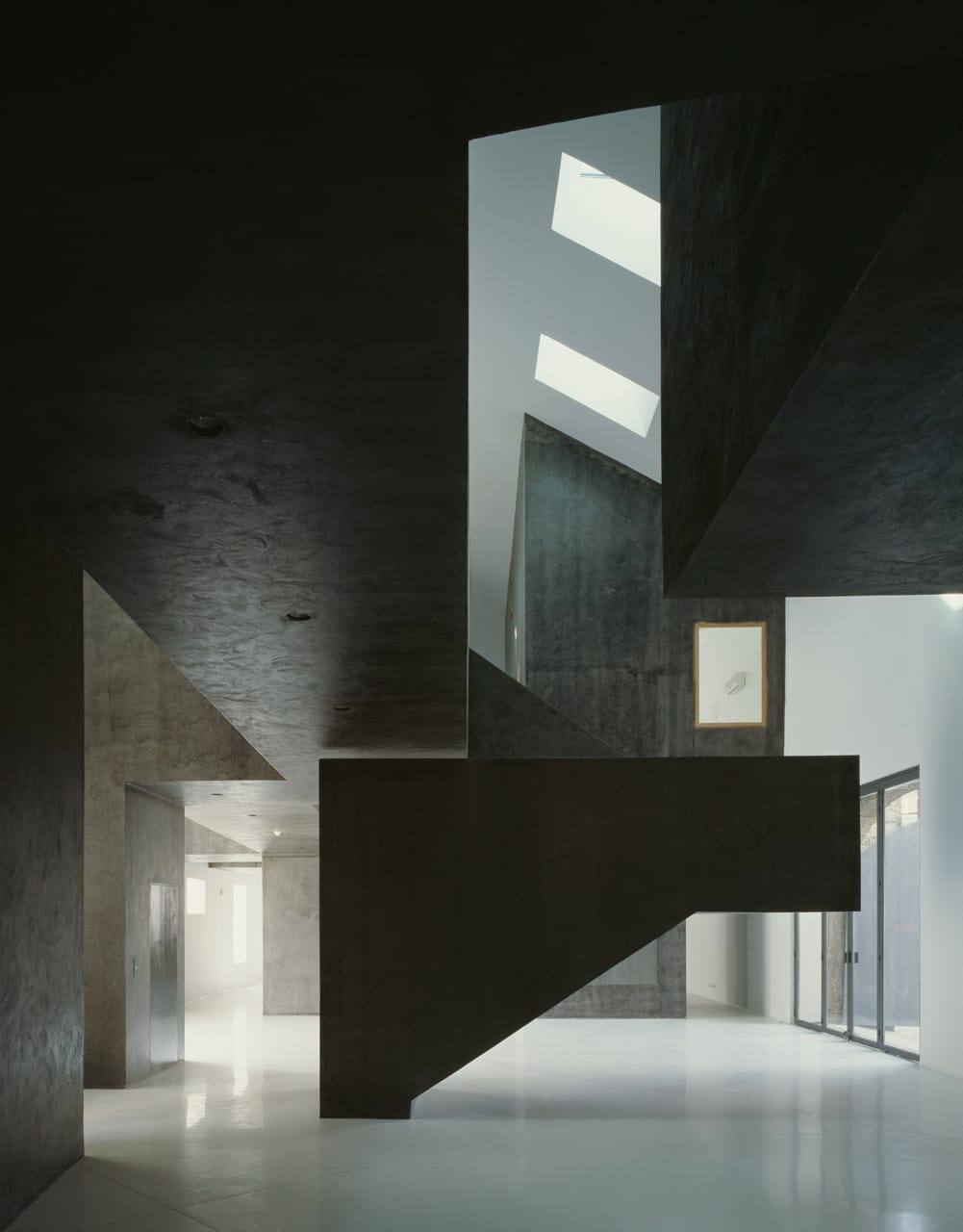
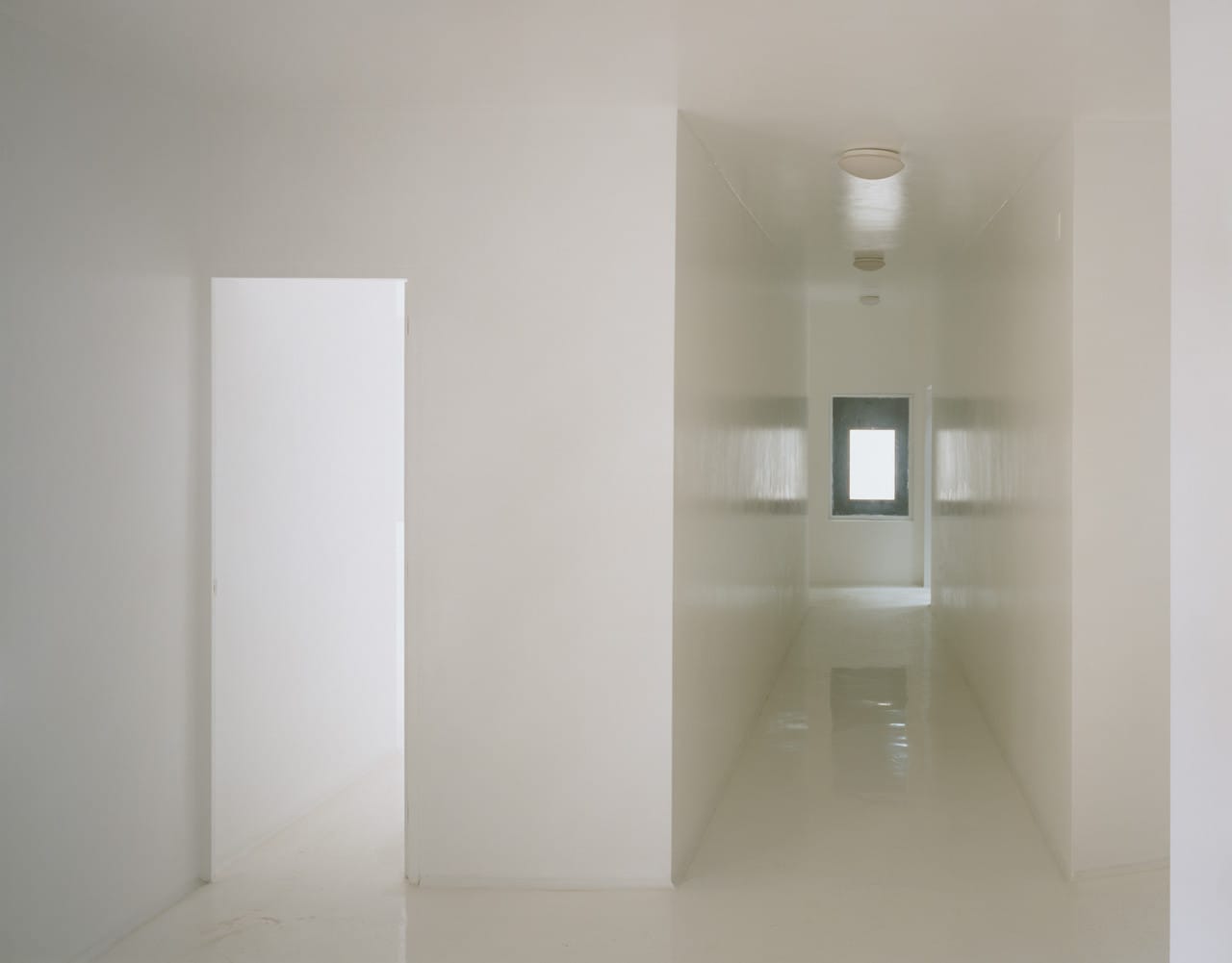
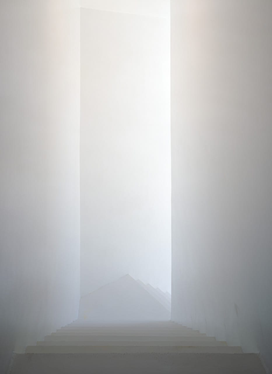
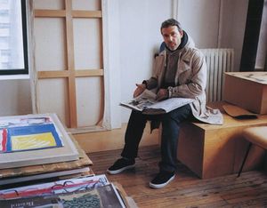
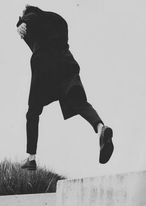
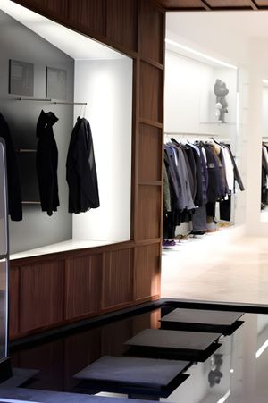
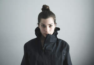
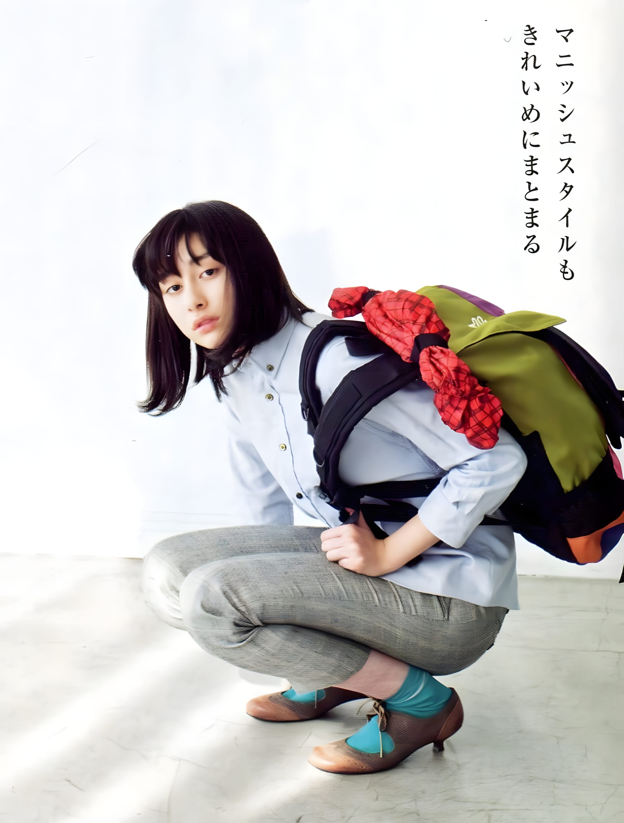
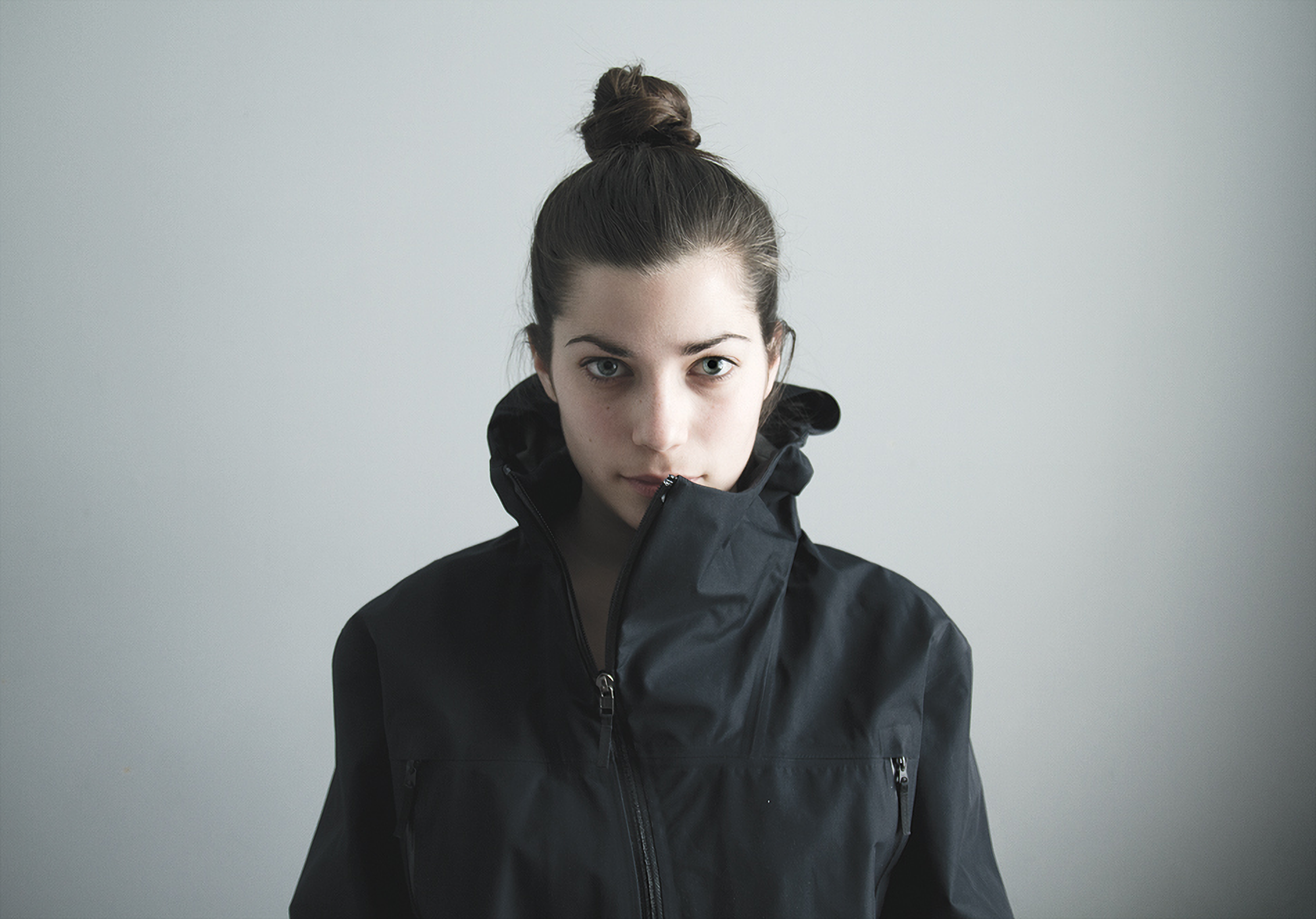
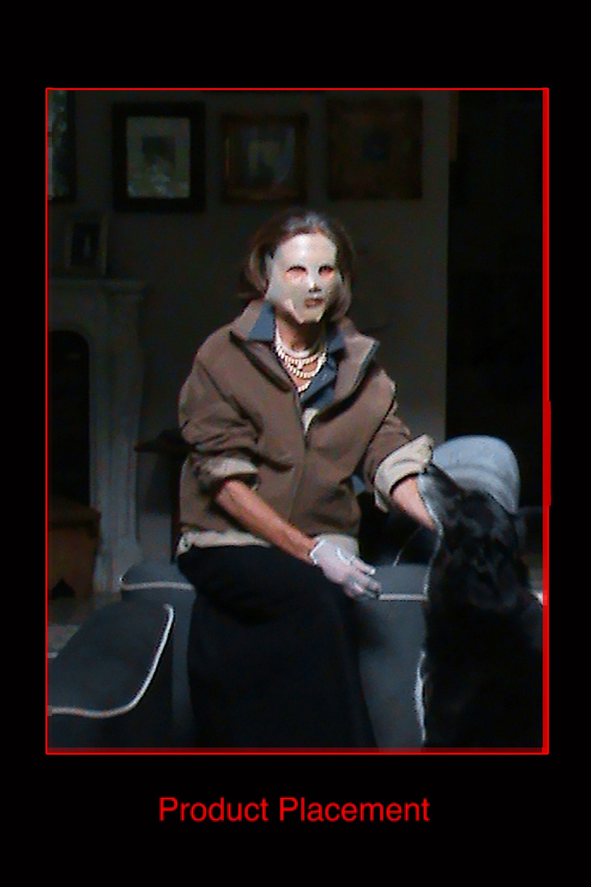
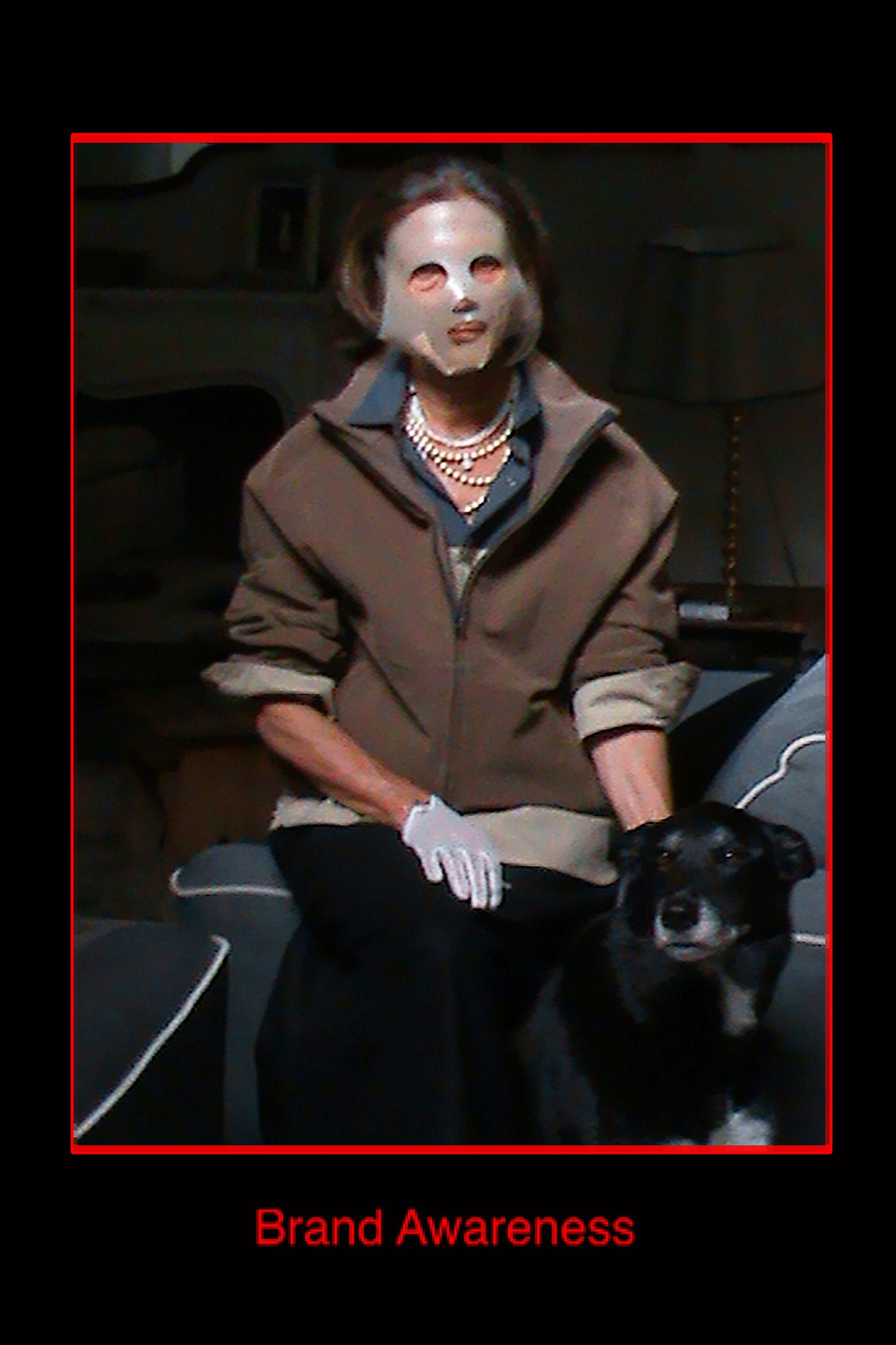
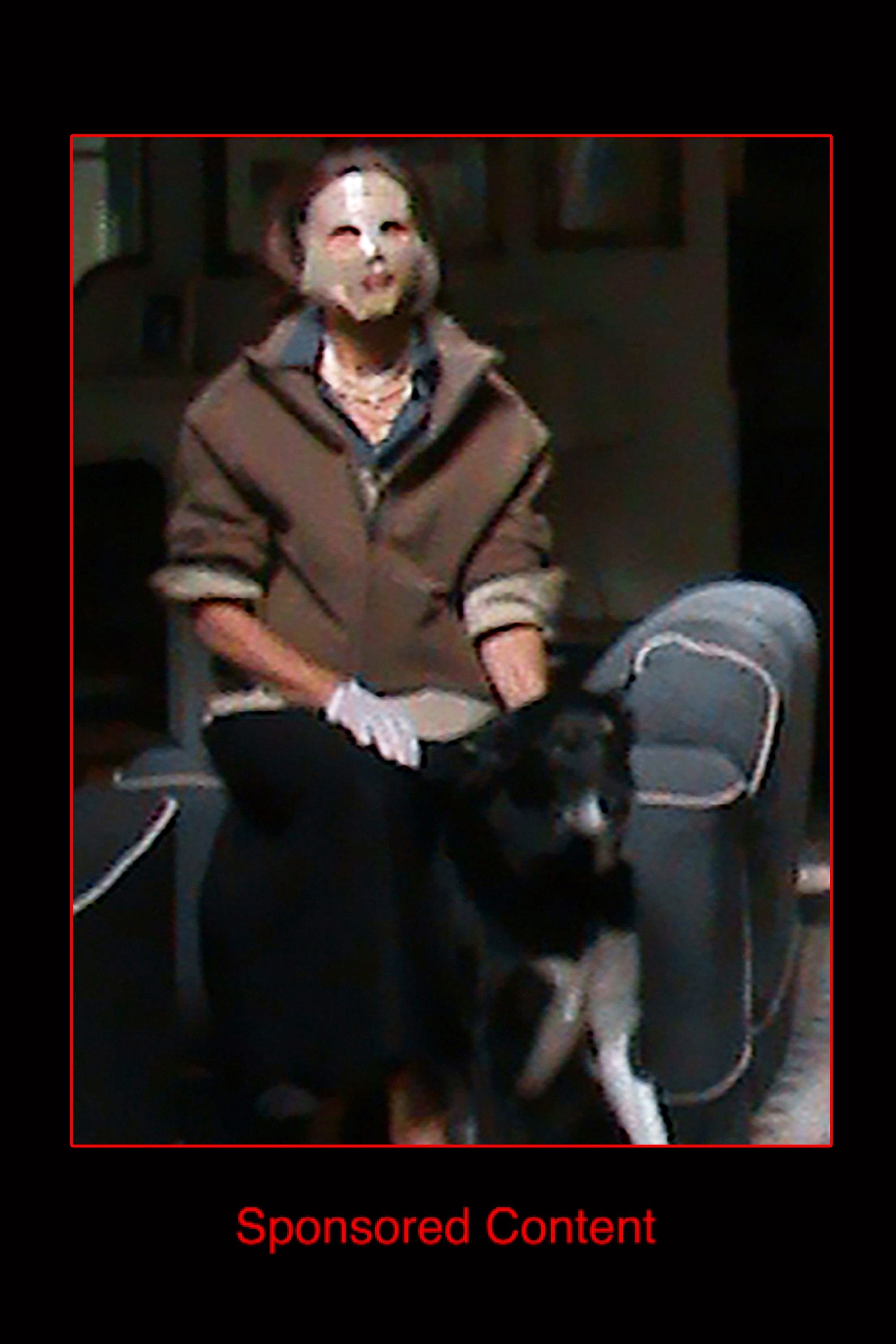
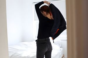
“I Wish They Made This for Girls” is a recurring photo series by artist Vincent Tsang on onandbeyond.com, his menswear and technical-apparel journal. Each installment documents men’s garments worn by a woman.
This installment: Arc’teryx Veilance Spring/Summer 2012.
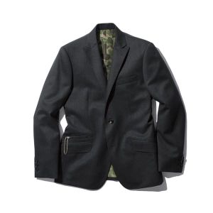
Deploy Composite Jacket (above) — black. WINDSTOPPER 3L front, shoulders and hood; stretch plain-weave nylon back and sides; asymmetric main zip carried over from the Arc’teryx Sidewinder.
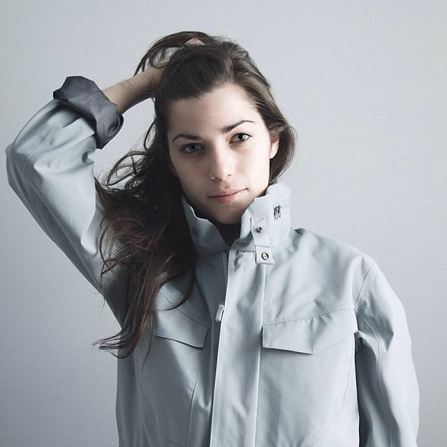
Field Jacket LT (above) — Cirrus (grey). Stand collar with snap tabs; flap chest pocket.
Published on onandbeyond, March 2012.
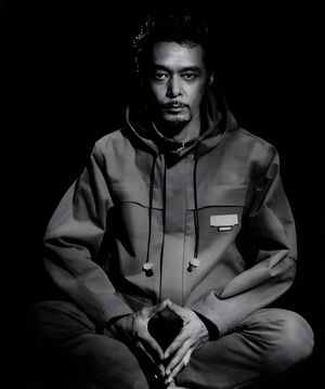
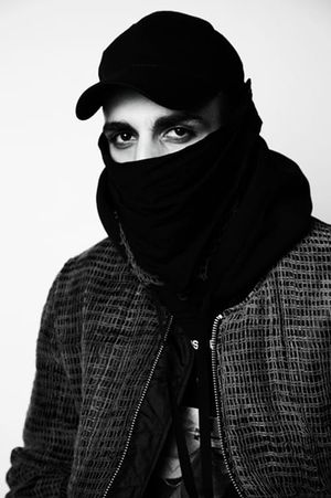
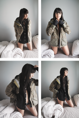
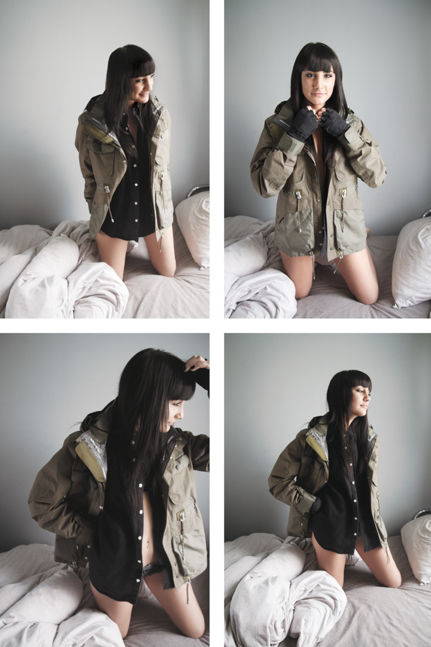
“I Wish They Made This for Girls” is a recurring photo series by artist Vincent Tsang on onandbeyond.com, his menswear and technical-apparel journal. Each installment documents men’s garments worn by a woman.
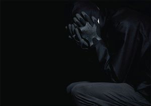
White Mountaineering field jacket — oversized; olive; drawcord waist; flap pockets; lined hood. Worn open over a black shirt. Black tactical gloves in the second frame.
Published on onandbeyond, 20 October 2011.
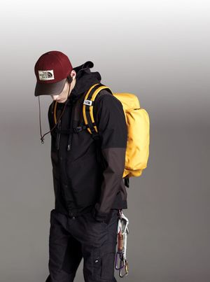
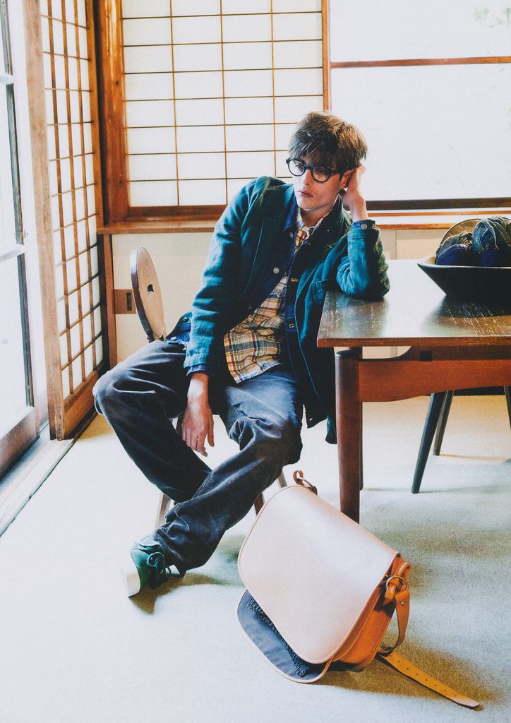
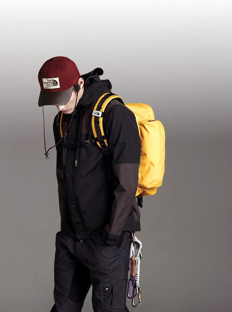
A look from The North Face's Fall/Winter 2011 lookbook, with model Robbie Wadge. Layered shells, fleece and insulated pieces from the mountaineering line, styled for the city.
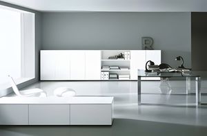

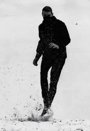
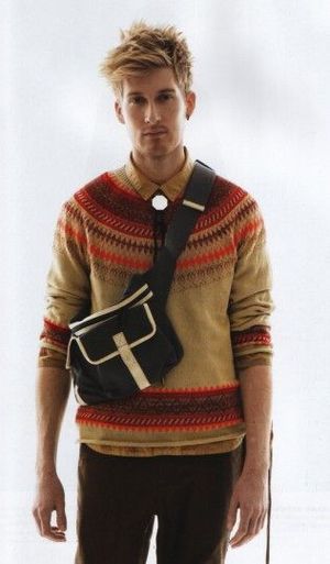
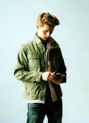
The WTAPS spring/summer “WHO DARES WINS” collection rolls into its fourth month of releases with this COOL TRANS photoshoot highlighting some of the upcoming items. As always from head designer TET, we see a very subtle collection with the use of leopard print and studded belts about the only thing that really sticks out from the norm. Military and 1960s British fashion influences can still be seen mixed in with the WTAPS unique brand of styling.
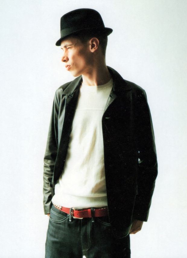
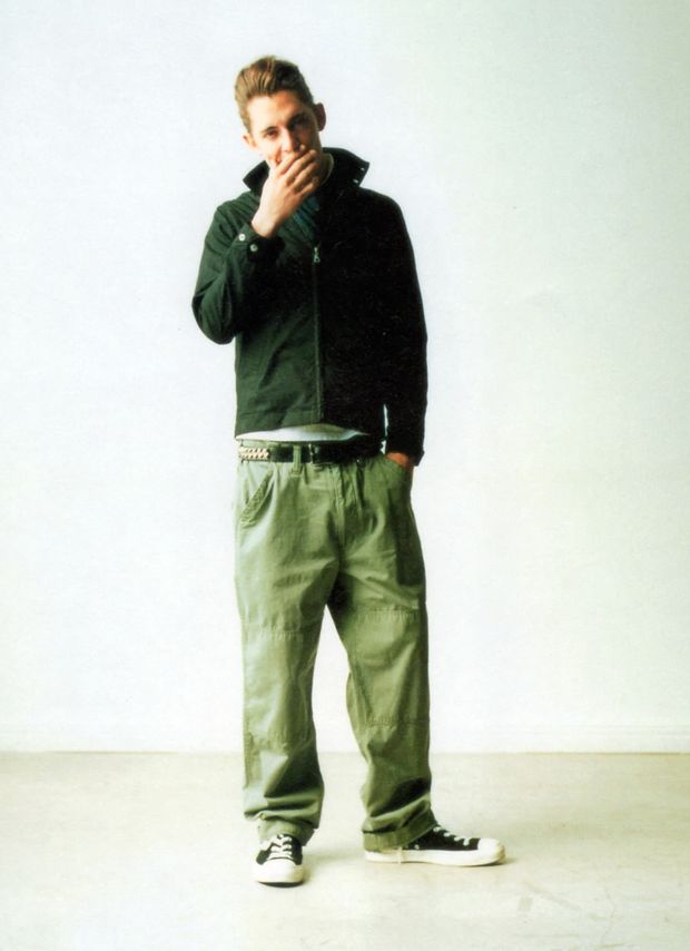
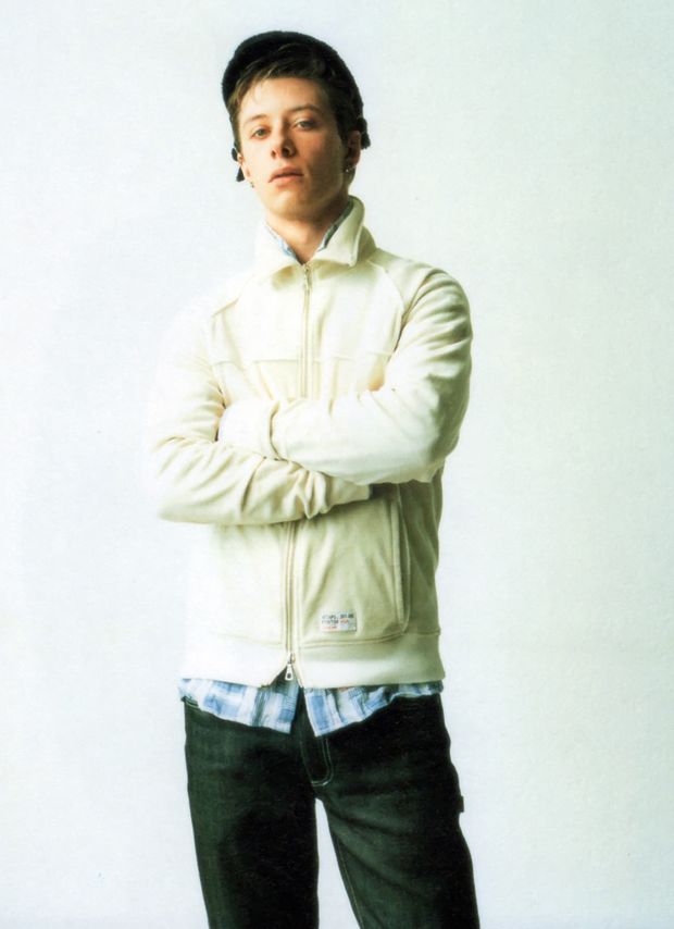
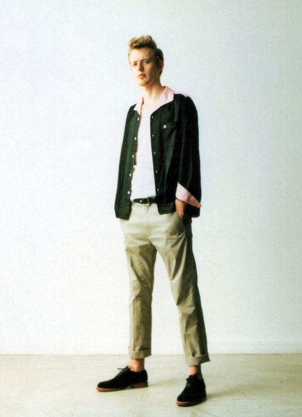
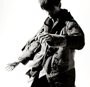
We see a lot Visvim x Gore-Tex x (N)ine multi-faceted collabos in there, mixed in with lets say an “optimistic goth” imagery.
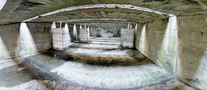
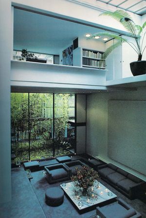
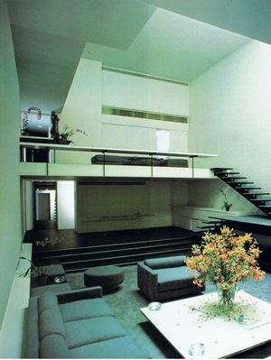
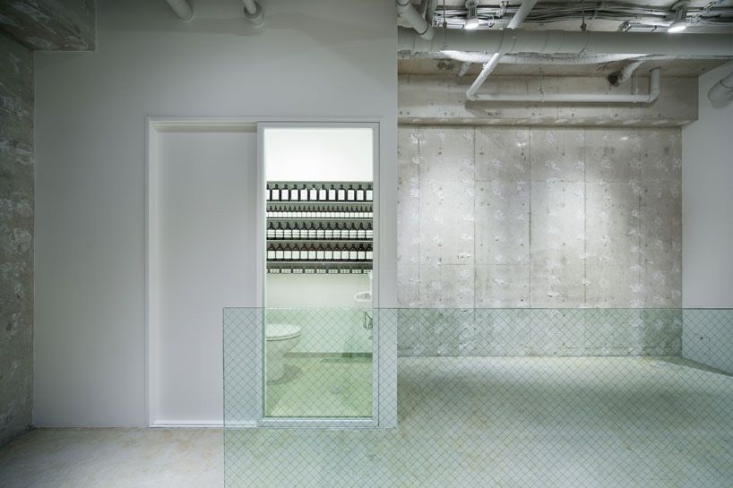
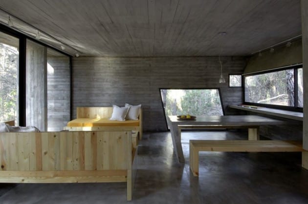
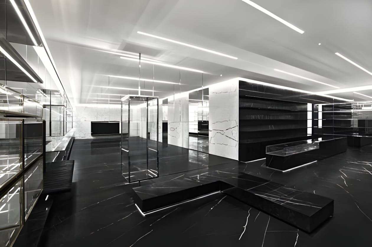
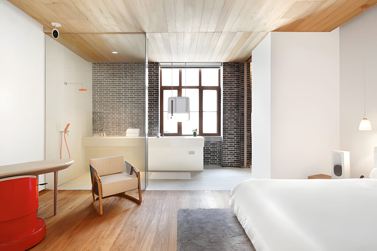
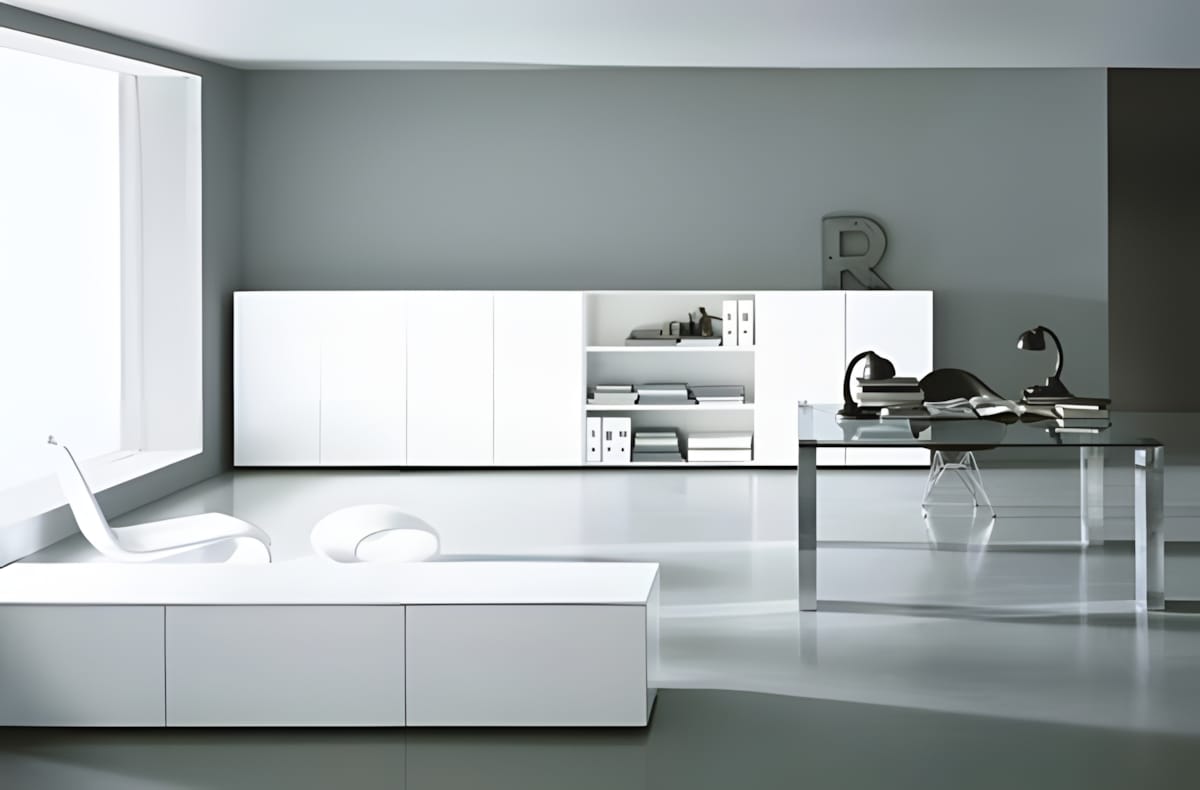
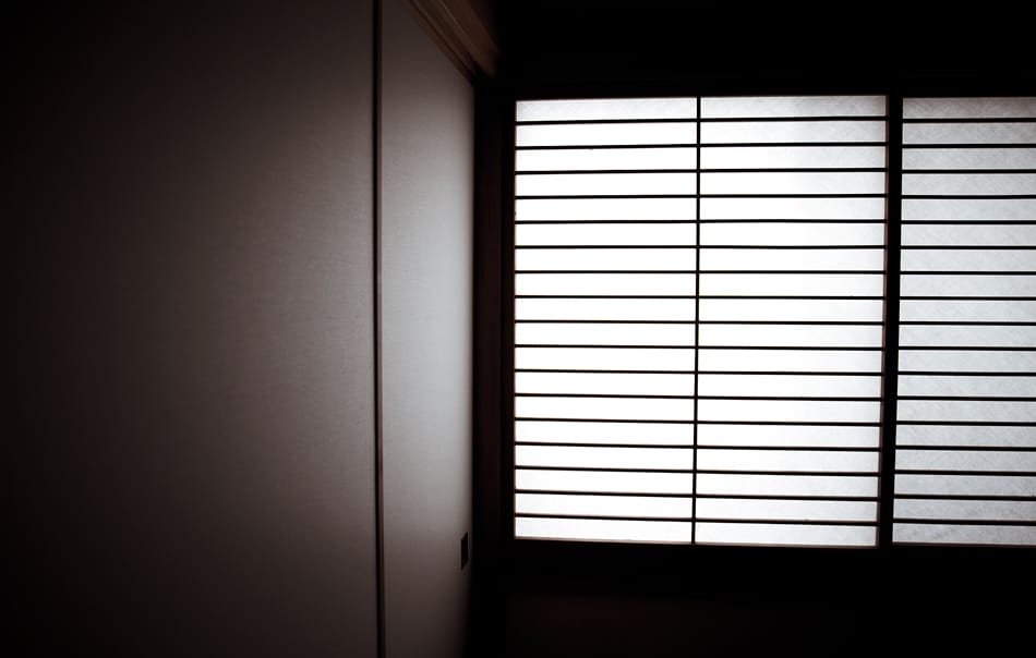
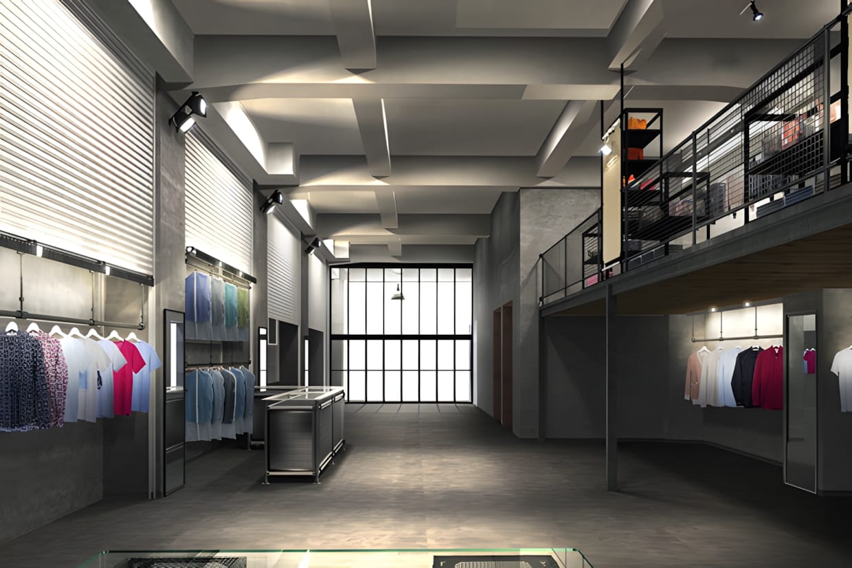
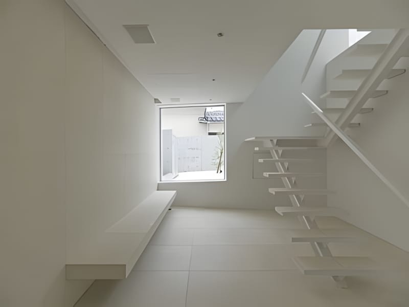
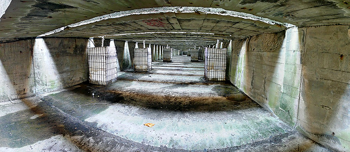
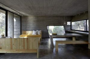
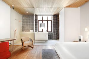
Concrete Bunker Interior